Introduction to this section:
Alright, we have finally finished learning some controls related to the Adapter class. Of course, besides the ones explained, there are many other related controls, which we won't go through one by one. If needed, you can consult the documentation yourself to check the relevant usage. What this section brings is: a control used by Android for displaying messages — Toast! Toast is a very convenient message prompt box. It displays a message prompt box on the screen, without any buttons, and does not gain focus. It disappears automatically after a period of time! It is very commonly used! In this section, we will learn the usage of Toast!
1. Create by directly calling the makeText() method of the Toast class
This is the form we use most often! For example, clicking a button and then a Toast pops up. Usage:Toast.makeText(MainActivity.this, "Hintofcontent", Toast.LENGTH_LONG).show();The first is the context object! The second is the content to display! The third is the display duration. Only LONG and SHORT take effect. Even if you define other values, ultimately these two are used!
In addition, Toast is very commonly used. We can extract these common parts and write them into a method! When you need to display a Toast, you can directly call this method to show the Toast, which is much more convenient! Example as follows:
>
void midToast(String str, int showTime)
{
    Toast toast = Toast.makeText(global_context, str, showTime);
    toast.setGravity(Gravity.CENTER_VERTICAL|Gravity.CENTER_HORIZONTAL , 0, 0);  //设置显示位置
    TextView v = (TextView) toast.getView().findViewById(android.R.id.message);
    v.setTextColor(Color.YELLOW);     //设置字体颜色
    toast.show();
}
With the extracted method above, we find that we can call setGravity to set the display position of the Toast, and obtain the displayed text via findViewById(android.R.id.message), then set the color or size, etc.! This is the second way to customize Toast through constructor methods!
2. Customize Toast via constructor methods:
Above we customized the text and display position. Below we write two simple examples:
1. Define a Toast with an image
Effect screenshot:
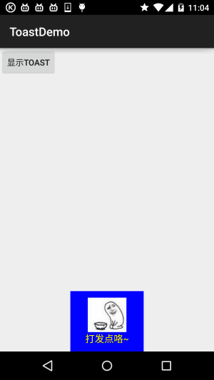
Key code:
private void midToast(String str, int showTime)
{
    Toast toast = Toast.makeText(mContext, str, showTime);
    toast.setGravity(Gravity.CENTER_HORIZONTAL|Gravity.BOTTOM , 0, 0);  //设置显示位置
    LinearLayout layout = (LinearLayout) toast.getView();
    layout.setBackgroundColor(Color.BLUE);
    ImageView image = new ImageView(this);
    image.setImageResource(R.mipmap.ic_icon_qitao);
    layout.addView(image, 0);
    TextView v = (TextView) toast.getView().findViewById(android.R.id.message);
    v.setTextColor(Color.YELLOW);     //设置字体颜色
    toast.show();
}
2. Fully custom Toast
If the above type still doesn't satisfy you, then you can completely write your own Toast layout and display it; however, we still cannot control the duration!
Screenshot of running effect:
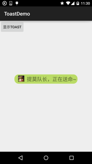
Key code:
private void midToast(String str, int showTime)
{
    LayoutInflater inflater = getLayoutInflater();
    View view = inflater.inflate(R.layout.view_toast_custom,
            (ViewGroup) findViewById(R.id.lly_toast));
    ImageView img_logo = (ImageView) view.findViewById(R.id.img_logo);
    TextView tv_msg = (TextView) view.findViewById(R.id.tv_msg);
    tv_msg.setText(str);
    Toast toast = new Toast(mContext);
    toast.setGravity(Gravity.CENTER, 0, 0);
    toast.setDuration(Toast.LENGTH_LONG);
    toast.setView(view);
    toast.show();
}
There is also custom Toast layout and rounded corner background:
Rounded corner background:bg_toast.xml:
<?xml version="1.0" encoding="utf-8"?>
<shape xmlns:android="http://schemas.android.com/apk/res/android">
    <!-- 设置透明背景色 -->
    <solid android:color="#BADB66" />
    <!-- 设置一个黑色边框 -->
    <stroke
        android:width="1px"
        android:color="#FFFFFF" />
    <!-- 设置四个圆角的半径 -->
    <corners
        android:bottomLeftRadius="50px"
        android:bottomRightRadius="50px"
        android:topLeftRadius="50px"
        android:topRightRadius="50px" />
    <!-- 设置一下边距,让空间大一点 -->
    <padding
        android:bottom="5dp"
        android:left="5dp"
        android:right="5dp"
        android:top="5dp" />
</shape>
Layout file:view_toast_custom.xml:
<?xml version="1.0" encoding="utf-8"?>
<LinearLayout xmlns:android="http://schemas.android.com/apk/res/android"
    android:id="@+id/lly_toast"
    android:layout_width="match_parent"
    android:layout_height="match_parent"
    android:background="@drawable/bg_toast"
    android:orientation="horizontal">

    <ImageView
        android:id="@+id/img_logo"
        android:layout_width="24dp"
        android:layout_height="24dp"
        android:layout_marginLeft="10dp"
        android:src="@mipmap/iv_lol_icon1.html" />

    <TextView
        android:id="@+id/tv_msg"
        android:layout_width="match_parent"
        android:layout_height="wrap_content"
        android:layout_marginLeft="10dp"
        android:textSize="20sp" />

</LinearLayout>
Very simple, hehe~
3. Download sample code
ToastDemo.zip
Summary of this section:
Alright, this section explained the basic usage of Toast and how to customize Toast. It's very simple. You can customize your own Toast during actual development~