Introduction to this section:
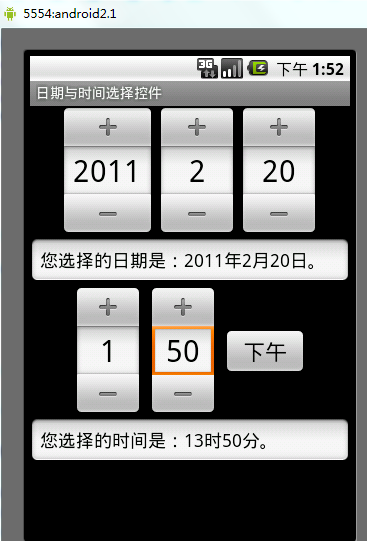
In this section, we continue to learn about several native Date & Time components provided by the Android system. They are: DatePicker (date picker), TimePicker (time picker), CalendarView (date view). Well, actually, at first I refused to deal with these things, because in my impression, they looked like this:
They were so ugly they made me cry, you know? Finally I understand why so many people like to customize this type of control. But after all, it was written in the outline. Since I wrote the outline myself, I have to finish it even with tears... When I put the DatePicker into the layout and looked at the preview, oh:
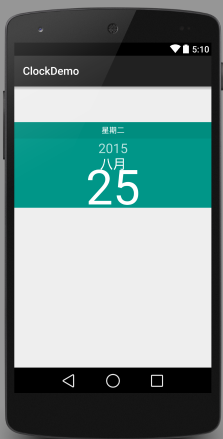
Oh, it actually looks pretty good. I'm in a great mood now, haha. So let's start this section!
1. DatePicker (Date Picker)
The attributes available to us are as follows:
- android:calendarTextColor: Text color of the calendar list
- android:calendarViewShown: Whether to show the calendar view
- android:datePickerMode: Component appearance, optional values: spinner, calendar. The former has the effect shown below, and the default is the latter.
- android:dayOfWeekBackground: Background color of the weekday header at the top
- android:dayOfWeekTextAppearance: Text color of the weekday header at the top
- android:endYear: Previous year (content), e.g., 2010
- android:firstDayOfWeek: Set which weekday the calendar list starts with
- android:headerBackground: Background color of the entire header
- android:headerDayOfMonthTextAppearance: Color of the date font in the header
- android:headerMonthTextAppearance: Font color of the month in the header
- android:headerYearTextAppearance: Font color of the year in the header
- android:maxDate: Maximum date displayed in this calendar view, in mm/dd/yyyy format
- android:minDate: Minimum date displayed in this calendar view, in mm/dd/yyyy format
- android:spinnersShown: Whether to show the spinner
- android:startYear: Set the first year (content), e.g., 19940
- android:yearListItemTextAppearance: The text of the list appears in the list.
- android:yearListSelectorColor: Color of the selected year in the year list
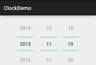
These are the attributes above. You can play with them however you like. Next, let's talk about the events of DatePicker:DatePicker.OnDateChangedListenerIn addition, strangely, if the mode above is "calendar", setting the event does not respond. It seems that with this mode you can only get the corresponding value after selection. If your mode is "spinner", you can use the following code to complete event listening:
The implementation code is as follows:
public class MainActivity extends AppCompatActivity implements DatePicker.OnDateChangedListener{

    @Override
    protected void onCreate(Bundle savedInstanceState) {
        super.onCreate(savedInstanceState);
        setContentView(R.layout.activity_main);
        DatePicker dp_test = (DatePicker) findViewById(R.id.dp_test);
        Calendar calendar = Calendar.getInstance();
        int year=calendar.get(Calendar.YEAR);
        int monthOfYear=calendar.get(Calendar.MONTH);
        int dayOfMonth=calendar.get(Calendar.DAY_OF_MONTH);
        dp_test.init(year,monthOfYear,dayOfMonth,this);
    }

    @Override
    public void onDateChanged(DatePicker view, int year, int monthOfYear, int dayOfMonth) {
        Toast.makeText(MainActivity.this,"您选择的日期是:"+year+"年"+(monthOfYear+1)+"月"+dayOfMonth+"日!",Toast.LENGTH_SHORT).show();
    }
}
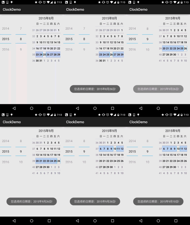
Screenshot of running effect:
2. TimePicker (Time Picker)
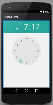
First, let's see what the 5.0 TimePicker looks like:
It looks pretty neat, huh? We find that the official attribute provided to us is only one:android:timePickerMode: Component appearance, likewise optional values: spinner and clock (default). The former is the old version of TimePicker. And its corresponding listening event is:TimePicker.OnTimeChangedListener
Below is a code example:
public class MainActivity extends AppCompatActivity{

    @Override
    protected void onCreate(Bundle savedInstanceState) {
        super.onCreate(savedInstanceState);
        setContentView(R.layout.activity_main);
        TimePicker tp_test = (TimePicker) findViewById(R.id.tp_test);
        tp_test.setOnTimeChangedListener(new TimePicker.OnTimeChangedListener() {
            @Override
            public void onTimeChanged(TimePicker view, int hourOfDay, int minute) {
                Toast.makeText(MainActivity.this,"您选择的时间是:"+hourOfDay+"时"+minute+"分!",Toast.LENGTH_SHORT).show();
            }
        });
    }

}
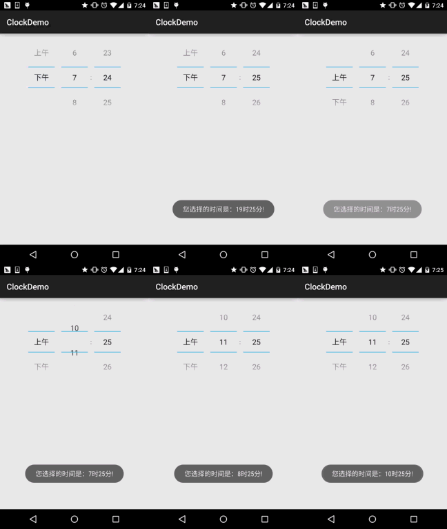
Screenshot of running effect:Unfortunately, this event is also triggered only by the old version of TimePicker!
3. CalendarView (Calendar View)
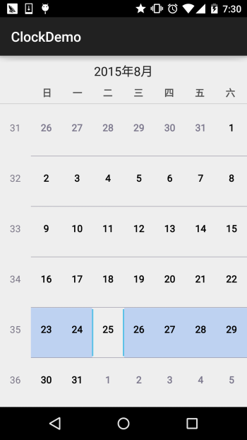
OK, let's also take a look at what it looks like first:
Hmm, it seems not much changed. Next, let's briefly look at the attributes provided in the documentation:
- android:firstDayOfWeek: Set the first day of a week
- android:maxDate: Maximum date displayed in this calendar view, in mm/dd/yyyy format
- android:minDate: Minimum date displayed in this calendar view, in mm/dd/yyyy format
- android:weekDayTextAppearance: The weekday text appears in the calendar title as abbreviations.
Besides the above, there are other attributes, but they are all deprecated... The corresponding date change event is:CalendarView.OnDateChangeListener
Example code:
public class MainActivity extends AppCompatActivity{
    @Override
    protected void onCreate(Bundle savedInstanceState) {
        super.onCreate(savedInstanceState);
        setContentView(R.layout.activity_main);
        CalendarView cv_test = (CalendarView) findViewById(R.id.cv_test);
        cv_test.setOnDateChangeListener(new CalendarView.OnDateChangeListener() {
            @Override
            public void onSelectedDayChange(CalendarView view, int year, int month, int dayOfMonth) {
                Toast.makeText(MainActivity.this,"您选择的时间是:"+ year + "年" + month + "月" + dayOfMonth + "日",Toast.LENGTH_SHORT).show();
            }
        });
    }
}
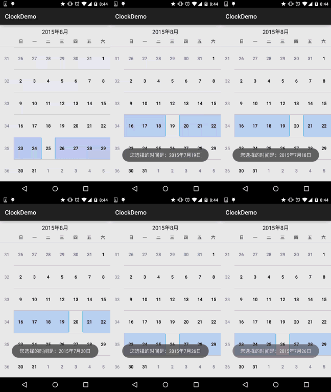
Screenshot of running effect:
Summary of this section:
OK, that's it for the introduction to these three controls. In actual development, we usually customize these controls. In the advanced series, we will write controls ourselves. Stay tuned, thanks~