Introduction:
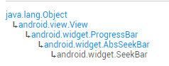
In this section, we continue to learn about the drag bar in Android's basic UI controls—SeekBar. I believe it is familiar to everyone. The most common places are music players or video players, where volume control or playback progress control all use this SeekBar. Let's first look at the class structure of SeekBar, and go to the official documentation:SeekBar
Hehe, this thing is a subclass of ProgressBar, which means all ProgressBar attributes can be used! And it also has its own attribute:android:thumb, which allows us to customize the thumb~ Alright, let's start this section!
1. Basic Usage of SeekBar
Well, the basic usage is actually very simple. The commonly used attributes are nothing more than the following few. In Java code, just use setXxx:
android:max="100" // Maximum value of the slider
android:progress="60" // Current value of the slider
android:secondaryProgress="70" // Progress of the secondary progress bar
android:thumb= "@mipmap/sb_icon" // Drawable of the thumb
Next, let's talk about SeekBar events.SeekBar.OnSeekBarChangeListenerWe just need to override three corresponding methods:
onProgressChanged: Triggered when the progress changes
onStartTrackingTouch: Triggered when SeekBar is pressed
onStopTrackingTouch: Triggered when SeekBar is released
Simple code example:
Effect screenshot:
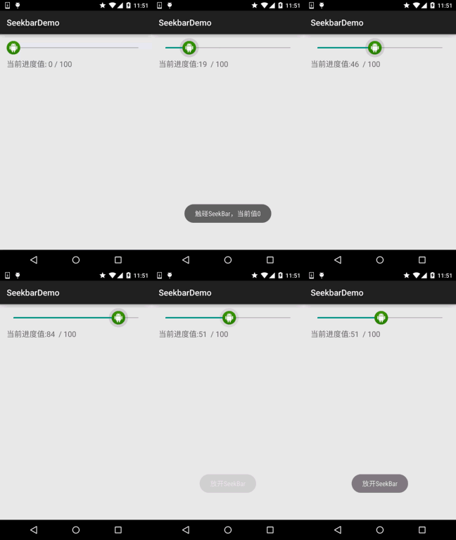
Implementation code:
public class MainActivity extends AppCompatActivity {

    private SeekBar sb_normal;
    private TextView txt_cur;
    private Context mContext;

    @Override
    protected void onCreate(Bundle savedInstanceState) {
        super.onCreate(savedInstanceState);
        setContentView(R.layout.activity_main);
        mContext = MainActivity.this;
        bindViews();
    }

    private void bindViews() {
        sb_normal = (SeekBar) findViewById(R.id.sb_normal);
        txt_cur = (TextView) findViewById(R.id.txt_cur);
        sb_normal.setOnSeekBarChangeListener(new SeekBar.OnSeekBarChangeListener() {
            @Override
            public void onProgressChanged(SeekBar seekBar, int progress, boolean fromUser) {
                txt_cur.setText("当前进度值:" + progress + "  / 100 ");
            }

            @Override
            public void onStartTrackingTouch(SeekBar seekBar) {
                Toast.makeText(mContext, "触碰SeekBar", Toast.LENGTH_SHORT).show();
            }

            @Override
            public void onStopTrackingTouch(SeekBar seekBar) {
                Toast.makeText(mContext, "放开SeekBar", Toast.LENGTH_SHORT).show();
            }
        });
    }
}
2. Simple SeekBar Customization:
I originally wanted to customize SeekBar, but then I thought, forget it. It involves some things about custom Views, which beginners may not understand, and it looks a bit difficult. Let's leave custom Views for the advanced section. So here we just simply customize SeekBar! The customization includes the thumb and the track!
Code example:
Running effect screenshot:
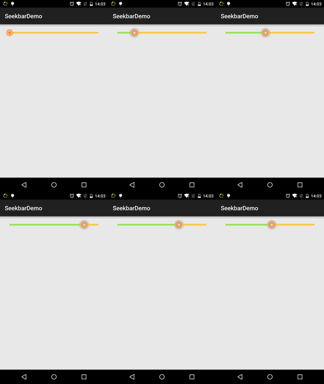
Code implementation: 1. Thumb state Drawable: sb_thumb.xml
<?xml version="1.0" encoding="utf-8"?>
<selector xmlns:android="http://schemas.android.com/apk/res/android">
    <item android:state_pressed="true" android:drawable="@mipmap/seekbar_thumb_pressed"/>
    <item android:state_pressed="false" android:drawable="@mipmap/seekbar_thumb_normal"/>
</selector>
Here are the assets:


2. Drawable for the bar: sb_bar.xml
Here we use a layer-list drawable resource! It is actually stacked images, in order: background, secondary progress bar, current progress:
<?xml version="1.0" encoding="utf-8"?>
<layer-list
    xmlns:android="http://schemas.android.com/apk/res/android">
    <item android:id="@android:id/background">
        <shape>
            <solid android:color="#FFFFD042" />
        </shape>
    </item>
    <item android:id="@android:id/secondaryProgress">
        <clip>
            <shape>
                <solid android:color="#FFFFFFFF" />
            </shape>
        </clip>
    </item>
    <item android:id="@android:id/progress">
        <clip>
            <shape>
                <solid android:color="#FF96E85D" />
            </shape>
        </clip>
    </item>
</layer-list>
3. Then after adding SeekBar in the layout, just set progressDrawable and thumb!
<SeekBar
        android:id="@+id/sb_normal"
        android:layout_width="match_parent"
        android:layout_height="wrap_content"
        android:maxHeight="5.0dp"
        android:minHeight="5.0dp"
        android:progressDrawable="@drawable/sb_bar"
        android:thumb="@drawable/sb_thumb"/>
That's it!
Section Summary:
Alright, that's all about SeekBar. Thank you everyone~