Introduction to this section:
The basic Android UI controls introduced in this section are: the switch button ToggleButton and the switch Switch. You may not be familiar with these two components. It suddenly reminds me of my first outsourcing company. The switch for whether to connect to the network over WiFi actually used a TextView, and then asked the graphic designer to create two images for before and after switching, and then set them in code. Of course, when clicking the TextView, it would check the state and set the corresponding background...
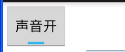
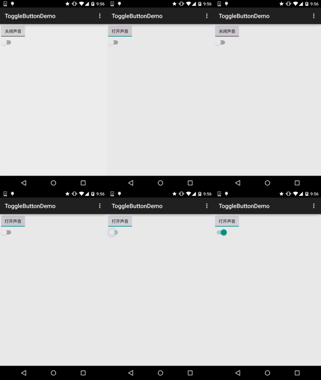
Okay, I was speechless as well... The two controls explained in this section are actually both switch components, but the latter can only be used after Android 4.0, so the minsdk in the AndroidManifest.xml file needs to be >= 14, otherwise it will report an error~. First, let's see what these two controls look like. After Android 5.0, these two controls look much nicer than before. Let's look at the appearance before 5.0:
ToggleButton and Switch before 5.0:
Version 5.0:
Okay, a stark contrast... Next, let's learn how to use these two controls. In fact, the usage of the two is almost identical.
Before we start, let's post the official API first:Switch;ToggleButton
1. Explanation of core attributes:
1) ToggleButton (Switch Button)
Attributes we can set:
- android:disabledAlpha: Set the transparency of the button when disabled.
- android:textOff:The text displayed when the button is not selected.
- android:textOn:The text displayed when the button is selected.
2) Switch
2) Switch
- android:showText:Attributes we can set:
- android:splitTrack:Set whether to show text when on/off, boolean.
- android:switchMinWidth:Set whether to create a gap to separate the thumb from the bottom image, boolean.
- android:switchPadding:Set the minimum width of the switch.
- android:switchTextAppearance:Set the spacing of text within the thumb.
- android:textOff:Set the text appearance of the switch. I haven't found what it does yet...
- android:textOn:The text displayed when the button is not selected.
- android:textStyle:The text displayed when the button is selected.
- android:track:Text style: bold, italic, underline, and so on.
- android:thumb:The image at the bottom.
- android:typeface:The image of the thumb (slider).*.ttfSet the font. By default, these three are supported: sans, serif, monospace; in addition, other font files can be used (Typeface typeFace =Typeface.createFromAsset(getAssets(),"fonts/HandmadeTypewriter.ttf"); textView.setTypeface(typeFace);
2. Usage example:
2. Usage example:
Because it is relatively simple, we write them together. In addition, we set the thumb and bottom image for Switch to achieve an effect similar to the IOS 7 slider. But there is a drawback: the size of the thumb and bottom cannot be set in XML; that is, the Switch will be as large as the image assets. We can obtain the Drawable object in Java and then modify its size. A simple example:
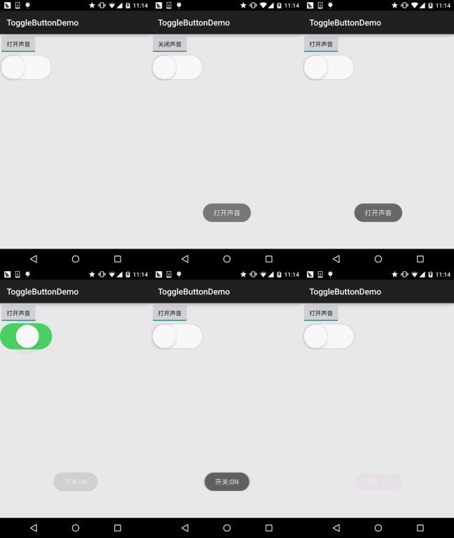
Effect screenshot:Implementation code:thumb_selctor.xml:
<?xml version="1.0" encoding="utf-8"?>
<selector xmlns:android="http://schemas.android.com/apk/res/android">
    <item android:state_pressed="true" android:drawable="@drawable/switch_btn_pressed"/>
    <item android:state_pressed="false" android:drawable="@drawable/switch_btn_normal"/>
</selector>
track_selctor.xml:
<?xml version="1.0" encoding="utf-8"?>
<selector xmlns:android="http://schemas.android.com/apk/res/android">
    <item android:state_checked="true" android:drawable="@drawable/switch_btn_bg_green"/>
    <item android:state_checked="false" android:drawable="@drawable/switch_btn_bg_white"/>
</selector>
First, the two drawable files:
<LinearLayout xmlns:android="http://schemas.android.com/apk/res/android"
    xmlns:tools="http://schemas.android.com/tools"
    android:layout_width="match_parent"
    android:layout_height="match_parent"
    android:orientation="vertical"
    tools:context=".MainActivity">

    <ToggleButton
        android:id="@+id/tbtn_open"
        android:layout_width="wrap_content"
        android:layout_height="wrap_content"
        android:checked="true"
        android:textOff="关闭声音"
        android:textOn="打开声音" />

    <Switch
        android:id="@+id/swh_status"
        android:layout_width="wrap_content"
        android:layout_height="wrap_content"
        android:textOff=""
        android:textOn=""
        android:thumb="@drawable/thumb_selctor"
        android:track="@drawable/track_selctor" />

</LinearLayout>
MainActivity.java:
public class MainActivity extends AppCompatActivity implements CompoundButton.OnCheckedChangeListener{

    private ToggleButton tbtn_open;
    private Switch swh_status;

    @Override
    protected void onCreate(Bundle savedInstanceState) {
        super.onCreate(savedInstanceState);
        setContentView(R.layout.activity_main);

        tbtn_open = (ToggleButton) findViewById(R.id.tbtn_open);
        swh_status = (Switch) findViewById(R.id.swh_status);
        tbtn_open.setOnCheckedChangeListener(this);
        swh_status.setOnCheckedChangeListener(this);
    }

    @Override
    public void onCheckedChanged(CompoundButton compoundButton, boolean b) {
        switch (compoundButton.getId()){
            case R.id.tbtn_open:
                if(compoundButton.isChecked()) Toast.makeText(this,"打开声音",Toast.LENGTH_SHORT).show();
                else Toast.makeText(this,"打开声音",Toast.LENGTH_SHORT).show();
                break;
            case R.id.swh_status:
                if(compoundButton.isChecked()) Toast.makeText(this,"开关:ON",Toast.LENGTH_SHORT).show();
                else Toast.makeText(this,"开关:OFF",Toast.LENGTH_SHORT).show();
                break;

        }
    }
}