Section Introduction:
In this section, we continue to learn about Drawable resources in Android. In the previous section, we learned:
ColorDrawable;
NinePatchDrawable;
ShapeDrawable;
GradientDrawable!
These four Drawables~ And in this section, we continue to learn the next five Drawables, which are:
BitmapDrawable;
InsertDrawable;
ClipDrawable;
RotateDrawable;
AnimationDrawable!
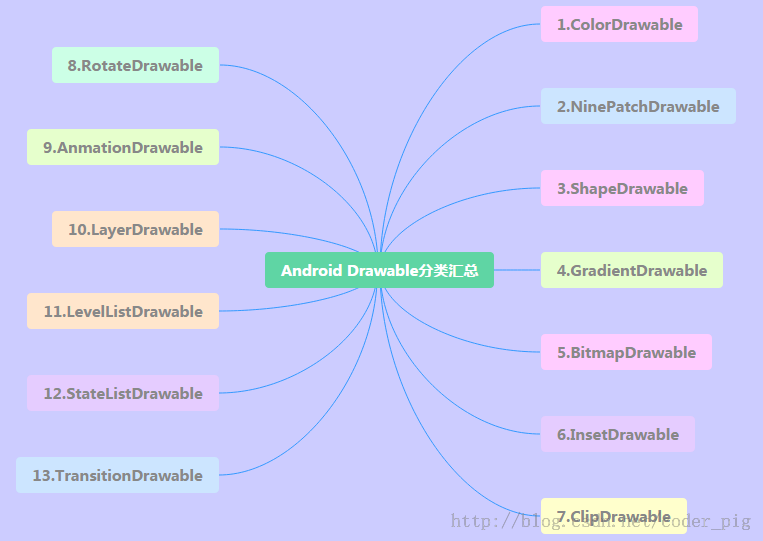
Let's post the mind map of the 13 Drawables again:
Alright, let's start this section~
1.BitmapDrawable
A wrapper for Bitmap. You can set how the wrapped bitmap is drawn within the BitmapDrawable area: tile fill, stretch fill, or keep the original image size! Using <bitmap> as the root node! Optional attributes are as follows:
- src: Image resource~
- antialias: Whether to support anti-aliasing
- filter: Whether to support bitmap filtering; if supported, the image can appear smoother when displayed
- dither: Whether to apply dithering to the bitmap
- gravity: If the bitmap is smaller than the container, you can set the relative position of the bitmap within the container
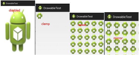
- tileMode: Specifies the mode for tiling the image to fill the container. If this is set, the gravity attribute will be ignored. The following optional values are available:disabled(the entire pattern is stretched and tiled),clamp(original image size),repeat(tile),mirror(mirror tile)
Corresponding effect images:
① Defining BitmapDrawable in XML:
<?xml version="1.0" encoding="utf-8"?>
<bitmap xmlns:android="http://schemas.android.com/apk/res/android"
    android:dither="true"
    android:src="@drawable/ic_launcher.html"
    android:tileMode="mirror" />
② Java code to achieve the same effect:
BitmapDrawable bitDrawable = new BitmapDrawable(bitmap);
bitDrawable.setDither(true);
bitDrawable.setTileModeXY(TileMode.MIRROR,TileMode.MIRROR);
2.InsetDrawable
It means embedding one Drawable inside another Drawable, and leaving some spacing inside. It is similar to the Drawable's padding property, butpaddingit representsthe margin between the Drawable's content and the Drawable itself! WhileInsetDrawableit representsthe margin between the two Drawables and the container, when the control needs abackground smaller than the actual border, InsetDrawable is more suitable. For example, using this can solve the spacing problem between our custom Dialog and the screen. Friends who have done it before will know that even if we set layout_margin, it won't work. At this time, we can use InsetDrawable! Just set insetXxx for InsetDrawable to set margins in different directions, and then set it as the Dialog's background!
Related attributes are as follows:
- 1.drawable: The referenced Drawable. If it is empty, there must be a child node of type Drawable!
- 2.visible: Set whether the Drawable occupies extra space
- 3.insetLeft,insetRight,insetTop,insetBottm: Set the left, right, top, and bottom margins
① Using it in XML:
<?xml version="1.0" encoding="utf-8"?>
<inset xmlns:android="http://schemas.android.com/apk/res/android"
    android:drawable="@drawable/test1"
    android:insetBottom="10dp"
    android:insetLeft="10dp"
    android:insetRight="10dp"
    android:insetTop="10dp" />
Using it in Java code:
InsetDrawable insetDrawable = new InsetDrawable(getResources()
        .getDrawable(R.drawable.test1), 10, 10, 10, 10);
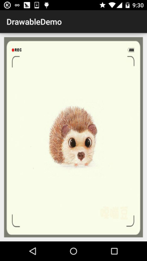
Usage effect images:
3.ClipDrawable
Clip can be translated as "cut". We can understand ClipDrawable as cutting a part from a bitmap. The progress bar in Android is implemented using ClipDrawable. It determines the size of the clipping area based on the set level value. The root node is <clip>
Related attributes are as follows:
- clipOrietntion: Set the clipping direction; both horizontal and vertical directions can be set
- gravity: The position from which to start clipping
- drawable: The referenced drawable resource. If empty, there needs to be a child node of type Drawable. ps: This Drawable-type child node means adding a statement like this inside <clip>:
Like this...
Usage example:
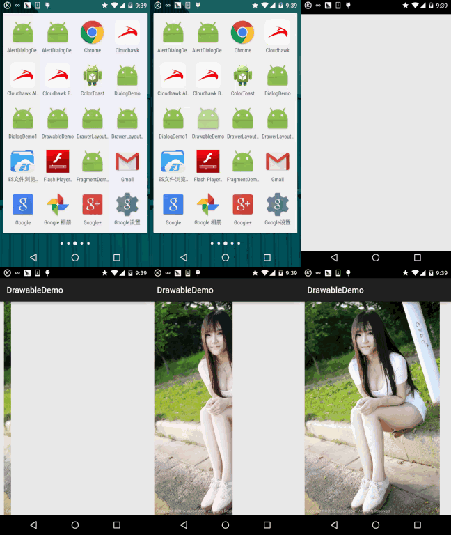
Core: Modify the level value of ClipDrawable through code! The level value is 0~10000!
Running effect images:
Code implementation:
① Define a ClipDrawable resource XML:
<?xml version="1.0" encoding="utf-8"?>
<clip xmlns:android="http://schemas.android.com/apk/res/android"
    android:clipOrientation="horizontal"
    android:drawable="@mipmap/ic_bg_meizi"
    android:gravity="left" />
② In the activity_main main layout file, set an ImageView and set src to clipDrawable! Remember to use src! If you write blackground, it will throw a null pointer exception!!!!
<LinearLayout xmlns:android="http://schemas.android.com/apk/res/android"
    xmlns:tools="http://schemas.android.com/tools"
    android:layout_width="match_parent"
    android:layout_height="match_parent"
    android:orientation="vertical">

    <ImageView
        android:id="@+id/img_show"
        android:layout_width="match_parent"
        android:layout_height="match_parent"
        android:src="@drawable/clip_bg.html" />

</LinearLayout>
③ Set the clipping area size via setLevel in MainActivity.java:
public class MainActivity extends AppCompatActivity {

    private ImageView img_show;
    private ClipDrawable cd;
    private Handler handler = new Handler() {
        @Override
        public void handleMessage(Message msg) {
            if (msg.what == 0x123) {
                cd.setLevel(cd.getLevel() + 500);
            }
        }
    };

    @Override
    protected void onCreate(Bundle savedInstanceState) {
        super.onCreate(savedInstanceState);
        setContentView(R.layout.activity_main);
        img_show = (ImageView) findViewById(R.id.img_show);
        // 核心实现代码
        cd = (ClipDrawable) img_show.getDrawable();
        final Timer timer = new Timer();
        timer.schedule(new TimerTask() {
            @Override
            public void run() {
                handler.sendEmptyMessage(0x123);
                if (cd.getLevel() >= 10000) {
                    timer.cancel();
                }
            }
        }, 0, 300);
    }
}
Alright, this is getting interesting. Don't ask me for the girl images; there are plenty on Baidu~
4.RotateDrawable
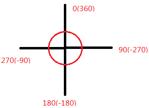
Used to rotate a Drawable. Rotation is also controlled via setLevel, with a maximum value of 10000.
Related attributes are as follows:
- fromDegrees: Starting angle, corresponding to the lowest level value, default is 0
- toDegrees: Ending angle, corresponding to the highest level value, default is 360
- pivotX: Set the x coordinate of the reference point, value range 0~1, default is 50%, i.e., 0.5
- pivotY: Set the Y coordinate of the reference point, value range 0~1, default is 50%, i.e., 0.5 ps: If the rotated image is not fully displayed, you can modify the above two values to solve it!
- drawable: Set the bitmap resource
- visible: Set whether the drawable is visible!
The angle diagram is as follows:
Usage example:
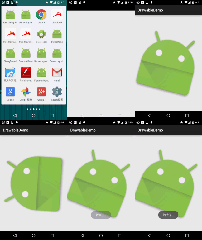
Running effect images:
Code implementation:
Just make a small modification to the clipDrawable from point 3!
① Define a rotateDrawable resource file:
<?xml version="1.0" encoding="utf-8"?>
<rotate xmlns:android="http://schemas.android.com/apk/res/android"
    android:drawable="@mipmap/ic_launcher"
    android:fromDegrees="-180"
    android:pivotX="50%"
    android:pivotY="50%" />
② Modify the src in activity_main.xml to point to the above drawable. In MainActivity, just change ClipDrawable to rotateDrawable!
public class MainActivity extends AppCompatActivity {

    private ImageView img_show;
    private RotateDrawable cd;
    private Handler handler = new Handler() {
        @Override
        public void handleMessage(Message msg) {
            if (msg.what == 0x123) {
                if (cd.getLevel() >= 10000)
                    Toast.makeText(MainActivity.this, "转完了~",
                            Toast.LENGTH_LONG).show();
                cd.setLevel(cd.getLevel() + 400);
            }
        }
    };

    @Override
    protected void onCreate(Bundle savedInstanceState) {
        super.onCreate(savedInstanceState);
        setContentView(R.layout.activity_main);
        img_show = (ImageView) findViewById(R.id.img_show);
        // 核心实现代码
        cd = (RotateDrawable) img_show.getDrawable();
        final Timer timer = new Timer();
        timer.schedule(new TimerTask() {
            @Override
            public void run() {
                handler.sendEmptyMessage(0x123);
                if (cd.getLevel() >= 10000) {
                    timer.cancel();
                }
            }
        }, 0, 100);
    }
}
5.AnimationDrawable
The last Drawable in this section. AnimationDrawable is used to implement frame animation in Android, which plays a series of Drawables frame by frame in a certain order. Android has rich animation options, including traditional tween animation, translation, scaling, and other effects. However, here we only introduce AnimationDrawable for implementing frame animation. As for alpha, scale, translate, rotate, etc., we will introduce them in detail later in the animation chapter~
Here we use <animation-list> as the root node
Related attributes and methods:
oneshot: Set whether to loop playback; false means looping!!!duration: Frame interval time, usually set to 300 milliseconds. After we obtain an AnimationDrawable instance, we need to call its start() method to play the animation. Also, note that calling it in the OnCreate() method has no effect because the View has not finished initialization yet. We can use a simple handler to delay the animation playback! Of course, there are other methods, as shown in the following link:Several ways to run Android AnimationDrawableUsing AnimationDrawable to implement frame animation is really very convenient~
Usage example:
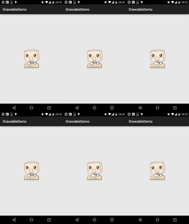
Running effect images:
Code implementation:
①First define an AnimationDrawable XML resource file:
<?xml version="1.0" encoding="utf-8"?>
<animation-list xmlns:android="http://schemas.android.com/apk/res/android"
    android:oneshot="false">

    <item
        android:drawable="@mipmap/ic_pull_to_refresh_loading01"
        android:duration="100" />

    <item
        android:drawable="@mipmap/ic_pull_to_refresh_loading02"
        android:duration="100" />
    <item
        android:drawable="@mipmap/ic_pull_to_refresh_loading03"
        android:duration="100" />
    <item
        android:drawable="@mipmap/ic_pull_to_refresh_loading04"
        android:duration="100" />
    <item
        android:drawable="@mipmap/ic_pull_to_refresh_loading05"
        android:duration="100" />
    <item
        android:drawable="@mipmap/ic_pull_to_refresh_loading06"
        android:duration="100" />

</animation-list>
② Set src in activity_main.xml, then in MainActivity:
public class MainActivity extends AppCompatActivity {

    private ImageView img_show;
    private AnimationDrawable ad;

    @Override
    protected void onCreate(Bundle savedInstanceState) {
        super.onCreate(savedInstanceState);
        setContentView(R.layout.activity_main);
        img_show = (ImageView) findViewById(R.id.img_show);
        // 核心实现代码
        ad = (AnimationDrawable) img_show.getDrawable();
        Handler handler = new Handler();
        handler.postDelayed(new Runnable() {
            @Override
            public void run() {
                ad.start();
            }
        }, 300);
    }
}
Hehe, super simple, isn't it? In the future, in places where frame animation is needed, just useAnimationDrawable, Of course, it is only suitable for frame animations that do not require control. For example, the one above is a simple frame animation made from the progress bar material used during pull-to-refresh in a super list! Expand it according to your own needs~
Section Summary:
This section introduced another five Drawables. Very interesting, right? Why not quickly apply them to your actual development~ Hehe, that's all for now, thanks! Also, a reader just privately messaged me asking if I could not delete previous articles. Well, let me say this here: only some duplicate ones are deleted, such as the sections similar to this one. Of course, I will also back them up! Deleted articles will all be backed up! So don't worry!