Introduction to this section:
This section brings you the RadioButton and Checkbox from Android's basic UI controls. First, let's talk about what this section will cover: regarding RadioButton and Checkbox
1. Basic usage
2. Event handling;
3. Custom click effects;
4. Changing the relative position of text and selection box;
5. Modifying the distance between text and selection box
Actually, these two controls are similar in many ways. Besides single-selection vs. multi-selection and event handling, everything else is similar! Additionally, there is the issue of Checkbox misalignment on ListView. We will solve that problem in the ListView chapter. Alright, let's begin this section~ Official documentation API for this section:RadioButton;CheckBox;
1. Basic usage and event handling:
1) RadioButton (radio button)
As the name suggests, a radio button can only have one selected, so we need to put RadioButtons into a RadioGroup button group to achieve single-selection functionality! First, let's get familiar with how to use RadioButton with a simple gender selection example: Additionally, we can set the orientation property on the outer RadioGroup to set the arrangement of the RadioButtons, whether vertical or horizontal~
Effect screenshot:
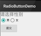
PS: The author's phone runs Android 5.0.1. The RadioButton here is slightly better looking than the old version of RadioButton~
The layout code is as follows:
<LinearLayout xmlns:android="http://schemas.android.com/apk/res/android"
    xmlns:tools="http://schemas.android.com/tools"
    android:id="@+id/LinearLayout1"
    android:layout_width="match_parent"
    android:layout_height="match_parent"
    android:orientation="vertical"
    tools:context=".MainActivity" >

    <TextView
        android:layout_width="wrap_content"
        android:layout_height="wrap_content"
        android:text="请选择性别"
        android:textSize="23dp"
        />

    <RadioGroup
        android:id="@+id/radioGroup"
        android:layout_width="wrap_content"
        android:layout_height="wrap_content"
        android:orientation="horizontal">

        <RadioButton
            android:id="@+id/btnMan"
            android:layout_width="wrap_content"
            android:layout_height="wrap_content"
            android:text="男"
            android:checked="true"/>

        <RadioButton
            android:id="@+id/btnWoman"
            android:layout_width="wrap_content"
            android:layout_height="wrap_content"
            android:text="女"/>
    </RadioGroup>

    <Button
        android:id="@+id/btnpost"
        android:layout_width="wrap_content"
        android:layout_height="wrap_content"
        android:text="提交"/>

</LinearLayout>
Getting the selected value:
There are two methods here,
The first oneis to set an event listener setOnCheckChangeListener for the RadioButton
Example code is as follows:
RadioGroup radgroup = (RadioGroup) findViewById(R.id.radioGroup);
        //第一种获得单选按钮值的方法
        //为radioGroup设置一个监听器:setOnCheckedChanged()
        radgroup.setOnCheckedChangeListener(new OnCheckedChangeListener() {
            @Override
            public void onCheckedChanged(RadioGroup group, int checkedId) {
                RadioButton radbtn = (RadioButton) findViewById(checkedId);
                Toast.makeText(getApplicationContext(), "按钮组值发生改变,你选了" + radbtn.getText(), Toast.LENGTH_LONG).show();
            }
        });
Running effect screenshot:


PS: Also, one thing to remember: you must add an id to each RadioButton, otherwise the single-selection feature won't work!!!
The second onemethod is to get the value of the selected radio button by clicking another button. Of course, we can also get it directly; this depends on the requirements~
Example code is as follows:
Button btnchange = (Button) findViewById(R.id.btnpost);
        RadioGroup radgroup = (RadioGroup) findViewById(R.id.radioGroup);
        //为radioGroup设置一个监听器:setOnCheckedChanged()
        btnchange.setOnClickListener(new OnClickListener() {
            @Override
            public void onClick(View v) {
                for (int i = 0; i < radgroup.getChildCount(); i++) {
                    RadioButton rd = (RadioButton) radgroup.getChildAt(i);
                    if (rd.isChecked()) {
                        Toast.makeText(getApplicationContext(), "点击提交按钮,获取你选择的是:" + rd.getText(), Toast.LENGTH_LONG).show();
                        break;
                    }
                }
            }
        });
Running effect screenshot:

Code analysis:Here we set a setOnClickListener event listener for the submit button. Each time it is clicked, it traverses the RadioGroup once to determine which button is selected. We can obtain the relevant information of the RadioButton through the following methods!
- getChildCount( ) Get the number of radio buttons in the button group;
- getChinldAt(i) Get our radio button based on the index value
- isChecked( ) Determine whether the button is selected
2) CheckBox (checkbox)
As the name suggests, a checkbox allows multiple options to be selected at the same time. As for getting the selected values, there are also two ways: 1. Add an event listener for each CheckBox: setOnCheckedChangeListener 2. Create a button, and after clicking it, check each checkbox with isChecked();
Running effect screenshot:
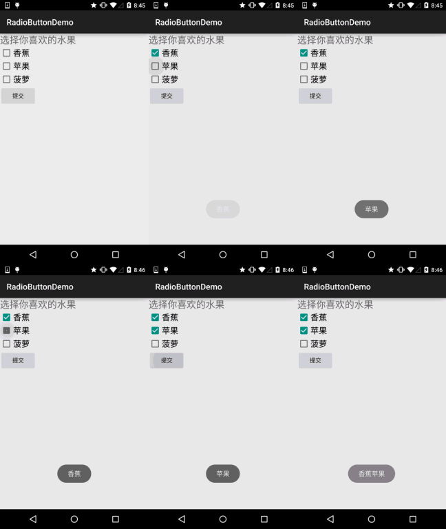
Implementation code:
public class MainActivity extends AppCompatActivity implements View.OnClickListener,CompoundButton.OnCheckedChangeListener{

    private CheckBox cb_one;
    private CheckBox cb_two;
    private CheckBox cb_three;
    private Button btn_send;

    @Override
    protected void onCreate(Bundle savedInstanceState) {
        super.onCreate(savedInstanceState);
        setContentView(R.layout.activity_main);

        cb_one = (CheckBox) findViewById(R.id.cb_one);
        cb_two = (CheckBox) findViewById(R.id.cb_two);
        cb_three = (CheckBox) findViewById(R.id.cb_three);
        btn_send = (Button) findViewById(R.id.btn_send);

        cb_one.setOnCheckedChangeListener(this);
        cb_two.setOnCheckedChangeListener(this);
        cb_three.setOnCheckedChangeListener(this);
        btn_send.setOnClickListener(this);

    }

    @Override
    public void onCheckedChanged(CompoundButton compoundButton, boolean b) {
       if(compoundButton.isChecked()) Toast.makeText(this,compoundButton.getText().toString(),Toast.LENGTH_SHORT).show();
    }

    @Override
    public void onClick(View view) {
        String choose = "";
        if(cb_one.isChecked())choose += cb_one.getText().toString() + "";
        if(cb_two.isChecked())choose += cb_two.getText().toString() + "";
        if(cb_three.isChecked())choose += cb_three.getText().toString() + "";
        Toast.makeText(this,choose,Toast.LENGTH_SHORT).show();
    }
}
2. Custom click effects
Although the RadioButton and Checkbox after 5.0 look a bit better than the old versions, we may still not like them or the requirements may call for custom click effects! It's very simple to implement. First, write a custom selector resource, setting the switching images for the selected and unselected states~!
The implementation effect screenshot is as follows:
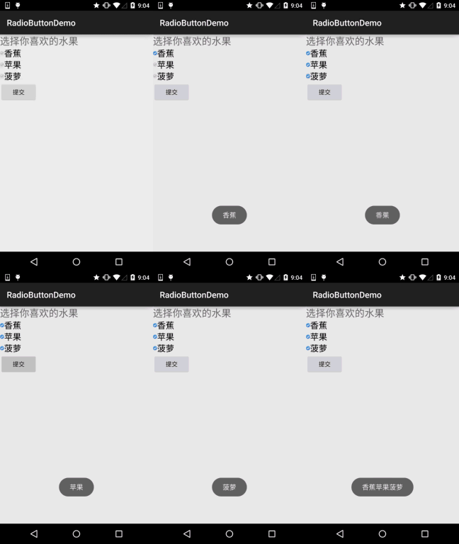
PS: Due to the material used here, it's a bit small...
<?xml version="1.0" encoding="utf-8"?>
<selector xmlns:android="http://schemas.android.com/apk/res/android">
    <item
        android:state_enabled="true"
        android:state_checked="true"
        android:drawable="@mipmap/ic_checkbox_checked"/>
    <item
        android:state_enabled="true"
        android:state_checked="false"
        android:drawable="@mipmap/ic_checkbox_normal" />
</selector>
Once written, we have two ways to set it, or you could say one way! You'll see when you look~
① Set the android:button attribute to the aforementioned selector
android:button="@drawable/rad_btn_selctor"
② Define an attribute in style, then set it via the android:style attribute. First, add the following code to the style:
    <style name="MyCheckBox" parent="@android:style/Widget.CompoundButton.CheckBox">
        <item name="android:button">@drawable/rad_btn_selctor</item>
    </style>
Then in the layout:
style="@style/MyCheckBox"
3. Changing the relative position of text and selection box
This is also very simple to implement. Remember the drawableXxx we used when learning about TextView earlier? To control the position of the selection box, two steps are enough! Set:
Step 1. android:button="@null"
Step 2. android:drawableTop="@android:drawable/btn_radio"
Of course, we can replace drawableXxx with our own preferred effect!
4. Modifying the distance between text and selection box
Sometimes, we may need to adjust the distance between the text and the selection box to make them look less cramped. We can:
1. Control it in the XML code: Use android:paddingXxx = "xxx" to control the distance
2. In Java code, which is a bit better, dynamically calculate paddingLeft!
Example code is as follows:
rb.setButtonDrawable(R.drawable.rad_btn_selctor);
int rb_paddingLeft = getResources().getDrawable(R.mipmap.ic_checkbox_checked).getIntrinsicWidth()+5;
rb.setPadding(rb_paddingLeft, 0, 0, 0);
Summary of this section:
Alright, that's all about RadioButton and Checkbox. If there is anything written incorrectly or not well, or if you have good suggestions, feel free to point them out. I would be extremely grateful~ Thanks...