Introduction to this section
In the previous section, we analyzed LinearLayout in detail. LinearLayout is also a layout that we use quite often. More often than not, we favor its weight attribute, which divides proportionally and is quite helpful for screen adaptation. However, there is also a problem when using LinearLayout: when the interface is relatively complex, it requires nesting multiple layers of LinearLayouts, which reduces the efficiency of UI Render (rendering speed). Moreover, if it is an item on a ListView or GridView, the efficiency is even lower. In addition, too many layers of nested LinearLayouts will occupy more system resources and may even cause stackoverflow. But if we use RelativeLayout, it may only take one layer to complete. With the parent container or sibling components as reference, plus margin and padding, we can set the display position of components, which is quite convenient! Of course, it is not absolute; analyze specific problems on a case-by-case basis! In summary:Try to use RelativeLayout combined with the weight attribute of LinearLayout!
1. Core attribute diagram
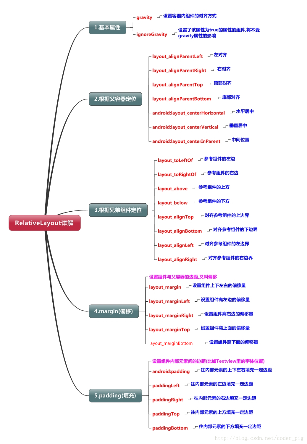
2. Parent container positioning attribute diagram

3. Positioning based on sibling components
Okay, let me first talk about what sibling components are. The so-called sibling components are components in a container at the same level, as shown in the figure
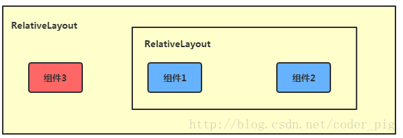
Components 1 and 2 in the figure are sibling components, while component 3 is not a sibling component of component 1 or component 2. Therefore, component 3 cannot be positioned through component 1 or 2. For example, layout_toLeftOf = "component 1" will report an error! Remember this! The most classic example of sibling component positioning is the "plum blossom layout". The code is implemented below:
Running effect diagram:
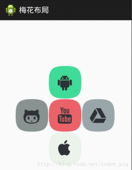
Implementation code:
<RelativeLayout xmlns:android="http://schemas.android.com/apk/res/android"
    xmlns:tools="http://schemas.android.com/tools"
    android:id="@+id/RelativeLayout1"
    android:layout_width="match_parent"
    android:layout_height="match_parent" >

    <!-- 这个是在容器中央的 -->

    <ImageView
        android:id="@+id/img1"
        android:layout_width="80dp"
        android:layout_height="80dp"
        android:layout_centerInParent="true"
        android:src="@drawable/pic1.html"/>

    <!-- 在中间图片的左边 -->
    <ImageView
        android:id="@+id/img2"
        android:layout_width="80dp"
        android:layout_height="80dp"
        android:layout_toLeftOf="@id/img1"
        android:layout_centerVertical="true"
        android:src="@drawable/pic2.html"/>

    <!-- 在中间图片的右边 -->
    <ImageView
        android:id="@+id/img3"
        android:layout_width="80dp"
        android:layout_height="80dp"
        android:layout_toRightOf="@id/img1"
        android:layout_centerVertical="true"
        android:src="@drawable/pic3.html"/>

    <!-- 在中间图片的上面-->
    <ImageView
        android:id="@+id/img4"
        android:layout_width="80dp"
        android:layout_height="80dp"
        android:layout_above="@id/img1"
        android:layout_centerHorizontal="true"
        android:src="@drawable/pic4.html"/>

    <!-- 在中间图片的下面 -->
    <ImageView
        android:id="@+id/img5"
        android:layout_width="80dp"
        android:layout_height="80dp"
        android:layout_below="@id/img1"
        android:layout_centerHorizontal="true"
        android:src="@drawable/pic5.html"/>

</RelativeLayout>
4. Difference between margin and padding
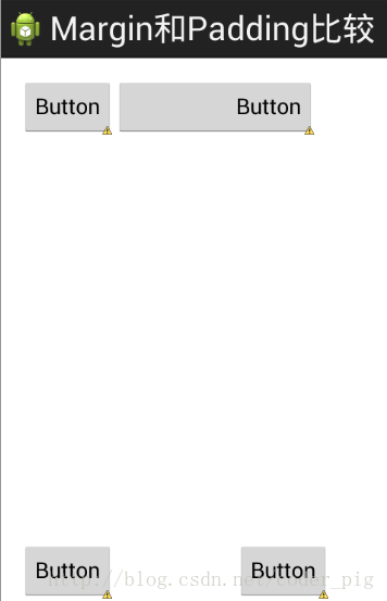
Beginners may be a little confused about these two attributes. Let's distinguish them here: First, margin represents offset. For example, marginLeft = "5dp" means the component is offset 5dp from the left edge of the container. Padding represents filling, and the object of filling is the elements in the component, such as the text in a TextView. For example, setting paddingLeft = "5dp" for a TextView means filling 5dp of space on the left of the elements in the component. Margin is for the components in the container, while padding is for the elements in the component. They must be distinguished! The difference between the two is demonstrated below with simple code:
Comparison example code is as follows:
<RelativeLayout xmlns:android="http://schemas.android.com/apk/res/android"
    xmlns:tools="http://schemas.android.com/tools"
    android:layout_width="match_parent"
    android:layout_height="match_parent"
    android:paddingBottom="@dimen/activity_vertical_margin"
    android:paddingLeft="@dimen/activity_horizontal_margin"
    android:paddingRight="@dimen/activity_horizontal_margin"
    android:paddingTop="@dimen/activity_vertical_margin"
    tools:context=".MainActivity" >

    <Button
        android:id="@+id/btn1"
        android:layout_height="wrap_content"
        android:layout_width="wrap_content"
        android:text="Button"/>
    <Button
        android:paddingLeft="100dp"
        android:layout_height="wrap_content"
        android:layout_width="wrap_content"
        android:text="Button"
        android:layout_toRightOf="@id/btn1"/>

    <Button
        android:id="@+id/btn2"
        android:layout_height="wrap_content"
        android:layout_width="wrap_content"
        android:text="Button"
        android:layout_alignParentBottom="true"/>
    <Button
        android:layout_marginLeft="100dp"
        android:layout_height="wrap_content"
        android:layout_width="wrap_content"
        android:text="Button"
        android:layout_toRightOf="@id/btn2"
        android:layout_alignParentBottom="true"/>

</RelativeLayout>
Comparison of running effect diagrams:
5. A very common point: margin can be set to negative numbers
I believe many friends don't know this. Usually when we set margin, we are used to positive numbers. In fact, it can be set to negative numbers. Below I'll write a simple program to demonstrate it. When simulating entering the software, an advertisement page pops up, and the margin of the cancel button in the upper right corner uses negative numbers!
The effect diagram is as follows:

Here is the layout code of the advertisement Activity. Of course, if you are interested in this, you can download the demo. Since it is just for achieving the effect, the code will be a bit rough!
<RelativeLayout xmlns:android="http://schemas.android.com/apk/res/android"
    xmlns:tools="http://schemas.android.com/tools"
    android:layout_width="match_parent"
    android:layout_height="match_parent"
    tools:context="com.jay.example.relativelayoutdemo.MainActivity"
    android:background="#00CCCCFF">

    <ImageView
        android:id="@+id/imgBack"
        android:layout_width="200dp"
        android:layout_height="200dp"
        android:layout_centerInParent="true"
        android:background="@drawable/myicon" />

    <ImageView
        android:id="@+id/imgCancle"
        android:layout_width="28dp"
        android:layout_height="28dp"
        android:layout_alignRight="@id/imgBack"
        android:layout_alignTop="@id/imgBack"
        android:background="@drawable/cancel"
        android:layout_marginTop="-15dp"
        android:layout_marginRight="-10dp" />

</RelativeLayout>
Summary of this section:
That's all for the detailed explanation of RelativeLayout. If there are any omissions, errors, or good suggestions, welcome to point them out~ Finally, the above demo code is provided for everyone to download:RelativeLayoutDemo