Introduction to this section:
This section brings you the ProgressBar (progress bar) among Android's basic UI controls. ProgressBar has many application scenarios. For example, when a user logs in, while the background is sending requests and waiting for the server to return information, a progress bar is used at this time. Or when performing some relatively time-consuming operations that require waiting for a longer period of time, if there is no prompt at this time, the user may think the program has crashed or the phone has frozen, which will greatly reduce the user experience. Therefore, in places where time-consuming operations need to be performed, add a progress bar so that users know the current program is executing, and it can also intuitively tell users the execution progress of the current task, etc.! Using a progress bar can bring us such convenience! Alright, let's begin explaining the content of this section~ By the way, the official ProgressBar API documentation:ProgressBar
1. Common Attributes Explanation and Basic Examples
From the official documentation, we see such a class relationship diagram:
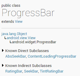
ProgressBar inherits from the View class, and its direct subclasses include AbsSeekBar and ContentLoadingProgressBar. Among them, AbsSeekBar's subclasses include SeekBar and RatingBar. It can be seen that these two are also implemented based on ProgressBar.
Detailed explanation of common attributes:
- android:max: Maximum value of the progress bar
- android:progress: The completed progress value of the progress bar
- android:progressDrawable: Sets the Drawable object corresponding to the track
- android:indeterminate: If set to true, the progress bar does not display progress precisely
- android:indeterminateDrawable: Sets the Drawable object for the progress bar that does not display progress
- android:indeterminateDuration: Sets the duration for indeterminate progress display
- android:secondaryProgress: Secondary progress bar, similar to video playback where one bar is the current playback progress and the other is the buffering progress; the former is set via the progress attribute!
Correspondingly, in Java we can call the following methods:
- getMax(): Returns the upper limit of this progress bar's range
- getProgress(): Returns progress
- getSecondaryProgress(): Returns secondary progress
- incrementProgressBy(int diff): Specifies the progress to increase
- isIndeterminate(): Indicates whether the progress bar is in indeterminate mode
- setIndeterminate(boolean indeterminate): Sets the indeterminate mode
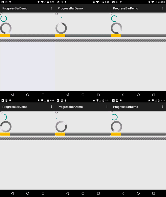
Next, let's look at the example of the default progress bar provided by the system!
System Default Progress Bar Usage Example:
Running effect:
Implementation layout code:
<LinearLayout xmlns:android="http://schemas.android.com/apk/res/android"
    xmlns:tools="http://schemas.android.com/tools"
    android:layout_width="match_parent"
    android:layout_height="match_parent"
    android:orientation="vertical"
    tools:context=".MainActivity">

    <!-- 系统提供的圆形进度条,依次是大中小 -->

    <ProgressBar
        style="@android:style/Widget.ProgressBar.Small"
        android:layout_width="wrap_content"
        android:layout_height="wrap_content" />

    <ProgressBar
        android:layout_width="wrap_content"
        android:layout_height="wrap_content" />

    <ProgressBar
        style="@android:style/Widget.ProgressBar.Large"
        android:layout_width="wrap_content"
        android:layout_height="wrap_content" />

    <!--系统提供的水平进度条-->
    <ProgressBar
        style="@android:style/Widget.ProgressBar.Horizontal"
        android:layout_width="match_parent"
        android:layout_height="wrap_content"
        android:max="100"
        android:progress="18" />

    <ProgressBar
        style="@android:style/Widget.ProgressBar.Horizontal"
        android:layout_width="match_parent"
        android:layout_height="wrap_content"
        android:layout_marginTop="10dp"
        android:indeterminate="true" />

</LinearLayout>
Well, except for the second one which is presentable, forget the others... The system-provided ones certainly cannot meet our needs! Below we will explain how we handle progress bars in actual development!
2. Using Animation to Replace Circular Progress Bar
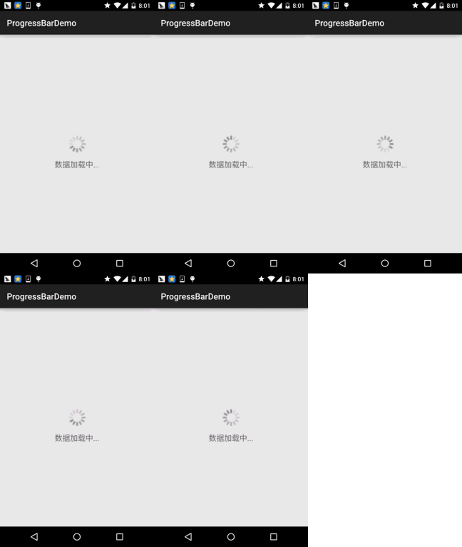
The first solution is to use a set of continuous images to form a frame animation. When the progress graphic is needed, make the animation visible; when it is not needed, make the animation invisible! This animation is usually implemented using AnimationDrawable! Alright, let's define an AnimationDrawable file:
PS: Image assets used:Progress bar image assets package.zip
Running effect:
Create a new folder named 'anim' under the res directory, then create the resource file amin_pgbar.xml:
<?xml version="1.0" encoding="utf-8"?>
<animation-list xmlns:android="http://schemas.android.com/apk/res/android"
    android:oneshot="false" >

    <item
        android:drawable="@drawable/loading_01"
        android:duration="200"/>
    <item
        android:drawable="@drawable/loading_02"
        android:duration="200"/>
    <item
        android:drawable="@drawable/loading_03"
        android:duration="200"/>
    <item
        android:drawable="@drawable/loading_04"
        android:duration="200"/>
    <item
        android:drawable="@drawable/loading_05"
        android:duration="200"/>
    <item
        android:drawable="@drawable/loading_06"
        android:duration="200"/>
    <item
        android:drawable="@drawable/loading_07"
        android:duration="200"/>
    <item
        android:drawable="@drawable/loading_08"
        android:duration="200"/>
    <item
        android:drawable="@drawable/loading_09"
        android:duration="200"/>
    <item
        android:drawable="@drawable/loading_10"
        android:duration="200"/>
    <item
        android:drawable="@drawable/loading_11"
        android:duration="200"/>
    <item
        android:drawable="@drawable/loading_12"
        android:duration="200"/>

</animation-list>
Then write a layout file, which only needs an ImageView to display the progress bar, and set src to the above drawable resource! Finally, go to MainActivity.java
public class MainActivity extends AppCompatActivity {

    private ImageView img_pgbar;
    private AnimationDrawable ad;

    @Override
    protected void onCreate(Bundle savedInstanceState) {
        super.onCreate(savedInstanceState);
        setContentView(R.layout.activity_main);
        img_pgbar = (ImageView) findViewById(R.id.img_pgbar);
        ad = (AnimationDrawable) img_pgbar.getDrawable();
        img_pgbar.postDelayed(new Runnable() {
            @Override
            public void run() {
                ad.start();
            }
        }, 100);
    }

}
Here we only wrote how to start the animation; the rest is up to you~ When the progress bar needs to be displayed, make the ImageView visible; when it is not needed, hide it! In addition, ProgressBar itself has an indeterminateDrawable; you only need to set this parameter to the above animation resource. However, the size of the progress bar pattern cannot be directly modified; it needs to be modified in Java code. If you set the width and height, and the width and height are too large, you will see multiple progress bars... Weigh the pros and cons yourself~
3. Custom Circular Progress Bar
I believe after reading Part 2, you will complain, "Damn, this is so ridiculous, using an animation to fool people." Haha, actual development is like this. Of course, the above situation is only suitable for occasions where progress does not need to be displayed; if progress needs to be displayed, it is useless. Alright, let's take a look at a simple custom circular progress bar found online! The code is relatively simple and easy to understand. If interested, you can take a look or make related extensions~
Running effect:

Implementation code:
Custom View class:
/**
 * Created by Jay on 2015/8/5 0005.
 */
public class CirclePgBar extends View {


    private Paint mBackPaint;
    private Paint mFrontPaint;
    private Paint mTextPaint;
    private float mStrokeWidth = 50;
    private float mHalfStrokeWidth = mStrokeWidth / 2;
    private float mRadius = 200;
    private RectF mRect;
    private int mProgress = 0;
    //目标值,想改多少就改多少
    private int mTargetProgress = 90;
    private int mMax = 100;
    private int mWidth;
    private int mHeight;


    public CirclePgBar(Context context) {
        super(context);
        init();
    }

    public CirclePgBar(Context context, AttributeSet attrs) {
        super(context, attrs);
        init();
    }

    public CirclePgBar(Context context, AttributeSet attrs, int defStyleAttr) {
        super(context, attrs, defStyleAttr);
        init();
    }


    //完成相关参数初始化
    private void init() {
        mBackPaint = new Paint();
        mBackPaint.setColor(Color.WHITE);
        mBackPaint.setAntiAlias(true);
        mBackPaint.setStyle(Paint.Style.STROKE);
        mBackPaint.setStrokeWidth(mStrokeWidth);

        mFrontPaint = new Paint();
        mFrontPaint.setColor(Color.GREEN);
        mFrontPaint.setAntiAlias(true);
        mFrontPaint.setStyle(Paint.Style.STROKE);
        mFrontPaint.setStrokeWidth(mStrokeWidth);


        mTextPaint = new Paint();
        mTextPaint.setColor(Color.GREEN);
        mTextPaint.setAntiAlias(true);
        mTextPaint.setTextSize(80);
        mTextPaint.setTextAlign(Paint.Align.CENTER);
    }


    //重写测量大小的onMeasure方法和绘制View的核心方法onDraw()
    @Override
    protected void onMeasure(int widthMeasureSpec, int heightMeasureSpec) {
        super.onMeasure(widthMeasureSpec, heightMeasureSpec);
        mWidth = getRealSize(widthMeasureSpec);
        mHeight = getRealSize(heightMeasureSpec);
        setMeasuredDimension(mWidth, mHeight);

    }


    @Override
    protected void onDraw(Canvas canvas) {
        initRect();
        float angle = mProgress / (float) mMax * 360;
        canvas.drawCircle(mWidth / 2, mHeight / 2, mRadius, mBackPaint);
        canvas.drawArc(mRect, -90, angle, false, mFrontPaint);
        canvas.drawText(mProgress + "%", mWidth / 2 + mHalfStrokeWidth, mHeight / 2 + mHalfStrokeWidth, mTextPaint);
        if (mProgress < mTargetProgress) {
            mProgress += 1;
            invalidate();
        }

    }

    public int getRealSize(int measureSpec) {
        int result = 1;
        int mode = MeasureSpec.getMode(measureSpec);
        int size = MeasureSpec.getSize(measureSpec);

        if (mode == MeasureSpec.AT_MOST || mode == MeasureSpec.UNSPECIFIED) {
            //自己计算
            result = (int) (mRadius * 2 + mStrokeWidth);
        } else {
            result = size;
        }

        return result;
    }

    private void initRect() {
        if (mRect == null) {
            mRect = new RectF();
            int viewSize = (int) (mRadius * 2);
            int left = (mWidth - viewSize) / 2;
            int top = (mHeight - viewSize) / 2;
            int right = left + viewSize;
            int bottom = top + viewSize;
            mRect.set(left, top, right, bottom);
        }
    }


}
Then add the following in the layout file:
 <com.jay.progressbardemo.CirclePgBar
        android:layout_width="match_parent"
        android:layout_height="match_parent"/>
It's just that simple~
Section Summary:
This section introduced a common control in Android: ProgressBar. We explained its basic usage, as well as two implementation methods for progress bars in actual development. The second custom progress bar can be improved by yourself and then used in actual development~! Alright, that's all for this section, thank you~