Section Introduction:
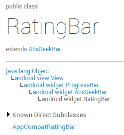
The SeekBar from the previous section was quite easy, right? The RatingBar (star rating bar) we are learning in this section is also very simple. I believe that if you have bought something on Taobao, you are no stranger to this: when you receive the seller's package, there is often a small piece of paper inside saying something like "rebate so many yuan for a five-star review". And when rating, you can use our star rating bar~ Let's first take a look at the official documentation. Official documentation:RatingBarWe can see that this widget has the same class structure as SeekBar, and is also a subclass of ProgressBar:
That is to say, it also has the related properties of ProgressBar. Next, let's explore the unique properties of RatingBar!
1. Basic usage of RatingBar:
First, let's see what the native SeekBar in 5.0 looks like:
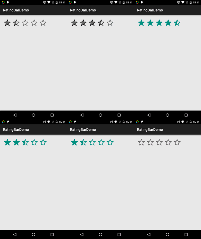
——Related properties:
android:isIndicator: Whether it is used as an indicator; the user cannot change it; default is false
android:numStars: How many stars to display, must be an integer
android:rating: Default rating value, must be a floating point number
android:stepSize:The increment value of the rating each time must be a floating point number.
In addition to the above, there are also two styles for us to choose from, but they are not recommended because both styles are ugly... They are:
style="?android:attr/ratingBarStyleSmall"
style="?android:attr/ratingBarStyleIndicator"
——Event handling:Just set the RatingBar'sOnRatingBarChangeListenerevent, then override theonRatingChanged()method!
The implementation code is as follows:
public class MainActivity extends AppCompatActivity {
    private RatingBar rb_normal;
    @Override
    protected void onCreate(Bundle savedInstanceState) {
        super.onCreate(savedInstanceState);
        setContentView(R.layout.activity_main);
        rb_normal = (RatingBar) findViewById(R.id.rb_normal);
        rb_normal.setOnRatingBarChangeListener(new RatingBar.OnRatingBarChangeListener() {
            @Override
            public void onRatingChanged(RatingBar ratingBar, float rating, boolean fromUser) {
                Toast.makeText(MainActivity.this, "rating:" + String.valueOf(rating),
                        Toast.LENGTH_LONG).show();
            }
        });
    }
}
2. Customization section:
Hehe, many times we don't use stars as the rating standard. Let's change it~ Change the stars to something else, like smiley faces. Two assets:


Next, just like the previous SeekBar, write a layer-list file:
ratingbar_full.xml:
<?xml version="1.0" encoding="utf-8"?>
<layer-list xmlns:android="http://schemas.android.com/apk/res/android">
    <item android:id="@android:id/background"
        android:drawable="@mipmap/ic_rating_off1" />
    <item android:id="@android:id/secondaryProgress"
        android:drawable="@mipmap/ic_rating_off1" />
    <item android:id="@android:id/progress"
        android:drawable="@mipmap/ic_rating_on1" />
</layer-list>
Next, customize the RatingBar Style in style.xml, instyle.xmladd this:
<style name="roomRatingBar" parent="@android:style/Widget.RatingBar">
        <item name="android:progressDrawable">@drawable/ratingbar_full</item>
        <item name="android:minHeight">24dip</item>
        <item name="android:maxHeight">24dip</item>
    </style>
Finally, set the RatingBar component in the layout as follows:
<RatingBar
        android:id="@+id/rb_normal"
        style="@style/roomRatingBar"
        android:layout_width="wrap_content"
        android:layout_height="wrap_content" />
Running effect screenshot:
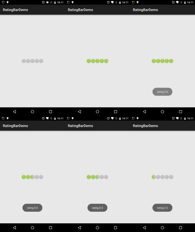
Okay, the effect is acceptable. As for the spacing issue, you need to process the images a bit, that is, when slicing the images, leave some space on the left and right sides of the images~!
Section Summary:
Alright, that's all for the use of RatingBar. It is actually much the same as the SeekBar before, and quite easy~ Well, thanks~