jQuery EasyUI Layout Plugin -Panel
 jQuery EasyUI Plugins
Override the default defaults via $.fn.panel.defaults.
The panel is used as a container for other content. It is the fundamental component for building other components (such as Layout, Tabs, Accordion, and so on). It also provides built-in collapsible, closable, maximizable, minimizable behaviors and other custom behaviors. A panel can be easily embedded anywhere on a web page.
Usage
Create a Panel
1. Create a Panel via Markup
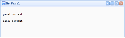
It is easier to create a Panel from markup. Add the 'easyui-panel' class to the <div> tag.
<div id="p" class="easyui-panel" title="My Panel"
    style="width:500px;height:150px;padding:10px;background:#FAFAFA;"
    data-options="iconCls:'icon-save',closable:true,
    collapsible:true,minimizable:true,maximizable:true">
    <p>panel content.</p>
    <p>panel content.</p>
</div>
2. Create a Panel Programmatically
Let's create a Panel with a toolbar at the top right.
<div id="p" style="padding:10px;">
    <p>panel content.</p>
    <p>panel content.</p>
</div>
$('#p').panel({
    width:500,
    height:150,
    title:'My Panel',
    tools:[{
    iconCls:'icon-add',
    handler:function(){alert('new')}
    },{
    iconCls:'icon-save',
    handler:function(){alert('save')}
    }]
});
Move the Panel
Call the 'move' method to move the Panel to a new position.
$('#p').panel('move',{
    left:100,
    top:100
});
Load Content
Let's load the panel content via ajax and display some information when the loading succeeds.
$('#p').panel({
    href:'content_url.php',
    onLoad:function(){
        alert('loaded successfully');
    }
});
Properties
| Name | Type | Description | Default Value |
|---|---|---|---|
| id | string | The id attribute of the panel. | null |
| title | string | The title text displayed in the panel header. | null |
| iconCls | string | A CSS class that displays a 16x16 icon in the panel. | null |
| width | number | Set the width of the panel. | auto |
| height | number | Set the height of the panel. | auto |
| left | number | Set the left position of the panel. | null |
| top | number | Set the top position of the panel. | null |
| cls | string | Add a CSS class to the panel. | null |
| headerCls | string | Add a CSS class to the panel header. | null |
| bodyCls | string | Add a CSS class to the panel body. | null |
| style | object | Add custom-formatted styles to the panel. Code example to change the panel border width:
<div class="easyui-panel" style="width:200px;height:100px"
        data-options="style:{borderWidth:2}">
</div>
|
{} |
| fit | boolean | When set to true, the panel size adapts to its parent container. The following example demonstrates a panel that automatically resizes to the maximum inner size of its parent container.<div style="width:200px;height:100px;padding:5px"> <div class="easyui-panel" style="width:200px;height:100px" data-options="fit:true,border:false"> Embedded Panel </div> </div> |
false |
| border | boolean | Defines whether to show the panel border. | true |
| doSize | boolean | If set to true, the panel will be resized and laid out when created. | true |
| noheader | boolean | If set to true, the panel header will not be created. | false |
| content | string | The body content of the panel. | null |
| collapsible | boolean | Defines whether to show the collapse button. | false |
| minimizable | boolean | Defines whether to show the minimize button. | false |
| maximizable | boolean | Defines whether to show the maximize button. | false |
| closable | boolean | Defines whether to show the close button. | false |
| tools | array,selector | Custom tools, possible values: 1. Array, each element contains two properties: iconCls and handler. 2. Selector, indicating the tools. The panel tools can be declared via an existing <div> tag:
<div class="easyui-panel" style="width:300px;height:200px"
        title="My Panel" data-options="iconCls:'icon-ok',tools:'#tt'">
</div>
<div id="tt">
    <a href="../index.html" class="icon-add" onclick="javascript:alert('add')"></a>
    <a href="../index.html" class="icon-edit" onclick="javascript:alert('edit')"></a>
</div>
The panel tools can be defined via an array:
<div class="easyui-panel" style="width:300px;height:200px"
        title="My Panel" data-options="iconCls:'icon-ok',tools:[
                {
                    iconCls:'icon-add',
                    handler:function(){alert('add')}
                },{
                    iconCls:'icon-edit',
                    handler:function(){alert('edit')}
                }]">
</div>
|
[] |
| collapsed | boolean | Defines whether the panel is initially collapsed. | false |
| minimized | boolean | Defines whether the panel is initially minimized. | false |
| maximized | boolean | Defines whether the panel is initially maximized. | false |
| closed | boolean | Defines whether the panel is initially closed. | false |
| href | string | A URL used to load remote data and display it in the panel. Note that the content will not be loaded unless the panel is opened. This is useful for creating a lazily loaded panel:
<div id="pp" class="easyui-panel" style="width:300px;height:200px"
        data-options="href='get_content.php.html',closed:true">
</div>
<a href="../index.html" onclick="javascript:$('#pp').panel('open')">Open</a>
|
null |
| cache | boolean | Set to true to cache the panel content loaded from href. | true |
| loadingMessage | string | Show a message in the panel when loading remote data. | Loading… |
| extractor | function | Defines how to extract content from the ajax response, returning the extracted data.
extractor: function(data){
    var pattern = /<body[^>]*>((.|[\n\r])*)<\/body>/im;
    var matches = pattern.exec(data);
    if (matches){
        return matches[1];    // only extract body content
    } else {
        return data;
    }
}
|
Events
| Name | Parameters | Description |
|---|---|---|
| onLoad | none | Fires when remote data is loaded. |
| onBeforeOpen | none | Fires before the panel opens; return false to stop it from opening. |
| onOpen | none | Fires after the panel opens. |
| onBeforeClose | none | Fires before the panel closes; return false to cancel the close. The panel declared below will not close.
<div class="easyui-panel" style="width:300px;height:200px;"
        title="My Panel" data-options="onBeforeClose:function(){return false}">
    The panel cannot be closed.
</div>
|
| onClose | none | Fires after the panel closes. |
| onBeforeDestroy | none | Fires before the panel is destroyed; return false to cancel the destroy. |
| onDestroy | none | Fires after the panel is destroyed. |
| onBeforeCollapse | none | Fires before the panel collapses; return false to stop the collapse. |
| onCollapse | none | Fires after the panel collapses. |
| onBeforeExpand | none | Fires before the panel expands; return false to stop the expand. |
| onExpand | none | Fires after the panel expands. |
| onResize | width, height | Fires after the panel is resized. width: the new outer width height: the new outer height |
| onMove | left,top | Fires after the panel is moved. left: the new left position top: the new top position |
| onMaximize | none | Fires after the window is maximized. |
| onRestore | none | Fires after the window is restored to its original size. |
| onMinimize | none | Fires after the window is minimized. |
Methods
| Name | Parameters | Description |
|---|---|---|
| options | none | Returns the options property. |
| panel | none | Returns the outer panel object. |
| header | none | Returns the panel header object. |
| body | none | Returns the panel body object. |
| setTitle | title | Set the title text of the header. |
| open | forceOpen | When the forceOpen parameter is set to true, open the panel bypassing the onBeforeOpen callback function. |
| close | forceClose | When the forceClose parameter is set to true, close the panel bypassing the onBeforeClose callback function. |
| destroy | forceDestroy | When the forceDestroy parameter is set to true, destroy the panel bypassing the onBeforeDestroy callback function. |
| refresh | href | Refresh the panel to load remote data. If a 'href' parameter is assigned, it will override the old 'href' property. Code example:
// open a panel and then refresh its contents.
$('#pp').panel('open').panel('refresh');
// refresh contents with a new URL.
$('#pp').panel('open').panel('refresh','new_content.php');
|
| resize | options | Set the panel size and perform layout. The Options object contains the following properties: width: the new panel width height: the new panel height left: the new panel left position top: the new panel top position Code example:
$('#pp').panel('resize',{
    width: 600,
    height: 400
});
|
| move | options | Move the panel to a new position. The Options object contains the following properties: left: the new panel left position top: the new panel top position |
| maximize | none | The panel adapts to the size of its container. |
| minimize | none | Minimize the panel. |
| restore | none | Restore the maximized panel to its original size and position. |
| collapse | animate | Collapse the panel body. |
| expand | animate | Expand the panel body. |
jQuery EasyUI Plugins Other Extensions