jQuery EasyUI Layout Plugin -Tabs
 jQuery EasyUI Plugin
Override the default defaults via $.fn.tabs.defaults.
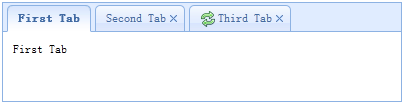
The tabs display a collection of panel. It shows only one tab panel at a time. Each tab panel has the header title and some mini button tools, including close button and other customized buttons.
Dependencies
- panel
- linkbutton
Usage
Create Tabs
1. Creating Tabs via Markup
Creating tabs from markup is easier, we don't need to write any JavaScript code. Remember to add the 'easyui-tabs' class to the <div> markup. Each tab panel is created via a child <div> markup, and its usage is the same as the panel.
<div id="tt" class="easyui-tabs" style="width:500px;height:250px;">
    <div title="Tab1" style="padding:20px;display:none;">
        tab1
    </div>
    <div title="Tab2" data-options="closable:true" style="overflow:auto;padding:20px;display:none;">
        tab2
    </div>
    <div title="Tab3" data-options="iconCls:'icon-reload',closable:true" style="padding:20px;display:none;">
        tab3
    </div>
</div>
2. Creating Tabs Programmatically
Now we create tabs programmatically, and we also capture the 'onSelect' event.
$('#tt').tabs({
    border:false,
    onSelect:function(title){
        alert(title+' is selected');
    }
});
Add a new tab panel
Add a new tab panel via a mini tool, the mini tool icon (8x8) is placed before the close button.
// 添加一个新的标签页面板(tab panel)
$('#tt').tabs('add',{
    title:'New Tab',
    content:'Tab Body',
    closable:true,
    tools:[{
        iconCls:'icon-mini-refresh',
        handler:function(){
            alert('refresh');
        }
    }]
});
Get the selected tab
// 获取选中的标签页面板(tab panel)和它的标签页(tab)对象
var pp = $('#tt').tabs('getSelected');
var tab = pp.panel('options').tab; // 相应的标签页(tab)对象
Properties
| Name | Type | Description | Default |
|---|---|---|---|
| width | number | The width of the tabs container. | auto |
| height | number | The height of the tabs container. | auto |
| plain | boolean | When set to true, no background container image is used to render the tab strip. | false |
| fit | boolean | When set to true, the size of the tabs container is set to fit its parent container. | false |
| border | boolean | When set to true, the border of the tabs container is displayed. | true |
| scrollIncrement | number | The number of pixels to scroll each time a tab scroll button is pressed. | 100 |
| scrollDuration | number | The number of milliseconds each scroll animation should last. | 400 |
| tools | array,selector | A toolbar placed on the left or right side of the header. Possible values: 1. An array, indicating a group of tools, each tool option is the same as a link button (Linkbutton). 2. A selector, indicating a <div> that contains the tools. Code examples: Define tools via an array.
$('#tt').tabs({
    tools:[{
        iconCls:'icon-add',
        handler:function(){
            alert('add')
        }
    },{
        iconCls:'icon-save',
        handler:function(){
            alert('save')
        }
    }]
});
Define tools via an existing DOM container.
$('#tt').tabs({
    tools:'#tab-tools'
});
<div id="tab-tools">
    <a href="../index.html" class="easyui-linkbutton" plain="true" iconCls="icon-add"></a>
    <a href="../index.html" class="easyui-linkbutton" plain="true" iconCls="icon-save"></a>
</div>
|
null |
| toolPosition | string | Toolbar position. Possible values: 'left', 'right'. This property is available since version 1.3.2. | right |
| tabPosition | string | Tab position. Possible values: 'top', 'bottom', 'left', 'right'. This property is available since version 1.3.2. | top |
| headerWidth | number | Tab header width. It is only valid when tabPosition is set to 'left' or 'right'. This property is available since version 1.3.2. | 150 |
| tabWidth | number | Tab strip width. This property is available since version 1.3.4. | auto |
| tabHeight | number | Tab strip height. This property is available since version 1.3.4. | 27 |
| selected | number | The index of the initially selected tab. This property is available since version 1.3.5. | 0 |
| showHeader | boolean | When set to true, display the tab header. This property is available since version 1.3.5. | true |
Events
| Name | Parameters | Description |
|---|---|---|
| onLoad | panel | Triggered when an ajax tab panel finishes loading remote data. |
| onSelect | title,index | Triggered when the user selects a tab panel. |
| onUnselect | title,index | Triggered when the user deselects a tab panel. This event is available since version 1.3.5. |
| onBeforeClose | title,index | Triggered before a tab panel is closed. Return false to cancel the close action. The example below demonstrates how to display a confirmation dialog before closing a tab panel.
$('#tt').tabs({
  onBeforeClose: function(title){
    return confirm('Are you sure you want to close ' + title);
  }
});
// using the async confirm dialog
$('#tt').tabs({
  onBeforeClose: function(title,index){
    var target = this;
    $.messager.confirm('Confirm','Are you sure you want to close '+title,function(r){
        if (r){
            var opts = $(target).tabs('options');
            var bc = opts.onBeforeClose;
            opts.onBeforeClose = function(){};  // allowed to close now
            $(target).tabs('close',index);
            opts.onBeforeClose = bc;  // restore the event function
        }
    });
    return false;    // prevent from closing
  }
});
|
| onClose | title,index | Triggered when the user closes a tab panel. |
| onAdd | title,index | Triggered when a new tab panel is added. |
| onUpdate | title,index | Triggered when a tab panel is updated. |
| onContextMenu | e, title,index | Triggered when a tab panel is right-clicked. |
Methods
| Name | Parameters | Description |
|---|---|---|
| options | none | Returns the tabs options. |
| tabs | none | Returns all tab panels. |
| resize | none | Resize the tabs container and perform layout. |
| add | options | Add a new tab panel. The options parameter is a configuration object. For more details, see the tab panel properties. When a new tab panel is added, it will be selected. If you want to add an unselected tab panel, remember to set the 'selected' property to false.
// add a unselected tab panel
$('#tt').tabs('add',{
    title: 'new tab',
    selected: false
    //...
});
|
| close | which | Close a tab panel. The 'which' parameter can be the title or index of the tab panel to be closed. |
| getTab | which | Get the specified tab panel. The 'which' parameter can be the title or index of the tab panel. |
| getTabIndex | tab | Get the index of the specified tab panel. |
| getSelected | none | Get the selected tab panel. The example below demonstrates how to get the index of the selected tab panel.
var tab = $('#tt').tabs('getSelected');
var index = $('#tt').tabs('getTabIndex',tab);
alert(index);
|
| select | which | Select a tab panel. The 'which' parameter can be the title or index of the tab panel. |
| unselect | which | Select a tab panel. The 'which' parameter can be the title or index of the tab panel. This method is available since version 1.3.5. |
| showHeader | none | Show the tabs header. This method is available since version 1.3.5. |
| hideHeader | none | Hide the tabs header. This method is available since version 1.3.5. |
| exists | which | Indicate whether the specified panel already exists. The 'which' parameter can be the title or index of the tab panel. |
| update | param | Update the specified tab panel. The param parameter contains two properties: tab: the tab panel to be updated. options: the options of the panel. Code example:
// update the selected panel with new title and content
var tab = $('#tt').tabs('getSelected');  // get selected panel
$('#tt').tabs('update', {
    tab: tab,
    options: {
        title: 'New Title',
        href: 'get_content.php'  // the new content URL
    }
});

// call 'refresh' method for tab panel to update its content
var tab = $('#tt').tabs('getSelected');  // get selected panel
tab.panel('refresh', 'get_content.php');
|
| enableTab | which | Enable the specified tab panel. The 'which' parameter can be the title or index of the tab panel. This method is available since version 1.3. Code example:
$('#tt').tabs('enableTab', 1);    // enable the second tab panel
$('#tt').tabs('enableTab', 'Tab2');    enable the tab panel that has 'Tab2' title
|
| disableTab | which | Disable the specified tab panel. The 'which' parameter can be the title or index of the tab panel. This method is available since version 1.3. Code example:
$('#tt').tabs('disableTab', 1); // disable the second tab panel.
|
| scrollBy | deltaX | Scroll the tab header by the specified number of pixels. A negative value scrolls to the right, a positive value scrolls to the left. This method is available since version 1.3.2. Code example:
// scroll the tab header to left
$('#tt').tabs('scroll', 10);
|
Tab Panel
Tab panel properties are defined in the panel component. The following are some commonly used properties.
| Name | Type | Description | Default |
|---|---|---|---|
| id | string | The id property of the tab panel. | null |
| title | string | The title text of the tab panel. | |
| content | string | The content of the tab panel. | |
| href | string | A URL to load remote content to populate the tab panel. | null |
| cache | boolean | When set to true, the tab panel is cached when a valid href attribute is set. | true |
| iconCls | string | The CSS class of the icon displayed on the title of the tab panel. | null |
| width | number | The width of the tab panel. | auto |
| height | number | The height of the tab panel. | auto |
| collapsible | boolean | When set to true, allows the tab panel to be collapsible. | false |
Some additional attributes.
| Name | Type | Description | Default value |
|---|---|---|---|
| closable | boolean | When set to true, the tab panel will display a close button; clicking it can close the tab panel. | false |
| selected | boolean | When set to true, the tab panel will be selected. | false |
jQuery EasyUI Plugin Other extensions