jQuery EasyUI Menu and Button Plugin -Splitbutton
 jQuery EasyUI Plugin
Extends from $.fn.linkbutton.defaults. Override the default defaults via $.fn.splitbutton.defaults.
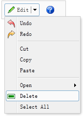
Similar to the menubutton, the splitbutton is also related to the linkbutton and the menu. Unlike the menubutton, the splitbutton is divided into two parts. When moving the mouse over the splitbutton, a split line will be displayed. The menu will only be displayed when moving the mouse over the right part of the splitbutton.
Dependencies
- menubutton
Usage
Create a splitbutton from markup.
<a href="#" id="sb" class="easyui-splitbutton"
    data-options="menu:'#mm',iconCls:'icon-ok'" onclick="javascript:alert('ok')">Ok</a>
<div id="mm" style="width:100px;">
    <div data-options="iconCls:'icon-ok'">Ok</div>
    <div data-options="iconCls:'icon-cancel'">Cancel</div>
</div>
Create a splitbutton using JavaScript.
<a href="#" id="sb" onclick="javascript:alert('ok')">Ok</a>
<div id="mm" style="width:100px;">
...
</div>
$('#sb').splitbutton({
    iconCls: 'icon-ok',
    menu: '#mm'
});
Properties
The properties extend from linkbutton. The following are the added properties of splitbutton.
| Name | Type | Description | Default Value |
|---|---|---|---|
| plain | boolean | If set to true, a plain effect is displayed. | true |
| menu | string | A selector used to create the corresponding menu. | null |
| duration | number | The duration, in milliseconds, to display the menu when hovering over the button. | 100 |
Methods
The methods inherit from linkbutton. The following are the added or overridden methods of splitbutton.
| Name | Parameter | Description |
|---|---|---|
| options | none | Return the options object. |
| disable | none | Disable the splitbutton. Example code:
$('#sb').splitbutton('disable');
|
| enable | none | Enable the splitbutton. Example code:
$('#sb').splitbutton('enable');
|
| destroy | none | Destroy the splitbutton. |
jQuery EasyUI Plugin Other Extensions