jQuery EasyUI Window Plugin -Dialog
 jQuery EasyUI Plugin
Extends from $.fn.window.defaults. Override the defaults with $.fn.dialog.defaults.
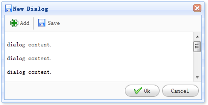
The dialog is a special type of window that has a toolbar at the top and a button bar at the bottom. By default, the dialog only has one close tool displayed on the right side of the header. Users can configure the dialog behavior to show other tools (such as: collapsible, minimizable, maximizable, etc.).
Dependencies
- window
- linkbutton
Usage
Create a dialog from an existing DOM node with markup. The example below demonstrates a modal dialog with resizable features.
<div id="dd" class="easyui-dialog" title="My Dialog" style="width:400px;height:200px;"
    data-options="iconCls:'icon-save',resizable:true,modal:true">
    Dialog Content.
</div>
Create a dialog using javascript. Now let's create a modal dialog, then call the 'refresh' method to load its content via ajax.
<div id="dd">Dialog Content.</div>
$('#dd').dialog({
    title: 'My Dialog',
    width: 400,
    height: 200,
    closed: false,
    cache: false,
    href: 'get_content.php',
    modal: true
});
$('#dd').dialog('refresh', 'new_content.php');
Properties
These properties extend from window. The following are properties overridden for dialog.
| Name | Type | Description | Default Value |
|---|---|---|---|
| title | string | The title text of the dialog. | New Dialog |
| collapsible | boolean | Defines whether to display the collapsible button. | false |
| minimizable | boolean | Defines whether to display the minimizable button. | false |
| maximizable | boolean | Defines whether to display the maximizable button. | false |
| resizable | boolean | Defines whether the dialog is resizable. | false |
| toolbar | array,selector | The top toolbar of the dialog. Possible values: 1. An array, each tool's options are the same as linkbutton. 2. A selector, indicating the toolbar. The dialog toolbar can be declared in a <div> tag: <div class="easyui-dialog" style="width:600px;height:300px" data-options="title:'My Dialog',toolbar:'#tb',modal:true"> Dialog Content. </div> <div id="tb"> <a href="../index.html" class="easyui-linkbutton" data-options="iconCls:'icon-edit',plain:true"/a> <a href="../index.html" class="easyui-linkbutton" data-options="iconCls:'icon-help',plain:true"/a> </div>The dialog toolbar can also be defined via an array:
<div class="easyui-dialog" style="width:600px;height:300px"
        data-options="title:'My Dialog',modal:true,
            toolbar:[{
                text:'Edit',
                iconCls:'icon-edit',
                handler:function(){alert('edit')}
            },{
                text:'Help',
                iconCls:'icon-help',
                handler:function(){alert('help')}
            }]">
    Dialog Content.
</div>
|
null |
| buttons | array,selector | The bottom buttons of the dialog. Possible values: 1. An array, each button's options are the same as linkbutton. 2. A selector, indicating the button bar. The buttons can be declared in a <div> tag: <div class="easyui-dialog" style="width:600px;height:300px" data-options="title:'My Dialog',buttons:'#bb',modal:true"> Dialog Content. </div> <div id="bb"> <a href="../index.html" class="easyui-linkbutton">Save</a> <a href="../index.html" class="easyui-linkbutton">Close</a> </div>The buttons can also be defined via an array:
<div class="easyui-dialog" style="width:600px;height:300px"
        data-options="title:'My Dialog',modal:true,
            buttons:[{
                text:'Save',
                handler:function(){...}
            },{
                text:'Close',
                handler:function(){...}
            }]">
    Dialog Content.
</div>
|
null |
Events
These events extend from panel.
Methods
These methods extend from window. The following are methods added for dialog.
| Name | Parameters | Description |
|---|---|---|
| dialog | none | Returns the external dialog object. |
jQuery EasyUI Plugin Other Extensions