jQuery EasyUI Form Plugin -Combo
 jQuery EasyUI Plugins
Extends from $.fn.validatebox.defaults. Override the default defaults via $.fn.combo.defaults.
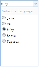
Combo displays an editable text box and drop-down panel on an HTML page. It is the base component for creating other complex combo components (such as: combobox, combotree, combogrid, etc.).
Dependencies
- validatebox
- panel
Usage
Combo can be created using JavaScript from a <select> or <input> element. Please note that creating a combo from markup is not valid.
<input id="cc" value="001">
$('#cc').combo({
    required:true,
    multiple:true
});
Properties
These properties extend from validatebox. The following are the added properties for combo.
| Name | Type | Description | Default Value |
|---|---|---|---|
| width | number | The width of the component. | auto |
| height | number | The height of the component. This property is available since version 1.3.2. | 22 |
| panelWidth | number | The width of the drop-down panel. | null |
| panelHeight | number | The height of the drop-down panel. | 200 |
| multiple | boolean | Defines whether multiple selection is supported. | false |
| selectOnNavigation | boolean | Defines whether to select an item when navigating items via keyboard. This property is available since version 1.3.3. | true |
| separator | string | The separator for text when multiple selection is enabled. | , |
| editable | boolean | Defines whether the user can directly type text into the text field. | true |
| disabled | boolean | Defines whether the text field is disabled. | false |
| readonly | boolean | Defines whether the component is read-only. This property is available since version 1.3.3. | false |
| hasDownArrow | boolean | Defines whether to show the down arrow button. | true |
| value | string | Default value. | |
| delay | number | Delay the search from the last key input event. | 200 |
| keyHandler | object | The function called when the user presses a key. The default keyHandler is defined as follows:
keyHandler: {
    up: function(){},
    down: function(){},
    enter: function(){},
    query: function(q){}
}
|
Events
| Name | Parameters | Description |
|---|---|---|
| onShowPanel | none | Triggered when the drop-down panel is shown. |
| onHidePanel | none | Triggered when the drop-down panel is hidden. |
| onChange | newValue, oldValue | Triggered when the value of the text field changes. |
Methods
These methods extend from validatebox. The following are the added methods for combo.
| Name | Parameters | Description |
|---|---|---|
| options | none | Returns the options object. |
| panel | none | Returns the drop-down panel object. |
| textbox | none | Returns the text box object. |
| destroy | none | Destroys the component. |
| resize | width | Adjusts the width of the component. |
| showPanel | none | Shows the drop-down panel. |
| hidePanel | none | Hides the drop-down panel. |
| disable | none | Disables the component. |
| enable | none | Enables the component. |
| readonly | mode | Enables/disables read-only mode. This method is available since version 1.3.3. Usage example:
$('#cc').combo('readonly');        // enable readonly mode
$('#cc').combo('readonly', true);    // enable readonly mode
$('#cc').combo('readonly', false);    // disable readonly mode
|
| validate | none | Validates the input value. |
| isValid | none | Returns the validation result. |
| clear | none | Clears the value of the component. |
| reset | none | Resets the value of the component. This method is available since version 1.3.2. |
| getText | none | Gets the input text. |
| setText | none | Sets the text value. |
| getValues | none | Gets the array of component values. |
| setValues | none | Sets the array of component values. |
| getValue | none | Gets the value of the component. |
| setValue | none | Sets the value of the component. |
jQuery EasyUI Plugins Other Extensions