Bootstrap Navigation
Introduction
In this tutorial, you will learn how to use the Bootstrap toolkit to create navigation based on navs, tabs, and pills.
We have demo examples with related explanations, including: basic tab-based and pill-based navigation, stacked or vertical tab-based and pill-based navigation, dropdown menus in tabs and pills, creating stacked navigation with nav lists, and creating clickable navigation with JavaScript (different directions).
Basic Tabs
Two CSS classes, .nav and .nav-tabs, are used to create basic tab-based navigation. In Bootstrap version v2.0.1, the styles for the CSS class .nav are declared in lines 2176 through 2220 (some related styles are also included here). Lines 2222 through 2267 contain the styles for .nav-tabs. The following example demonstrates how to create a basic tab-based navigation using Bootstrap.
Bootstrap Basic Tab Navigation Example
Example
<div class="row">
<div class="span6">
<ul class="nav nav-tabs">
<li class="active"><a href="../index.html">Home</a></li>
<li><a href="../index.html">Tutorials</a></li>
<li><a href="../index.html">Practice Editor </a></li>
<li><a href="../index.html">Gallery</a></li>
<li><a href="../index.html">Contact</a></li>
</ul>
</div>
</div>
</div>
Output

View Online
View the above example in different browser windows.
Basic Pills
Once you know how to create basic tab-based navigation with Bootstrap, it becomes easy to create basic pill-based navigation. Instead of using the .nav-tabs class, you use the .nav-pills class here. The styles for .nav-pills are located at lines 2222 to 2224 in bootstrap.css, and are repeated at lines 2268 to 2280 in bootstrap.css (used in the last example).
The following example demonstrates how to create a basic pill-based navigation.
Bootstrap Basic Pill Navigation Example
Example
<div class="row">
<div class="span8">
<ul class="nav nav-pills">
<li class="active"><a href="../index.html">Home</a></li>
<li><a href="../index.html">Tutorials</a></li>
<li><a href="../index.html">Practice Editor </a></li>
<li><a href="../index.html">Gallery</a></li>
<li><a href="../index.html">Contact</a></li>
</ul>
</div>
</div>
</div>
Output

View Online
View the above example in different browser windows.
Stacked or Vertical Tabs
To create stacked or vertical tab-based navigation, you need to add the .nav-stacked, .nav, and .nav-tabs classes to your markup. By default, horizontal tab-based navigation is created. Lines 2281 to 2309 contain the styles for .nav-stacked. Here is an example.
Bootstrap Stacked or Vertical Tab Navigation Example
Example
<div class="row">
<div class="span8">
<ul class="nav nav-tabs nav-stacked">
<li class="active"><a href="../index.html">Home</a></li>
<li><a href="../index.html">Tutorials</a></li>
<li><a href="../index.html">Practice Editor </a></li>
<li><a href="../index.html">Gallery</a></li>
<li><a href="../index.html">Contact</a></li>
</ul>
</div>
</div>
</div>
Output
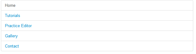
View Online
View the above example in a different browser window.
Stacked or Vertical Pills
Similar to creating stacked or vertical tabs, you need an additional CSS class to create stacked or vertical pill-based navigation. That is the .nav-stacked class, located at lines 2281 to 2309, which contains the styles for .nav-stacked. Below is an example.
Bootstrap Stacked or Vertical Pill Navigation Example
Example
<div class="row">
<div class="span2">
<ul class="nav nav-pills nav-stacked">
<li class="active"><a href="../index.html">Home</a></li>
<li><a href="../index.html">Tutorials</a></li>
<li><a href="../index.html">Practice Editor </a></li>
<li><a href="../index.html">Gallery</a></li>
<li><a href="../index.html">Contact</a></li>
</ul>
</div>
</div>
</div>
Output
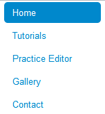
View Online
View the above example in a different browser window.
Tabs with Dropdown Menus
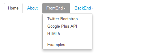
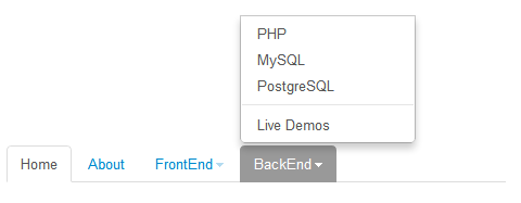
You can use Bootstrap to create tab-based dropdown menu navigation. There are four CSS classes - .dropdown, .dropdown-toggle, .dropdown-menu, and .caret - that you need, along with the .nav and .nav-tabs classes. In bootstrap.css (version 2.0.1), lines 1545 to 1547 contain the styles for the .dropdown class, lines 1548 to 1553 contain the styles for .dropdown-toggle, lines 1576 to 1632 contain the styles for .dropdown-menu, and lines 1554 to 1575 contain the styles for .caret. In the demo example, another CSS class .divider is also used, but it is not required.
Of course, you need to reference three JavaScript files in your HTML file - jquery.js, bootstrap-dropdown.js, and application.js. All of these are located in the docs/assets/js/ folder.
Below is an example.
Bootstrap Tab-based Dropdown Menu Navigation Example
Example
<html lang="en">
<head>
<meta charset="utf-8">
<title>Bootstrap Tab-based Dropdown Menu Navigation Example</title>
<meta name="description" content="Bootstrap Tab-based Dropdown Menu Navigation Example">
<link href="../bootstrap/twitter-bootstrap-v2/docs/assets/css/bootstrap2.2.css.html" rel="stylesheet">
<style type="text/css">
.container {
margin-top: 200px;
}
</style>
</head>
<body>
<div class="container">
<div class="row">
<div class="span6">
<ul class="nav nav-tabs">
<li class="active"><a href="../index.html">Home</a></li>
<li><a href="../index.html">About</a></li>
<li class="dropdown"><a class="dropdown-toggle" data-toggle="dropdown" href="../index.html">FrontEnd<b class="caret"></b></a>
<ul class="dropdown-menu">
<li><a href="../index.html">Twitter Bootstrap</a></li>
<li><a href="../index.html">Google Plus API</a></li>
<li><a href="../index.html">HTML5</a></li>
<li class="divider"></li>
<li><a href="../index.html">Examples</a></li>
</ul>
</li>
<li class="dropdown"><a class="dropdown-toggle" data-toggle="dropdown" href="../index.html">BackEnd<b class="caret bottom-up"></b></a>
<ul class="dropdown-menu bottom-up pull-right">
<li><a href="../index.html">PHP</a></li>
<li><a href="../index.html">MySQL</a></li>
<li><a href="../index.html">PostgreSQL</a></li>
<li class="divider"></li>
<li><a href="../index.html">Live Demos</a></li>
</ul>
</li>
</ul>
</div>
</div>
</div>
<script src="../bootstrap/twitter-bootstrap-v2/docs/assets/js/jquery.js.html"></script>
<script src="../bootstrap/twitter-bootstrap-v2/docs/assets/js/bootstrap-dropdown.js.html"></script>
<script src="../bootstrap/twitter-bootstrap-v2/docs/assets/js/application.js.html"></script>
</body>
</html>
Note: We added a separate style tag and referenced it in a small set of styles to create a 200-pixel top margin for the container; this is just for demonstration. data-toggle is a Bootstrap-specific attribute. Setting its value to "dropdown" creates a dropdown menu navigation.
Output
Tab-based dropdown menu:
Tab-based dropup menu:
View Online
View the above example in a different browser window.
Pills with Dropdown Menus
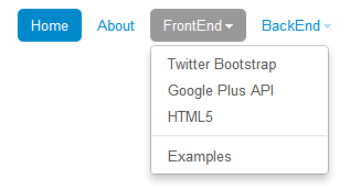
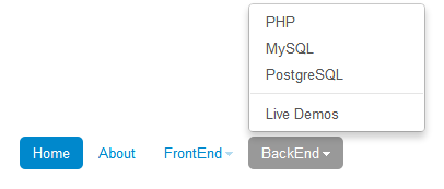
The markup and CSS for creating pill-based dropdown menus are similar to those for creating tab-based dropdown menus. The only thing to do is to replace .nav-tabs with the .nav-pills class. Below is an example.
Bootstrap Pill-based Dropdown Menu Navigation Example
Example
<html lang="en">
<head>
<meta charset="utf-8">
<title>Bootstrap Pill-based Dropdown Menu Navigation Example</title>
<meta name="description" content="Bootstrap Pill-based Dropdown Menu Navigation Example">
<link href="../bootstrap/twitter-bootstrap-v2/docs/assets/css/bootstrap2.2.css.html" rel="stylesheet">
<style type="text/css">
.container {
margin-top: 200px;
}
</style>
</head>
<body>
<div class="container">
<div class="row">
<div class="span6">
<ul class="nav nav-pills">
<li class="active"><a href="../index.html">Home</a></li>
<li><a href="../index.html">About</a></li>
<li class="dropdown"><a class="dropdown-toggle" data-toggle="dropdown" href="../index.html">FrontEnd<b class="caret"></b></a>
<ul class="dropdown-menu">
<li><a href="../index.html">Twitter Bootstrap</a></li>
<li><a href="../index.html">Google Plus API</a></li>
<li><a href="../index.html">HTML5</a></li>
<li class="divider"></li>
<li><a href="../index.html">Examples</a></li>
</ul>
</li>
<li class="dropdown"><a class="dropdown-toggle" data-toggle="dropdown" href="../index.html">BackEnd<b class="caret bottom-up"></b></a>
<ul class="dropdown-menu bottom-up pull-right">
<li><a href="../index.html">PHP</a></li>
<li><a href="../index.html">MySQL</a></li>
<li><a href="../index.html">PostgreSQL</a></li>
<li class="divider"></li>
<li><a href="../index.html">Live Demos</a></li>
</ul>
</li>
</ul>
</div>
</div>
</div>
<script src="../bootstrap/twitter-bootstrap-v2/docs/assets/js/jquery.js.html"></script>
<script src="../bootstrap/twitter-bootstrap-v2/docs/assets/js/bootstrap-dropdown.js.html"></script>
<script src="../bootstrap/twitter-bootstrap-v2/docs/assets/js/application.js.html"></script>
</body>
</html>
Output
Pill-based dropdown menu:
Pill-based dropup menu:
View Online
View the above example in a different browser window.
Creating Stacked Navigation with Optional Headers Using Nav List
The .nav-class can be used to create a stacked navigation suitable for a sidebar. You can add headings to a group of links, with styles defined for .nav-list located at lines 2201 to 2221 in bootstrap.css (version 2.0.1). Below is an example.
Stacked Navigation with Nav List Example
Example
<div class="row">
<div class="span6">
<ul class="nav nav-list">
<li class="nav-header">List header</li>
<li class="active"><a href="../index.html">Home</a></li>
<li><a href="../index.html">Library</a></li>
<li><a href="../index.html">Applications</a></li>
<li class="nav-header">Another list header</li>
<li><a href="../index.html">Profile</a></li>
<li><a href="../index.html">Settings</a></li>
<li class="divider"></li>
<li><a href="../index.html">Help</a></li>
</ul>
</div>
</div>
</div>
Output
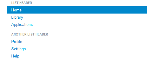
View Online
View the above example in a different browser window.
Creating Stacked Navigation with Icons Using Nav List
Example
<div class="span6">
<ul class="nav nav-list">
<li class="nav-header">List header</li>
<li class="active"><a href="../index.html"><i class="icon-white icon-home"></i> Home</a></li>
<li><a href="../index.html"><i class="icon-book"></i> Library</a></li>
<li><a href="../index.html"><i class="icon-pencil"></i> Applications</a></li>
<li class="nav-header">Another list header</li>
<li><a href="../index.html"><i class="icon-user"></i> Profile</a></li>
<li><a href="../index.html"><i class="icon-cog"></i> Settings</a></li>
<li class="divider"></li>
<li><a href="../index.html"><i class="icon-flag"></i> Help</a></li>
</ul>
</div>
</div>
Output
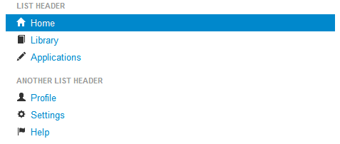
View Online
View the above examples in different browser windows.
Creating Clickable Navigation with JavaScript
You can create tabbed navigation with Bootstrap's lightweight jQuery plugin and simple markup.
How to Create Clickable Navigation?
You need a CSS class named "tabbable" that acts as a wrapper. Inside it, add the "nav" and "nav-tabs" classes to a "ul" element. Inside that, use 'data-toggle="tab"' (applied to the relevant anchor elements) to create clickable areas. Then, create a div with the CSS class "tab-content", and inside that div, some divs with the CSS class "tab-pane" are used to hold the actual content.
For the clickable navigation to work properly, you need to reference two JS files - jquery.js and bootstrap-tab.js. Both files are located in the docs/assets/js folder.
Below is an example demonstrating clickable navigation.
Example
<div class="row">
<div class="span4">
<div class="tabbable">
<ul class="nav nav-tabs">
<li class="active"><a href="../index.html" data-toggle="tab">Section 1</a></li>
<li class=""><a href="../index.html" data-toggle="tab">Section 2</a></li>
<li class=""><a href="../index.html" data-toggle="tab">Section 3</a></li>
</ul>
<div class="tab-content">
<div class="tab-pane active" id="1">
<p>You are watching section 1.</p>
</div>
<div class="tab-pane" id="2">
<p>You are watching Section 2.</p>
</div>
<div class="tab-pane" id="3">
<p>You are watching Section 3.</p>
</div>
</div>
</div>
</div>
</div>
</div>
Click here to download all HTML, CSS, JS, and image files used in this tutorial.
Other Extensions