Bootstrap List group
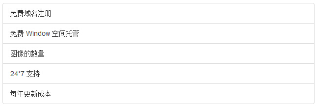
In this chapter we will discuss list groups. The list group component is used to present complex and custom content in a list form. The steps to create a basic list group are as follows:
- Add class to the <ul> element.list-group。
- Add class to the <li> element.list-group-item。
The following example demonstrates this:
Example
<ul class="list-group">
<li class="list-group-item">Free domain registration</li>
<li class="list-group-item">Free Window space hosting</li>
<li class="list-group-item">Number of images</li>
<li class="list-group-item">24*7 support</li>
<li class="list-group-item">Annual update cost</li>
</ul>
Try it »
The result is as follows:
Add badges to list group
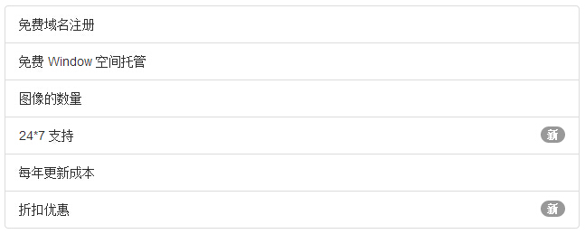
We can add badge components to any list item, and they will automatically be positioned to the right. Just add it to the <li> element<span class="badge">and that's it. The following example demonstrates this:
Example
<ul class="list-group">
<li class="list-group-item">Free domain registration</li>
<li class="list-group-item">Free Window space hosting</li>
<li class="list-group-item">Number of images</li>
<li class="list-group-item">
<span class="badge">New</span>24*7 support</li>
<li class="list-group-item">Annual update cost</li>
<li class="list-group-item">
<span class="badge">New</span>Discount offer</li>
</ul>
Try it »
The result is as follows:
Add links to list group
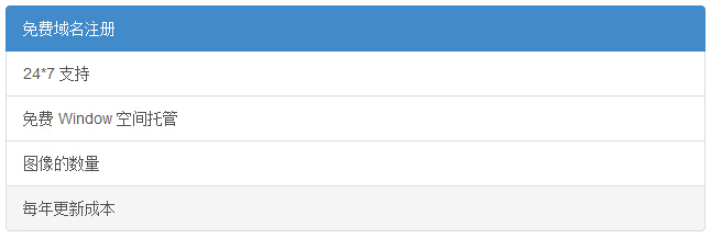
By using anchor tags instead of list items, we can add links to the list group. We need to use the <a> element instead of the <li> element. The following example demonstrates this:
Example
<a href="#" class="list-group-item active">Free domain registration</a>
<a href="#" class="list-group-item">24*7 support</a>
<a href="#" class="list-group-item">Free Window space hosting</a>
<a href="#" class="list-group-item">Number of images</a>
<a href="#" class="list-group-item">Annual update cost</a>
Try it »
The result is as follows:
Add custom content to list group
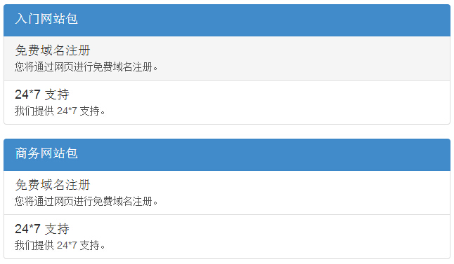
We can add arbitrary HTML content to the list group that we added links to above. The following example demonstrates this:
Example
<div class="list-group">
<a href="#" class="list-group-item active">
<h4 class="list-group-item-heading">Starter website package</h4>
</a>
<a href="#" class="list-group-item">
<h4 class="list-group-item-heading">Free domain registration</h4>
<p class="list-group-item-text">You will register your free domain through the web.</p>
</a>
<a href="#" class="list-group-item">
<h4 class="list-group-item-heading">24*7 support</h4>
<p class="list-group-item-text">We provide 24*7 support.</p>
</a>
</div>
<div class="list-group">
<a href="#" class="list-group-item active">
<h4 class="list-group-item-heading">Business website package</h4>
</a>
<a href="#" class="list-group-item">
<h4 class="list-group-item-heading">Free domain registration</h4>
<p class="list-group-item-text">You will register your free domain through the web.</p>
</a>
<a href="#" class="list-group-item">
<h4 class="list-group-item-heading">24*7 support</h4>
<p class="list-group-item-text">We provide 24*7 support.</p>
</a>
</div>
Try it »
The result is as follows:
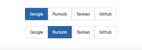
Horizontal list
In the above examples, the lists are displayed vertically. If we need a horizontal list, we can achieve it with the following code:
Example
.list-group-horizontal .list-group-item {
display: inline-block;
}
.list-group-horizontal .list-group-item {
margin-bottom: 0;
margin-left:-4px;
margin-right: 0;
}
.list-group-horizontal .list-group-item:first-child {
border-top-right-radius:0;
border-bottom-left-radius:4px;
}
.list-group-horizontal .list-group-item:last-child {
border-top-right-radius:4px;
border-bottom-left-radius:0;
}
Try it »
The result is as follows:
Other extensions