Bootstrap Panels
This chapter will explain Bootstrap panels. The panel component is used to insert DOM components into a box. To create a basic panel, simply add the class to the <div> element.paneland class.panel-defaultand that's it, as shown in the example below:
Example
<div class="panel panel-default">
<div class="panel-body">This is a basic panel</div>
</div>
Try it Yourself »
The result is as follows:
Panel Title
We can add panel titles in two ways:
- Using.panel-headingthe class can easily add a title container to the panel.
- Using.panel-titlethe <h1>-<h6> with class to add a title with predefined styles.
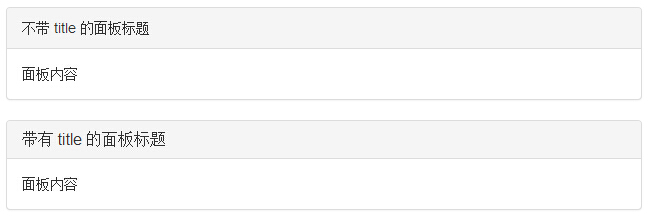
The following example demonstrates these two ways:
Example
<div class="panel panel-default">
<div class="panel-heading">Panel heading without title</div>
<div class="panel-body">Panel content</div>
</div>
<div class="panel panel-default">
<div class="panel-heading">
<h3 class="panel-title">Panel heading with title</h3>
</div>
<div class="panel-body">Panel content</div>
</div>
Try it Yourself »
The result is as follows:
Panel Footer
We can add a footer to the panel by placing a button or secondary text in a <div> with class.panel-footerin the <div> and that's it. The following example demonstrates this:
Example
<div class="panel panel-default">
<div class="panel-body">This is a basic panel</div>
<div class="panel-footer">Panel footer</div>
</div>
Try it Yourself »
The result is as follows:
The panel footer does not inherit colors and borders from the contextual panel because it is not in the foreground content.
Panels with Contextual Colors
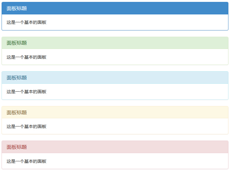
Use the contextual state classespanel-primary、panel-success、panel-info、panel-warning、panel-danger, to set panels with contextual colors. Examples are as follows:
Example
<div class="panel panel-primary">
<div class="panel-heading">
<h3 class="panel-title">Panel title</h3>
</div>
<div class="panel-body">This is a basic panel</div>
</div>
<div class="panel panel-success">
<div class="panel-heading">
<h3 class="panel-title">Panel title</h3>
</div>
<div class="panel-body">This is a basic panel</div>
</div>
<div class="panel panel-info">
<div class="panel-heading">
<h3 class="panel-title">Panel title</h3>
</div>
<div class="panel-body">This is a basic panel</div>
</div>
<div class="panel panel-warning">
<div class="panel-heading">
<h3 class="panel-title">Panel title</h3>
</div>
<div class="panel-body">This is a basic panel</div>
</div>
<div class="panel panel-danger">
<div class="panel-heading">
<h3 class="panel-title">Panel title</h3>
</div>
<div class="panel-body">This is a basic panel</div>
</div>
Try it Yourself »
The result is as follows:
Panels with Tables
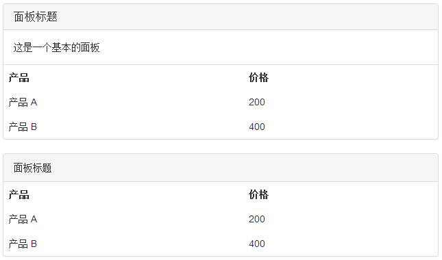
To create a borderless table in a panel, we can use the class in the panel.table. Suppose there is a <div> containing.panel-body, we can add an extra border to the top of the table to separate it. If there is no containing.panel-body<div>, then the component will move uninterrupted from the panel header to the table.
The following example demonstrates this:
Example
<div class="panel panel-default">
<div class="panel-heading">
<h3 class="panel-title">Panel title</h3>
</div>
<div class="panel-body">This is a basic panel</div>
<table class="table">
<th>Product</th><th>Price</th>
<tr><td>Product A</td><td>200</td></tr>
<tr><td>Product B</td><td>400</td></tr>
</table>
</div>
<div class="panel panel-default">
<div class="panel-heading">Panel title</div>
<table class="table">
<th>Product</th><th>Price</th>
<tr><td>Product A</td><td>200</td></tr>
<tr><td>Product B</td><td>400</td></tr>
</table>
</div>
Try it Yourself »
The result is as follows:
Panels with List Groups
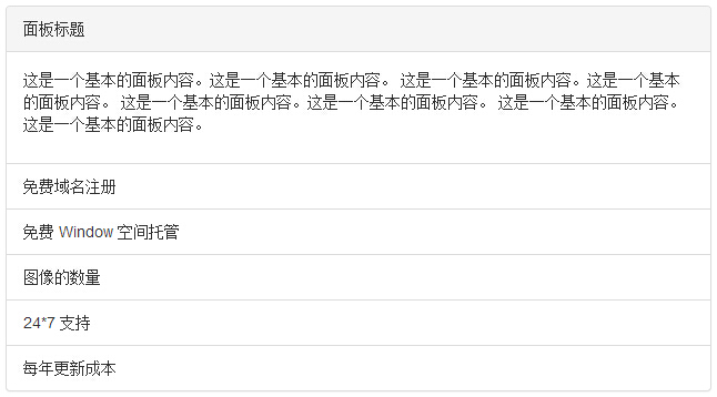
We can include a list group in any panel by adding to the <div> element.paneland.panel-defaultthe class to create the panel, and add a list group to the panel. You can from theList Groupschapter to learn how to create list groups.
Example
<div class="panel panel-default">
<div class="panel-heading">Panel title</div>
<div class="panel-body">
<p>This is basic panel content. This is basic panel content.
This is basic panel content. This is basic panel content.
This is basic panel content. This is basic panel content.
This is basic panel content. This is basic panel content.</p>
</div>
<ul class="list-group">
<li class="list-group-item">Free Domain Registration</li>
<li class="list-group-item">Free Window space hosting</li>
<li class="list-group-item">Number of images</li>
<li class="list-group-item">24*7 support</li>
<li class="list-group-item">Annual update cost</li>
</ul>
</div>
Try it »
The results are as follows:
Other extensions