Bootstrap Grid System
In this chapter, we will explain Bootstrap's Grid System.
Bootstrap provides a responsive, mobile-first fluid grid system. As the screen or viewport size increases, the system automatically divides into up to 12 columns.
What is a Grid?
From Wikipedia:
In graphic design, a grid is a structure (usually two-dimensional) made up of a series of intersecting straight lines (vertical, horizontal) used to organize content. It is widely used in print design for layout and content structure. In web design, it is a method for quickly creating consistent layouts and effectively using HTML and CSS.
Simply put, a grid in web design is used to organize content, making the website easy to browse and reducing the load on the user side.
What is the Bootstrap Grid System?
Description of the grid system in the official Bootstrap documentation:
Bootstrap includes a responsive, mobile-first, fluid grid system that appropriately expands to 12 columns as the device or viewport size increases. It includes predefined classes for simple layout options, as well as powerful mixins for generating more semantic layouts.
Let's understand the above statement. Bootstrap 3 is mobile-first in the sense that Bootstrap code starts from small screen devices (such as mobile devices, tablets) and then extends to components and grids on larger screen devices (such as laptops, desktops).
Mobile-first Strategy
- Content
- Decide what is most important.
- Layout
- Prioritize designing for smaller widths.
- Base CSS is mobile-first, and media queries are for tablets and desktops.
- Progressive Enhancement
- Add elements as the screen size increases.
The responsive grid system automatically divides into up to 12 columns as the screen or viewport size increases.
| 1 | 1 | 1 | 1 | 1 | 1 | 1 | 1 | 1 | 1 | 1 | 1 |
| 4 | 4 | 4 | |||||||||
| 4 | 8 | ||||||||||
| 6 | 6 | ||||||||||
| 12 | |||||||||||
How the Bootstrap Grid System Works
The grid system creates page layouts through a series of rows and columns that contain content. Below is how the Bootstrap grid system works:
- Rows must be placed within.containerclass, in order to obtain proper alignment and padding.
- Use rows to create horizontal groups of columns.
- Content should be placed within columns, and only columns may be direct children of rows.
- Predefined grid classes, such as.rowand.col-xs-4, can be used to quickly create grid layouts. LESS mixins can be used for more semantic layouts.
- Columns create gaps between column contents through padding. This padding is achieved by.rowstaking negative margins on the outer margin, indicating the row offset for the first and last columns.
- The grid system is created by specifying the twelve available columns you want to span. For example, to create three equal columns, use three.col-xs-4。
Media Queries
Media queries are very nifty "conditional CSS rules". They apply only to some CSS based on certain specified conditions. If those conditions are met, the corresponding styles are applied.
Media queries in Bootstrap allow you to move, show, and hide content based on viewport size. The following media queries are used in the LESS files to create the key breakpoint thresholds in the Bootstrap grid system.
/* 超小设备(手机,小于 768px) */
/* Bootstrap 中默认情况下没有媒体查询 */

/* 小型设备(平板电脑,768px 起) */
@media (min-width: @screen-sm-min) { ... }

/* 中型设备(台式电脑,992px 起) */
@media (min-width: @screen-md-min) { ... }

/* 大型设备(大台式电脑,1200px 起) */
@media (min-width: @screen-lg-min) { ... }
We sometimes also includemax-width, to limit the impact of the CSS to a smaller range of screen sizes.
@media (max-width: @screen-xs-max) { ... }
@media (min-width: @screen-sm-min) and (max-width: @screen-sm-max) { ... }
@media (min-width: @screen-md-min) and (max-width: @screen-md-max) { ... }
@media (min-width: @screen-lg-min) { ... }
Media queries have two parts: first a device specification, then a size rule. In the above case, the following rules are set:
Let's look at the following line of code:
@media (min-width: @screen-sm-min) and (max-width: @screen-sm-max) { ... }
For all withmin-width: @screen-sm-mindevices, if the screen width is less than@screen-sm-max, then some processing will be performed.
Grid Options
The following table summarizes how the Bootstrap grid system works across multiple devices:
| Extra small devices Phones (<768px) | Small devices Tablets (≥768px) | Medium devices Desktops (≥992px) | Large devices Desktops (≥1200px) | |
|---|---|---|---|---|
| Grid behavior | Always horizontal | Collapsed to start, horizontal above breakpoints | Collapsed to start, horizontal above breakpoints | Collapsed to start, horizontal above breakpoints |
| Max container width | None (auto) | 750px | 970px | 1170px |
| Class prefix | .col-xs- | .col-sm- | .col-md- | .col-lg- |
| Number of columns and | 12 | 12 | 12 | 12 |
| Minimum column width | Auto | 60px | 78px | 95px |
| Gutter width | 30px (15px on each side of a column) | 30px (15px on each side of a column) | 30px (15px on each side of a column) | 30px (15px on each side of a column) |
| Nestable | Yes | Yes | Yes | Yes |
| Offsets | Yes | Yes | Yes | Yes |
| Column ordering | Yes | Yes | Yes | Yes |
Basic Grid Structure
Below is the basic structure of the Bootstrap grid:
<div class="container">
   <div class="row">
      <div class="col-*-*"></div>
      <div class="col-*-*"></div>
   </div>
   <div class="row">...</div>
</div>
<div class="container">....
Let's look at a few simple grid examples:
Responsive Column Resets
The following example contains 4 grids, but we cannot determine where the grids display when browsing on small devices.
To solve this problem, you can use the.clearfixclass andresponsive utility classesto resolve it, as shown in the example below:
Examples
Try it yourself »
Adjust the window size in your browser to see the changes, or view the result on your phone.
Offsetting Columns
Offsetting is a useful feature for more professional layouts. They can be used to make more space for columns. For example,.col-xs-*classes do not support offsets, but they can simply achieve this effect by using an empty cell.
To use offsets on large screen displays, use the.col-md-offset-*classes. These classes increase the left margin (margin) of a column by*columns, where*the range is from1to11。
In the example below, we have <div class="col-md-6">..</div>, we will use the.col-md-offset-3class to center this div.
Example
Try it yourself »
The result is as follows:

Nesting Columns
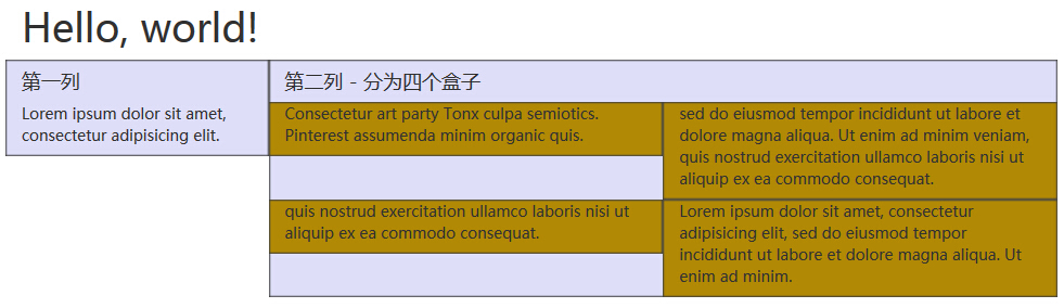
To nest the default grid in the content, add a new.row, and in an existing.col-md-*column add a set of.col-md-*columns. The nested row should contain a set of columns, and the number of columns cannot exceed 12 (actually, there is no requirement that you must fill all 12 columns).
In the example below, the layout has two columns, and the second column is divided into two rows of four boxes.
Example
Try it yourself »
The result is as follows:
Column Ordering
Another perfect feature of the Bootstrap grid system is that you can easily write columns in one order and then display them in another order.
You can very easily change the built-in grid column order with the.col-md-push-*and.col-md-pull-*classes, where*the range is from1to11。
In the example below, we have a two-column layout, with the left column narrow and acting as a sidebar. We will use the.col-md-push-*and.col-md-pull-*class to swap the order of these two columns.
Example
Try it yourself »
The result is as follows:
