Bootstrap Input Groups
This chapter explains another feature supported by Bootstrap, input groups. Input groups extend theform controls. With input groups, you can easily add text or buttons as prefixes or suffixes to text-based inputs.
By adding prefix and suffix content to input fields, you can add common elements to user input. For example, you can add a dollar sign, or an @ before a Twitter username, or other common elements required by an application interface.
toward.form-controlThe steps to add prefix or suffix elements are as follows:
- Place the prefix or suffix element in a <div> with class.input-groupinside the <div>.
- Then, inside the same <div>, in a <span> with class.input-group-addonplace the additional content inside the <span>.
- Place the <span> before or after the <input> element.
For cross-browser compatibility, avoid using <select> elements, as they are not fully rendered in WebKit browsers. Also, do not apply the input group class directly to form groups; an input group is an isolated component.
Basic Input Group
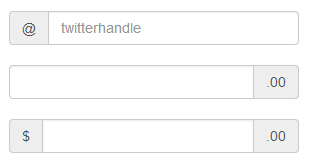
The following example demonstrates a basic input group:
Example
<div style="padding: 100px 100px 10px;">
<form class="bs-example bs-example-form" role="form">
<div class="input-group">
<span class="input-group-addon">@</span>
<input type="text" class="form-control" placeholder="twitterhandle">
</div>
<br>
<div class="input-group">
<input type="text" class="form-control">
<span class="input-group-addon">.00</span>
</div>
<br>
<div class="input-group">
<span class="input-group-addon">$</span>
<input type="text" class="form-control">
<span class="input-group-addon">.00</span>
</div>
</form>
</div>
Try it »
The result is shown below:
Input Group Size
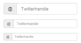
You can change the size of an input group by adding.input-groupform-relative sizing classes (such as.input-group-lg、input-group-sm) to it. The content inside the input will automatically adjust size.
The following example demonstrates this:
Example
<div style="padding: 100px 100px 10px;">
<form class="bs-example bs-example-form" role="form">
<div class="input-group input-group-lg">
<span class="input-group-addon">@</span>
<input type="text" class="form-control" placeholder="Twitterhandle">
</div>
<br>
<div class="input-group">
<span class="input-group-addon">@</span>
<input type="text" class="form-control" placeholder="Twitterhandle">
</div>
<br>
<div class="input-group input-group-sm">
<span class="input-group-addon">@</span>
<input type="text" class="form-control" placeholder="Twitterhandle">
</div>
</form>
</div>
Try it »
The result is shown below:
Checkbox and Radio Addons
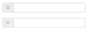
You can use checkboxes and radio addons as prefix or suffix elements of an input group, as shown in the example below:
Example
<div style="padding: 100px 100px 10px;">
<form class="bs-example bs-example-form" role="form">
<div class="row">
<div class="col-lg-6">
<div class="input-group">
<span class="input-group-addon">
<input type="checkbox"></span>
<input type="text" class="form-control">
</div>
</div>
<br>
<div class="col-lg-6">
<div class="input-group">
<span class="input-group-addon">
<input type="radio"></span>
<input type="text" class="form-control">
</div>
</div>
</div>
</form>
</div>
Try it »
The result is shown below:
Button Addons
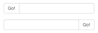
You can also use buttons as prefix or suffix elements of an input group. In this case, you are not adding.input-group-addonclass; you need to use class.input-group-btnto wrap the button. This is necessary because the default browser styles will not be overridden. The following example demonstrates this:
Example
<div style="padding: 100px 100px 10px;">
<form class="bs-example bs-example-form" role="form">
<div class="row">
<div class="col-lg-6">
<div class="input-group">
<span class="input-group-btn">
<button class="btn btn-default" type="button">Go!</button>
</span>
<input type="text" class="form-control">
</div>
</div>
<br>
<div class="col-lg-6">
<div class="input-group">
<input type="text" class="form-control">
<span class="input-group-btn">
<button class="btn btn-default" type="button">Go!</button>
</span>
</div>
</div>
</div>
</form>
</div>
Try it »
The result is shown below:
Buttons with Dropdown Menus
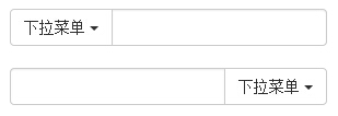
To add buttons with dropdown menus to an input group, simply.input-group-btnwrap the button and dropdown menu in a class, as shown in the example below:
Example
<div style="padding: 100px 100px 10px;">
<form class="bs-example bs-example-form" role="form">
<div class="row">
<div class="col-lg-6">
<div class="input-group">
<div class="input-group-btn">
<button type="button" class="btn btn-default
dropdown-toggle" data-toggle="dropdown">Dropdown menu<span class="caret"></span>
</button>
<ul class="dropdown-menu">
<li>
<a href="#">Action</a>
</li>
<li>
<a href="#">Another action</a>
</li>
<li>
<a href="#">Something else here</a>
</li>
<li class="divider"></li>
<li>
<a href="#">Separated link</a>
</li>
</ul>
</div>
<input type="text" class="form-control">
</div>
</div>
<br>
<div class="col-lg-6">
<div class="input-group">
<input type="text" class="form-control">
<div class="input-group-btn">
<button type="button" class="btn btn-default
dropdown-toggle" data-toggle="dropdown">Dropdown menu<span class="caret"></span>
</button>
<ul class="dropdown-menu pull-right">
<li>
<a href="#">Action</a>
</li>
<li>
<a href="#">Another action</a>
</li>
<li>
<a href="#">Something else here</a>
</li>
<li class="divider"></li>
<li>
<a href="#">Separated link</a>
</li>
</ul>
</div>
</div>
</div>
</div>
</form>
</div>
Try it »
The result is shown below:
Split Dropdown Menu Buttons
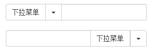
To add split buttons with dropdown menus to an input group, use a style similar to dropdown menu buttons, but add a primary action to the dropdown menu, as shown in the example below:
Example
<div style="padding: 100px 100px 10px;">
<form class="bs-example bs-example-form" role="form">
<div class="row">
<div class="col-lg-6">
<div class="input-group">
<div class="input-group-btn">
<button type="button" class="btn btn-default" tabindex="-1">Dropdown menu</button>
<button type="button" class="btn btn-default
dropdown-toggle" data-toggle="dropdown" tabindex="-1">
<span class="caret"></span>
<span class="sr-only">Toggle dropdown</span>
</button>
<ul class="dropdown-menu">
<li>
<a href="#">Action</a>
</li>
<li>
<a href="#">Another action</a>
</li>
<li>
<a href="#">Something else here</a>
</li>
<li class="divider"></li>
<li>
<a href="#">Separated link</a>
</li>
</ul>
</div>
<input type="text" class="form-control">
</div>
</div>
<br>
<div class="col-lg-6">
<div class="input-group">
<input type="text" class="form-control">
<div class="input-group-btn">
<button type="button" class="btn btn-default" tabindex="-1">Dropdown menu</button>
<button type="button" class="btn btn-default
dropdown-toggle" data-toggle="dropdown" tabindex="-1">
<span class="caret"></span>
<span class="sr-only">Toggle dropdown</span>
</button>
<ul class="dropdown-menu pull-right">
<li>
<a href="#">Action</a>
</li>
<li>
<a href="#">Another action</a>
</li>
<li>
<a href="#">Something else here</a>
</li>
<li class="divider"></li>
<li>
<a href="#">Separated link</a>
</li>
</ul>
</div>
</div>
</div>
</div>
</form>
</div>
Try it »
The result is shown below:
Other Extensions