Bootstrap Navigation Elements
In this chapter we will explain some options provided by Bootstrap for defining navigation elements. They use the same markup and base class.nav. Bootstrap also provides a helper class for sharing markup and states. By changing the modifier class, you can switch between different styles.
Table navigation or tabs
To create a tab-style navigation menu:
- Start with an unordered list with class.navAdd class
- Add class.nav-tabs。
The following example demonstrates this:
Example
Try it »
The result is as follows:

Pills navigation menu
Basic pills navigation menu
If you want to change tabs to pills style, just use class.nav-pillsinstead of.nav-tabs, the other steps are the same as above.
The following example demonstrates this:
Example
Try it »
The result is as follows:

Vertical pills navigation menu
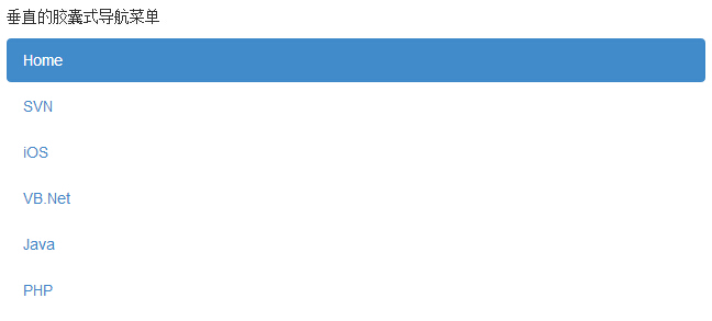
You can use class.nav、.nav-pillstogether with class.nav-stackedto make the pills stack vertically.
The following example demonstrates this:
Example
Try it »
The result is as follows:
Justified navigation
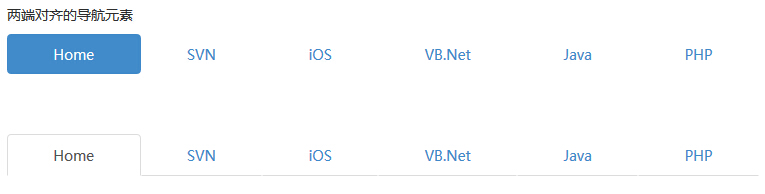
When the screen width is greater than 768px, you can respectively use class.nav、.nav-tabsor.nav、.nav-pillstogether with class.nav-justifiedto make the tab-style or pills navigation menu equal to the width of the parent element. On smaller screens, the navigation links will stack.
The following example demonstrates this:
Example
Try it »
The result is as follows:
Disabled links
For each.navclass, if the.disabledclass is added, a gray link will be created, and the:hoverstate of the link is disabled, as shown in the following example:
Example
Try it »
The result is as follows:
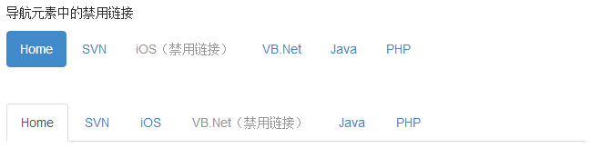
This class only changes the appearance of <a>, not its functionality. Here, you need to use custom JavaScript to disable the links.
Dropdown menus
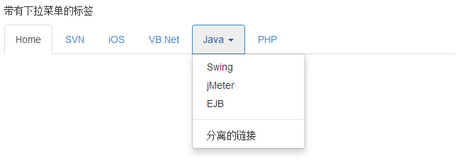
Navigation menus use similar syntax to dropdown menus. By default, the anchors of list items work with some data attributes to trigger an unordered list with.dropdown-menuclass.
Tabs with dropdown menu
The steps to add a dropdown menu to tabs are as follows:
- Start with an unordered list with class.navAdd class
- Add an unordered list with.nav-tabs。
- class..dropdown-menuExample
Example
The result is as follows:
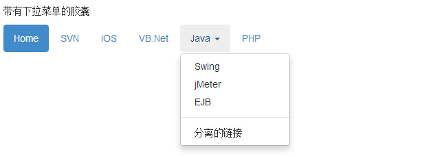
Pills with dropdown menu
Pills with dropdown menu
Just need to.nav-tabsChange class to.nav-pills, as shown in the example below:
Example
Try it »
The result is as follows:
More navigation component examples
Tabs and pill tabs
| Class | Description | Example |
|---|---|---|
| .nav nav-tabs | Tabs | Try it |
| .nav nav-pills | Pills | Try it |
| .nav nav-pills nav-stacked | Pills stacked vertically | Try it |
| .nav-justified | Justified tabs: On screens larger than 768px, the .nav-justified class can easily make tabs or pills have equal width. On small screens, the nav links are stacked. | Try it |
| .disabled | Disabled tabs | Try it |
| Tabs with dropdown menus | Try it | |
| Pills with dropdown menus | Try it | |
| .tab-content | Used with .tab-pane and data-toggle="tab" (data-toggle="pill"), to make the corresponding tab content change as the tabs switch. | Try it |
| .tab-pane | Used with .tab-content and data-toggle="tab" (data-toggle="pill"), to make the corresponding tab content change as the tabs switch. | Try it |