Bootstrap Modals
Description
Bootstrap Modals are created using a custom jQuery plugin. They can be used to create modal windows to enrich user experience, or to add practical functionality for users. You can use Popovers and Tooltips within Modals.
In this tutorial, we will discuss how to create modal windows using Bootstrap through some examples and explanations. We will also discuss the various available options for customization.
What is required
You need jQuery, Bootstrap CSS, and the JavaScript file bootstrap-modal.js. This js file is located in the js folder inside the main Bootstrap folder you downloaded.
jQuery is located under docs > assets > js in your Bootstrap main folder, named jquery.js. Or you can directly visit https://ajax.googleapis.com/ajax/libs/jquery/1.7.1/jquery.min.js to download jQuery.
What do Bootstrap Modals look like
The example below demonstrates what Bootstrap Modals look like.
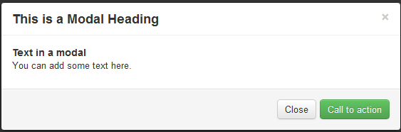
Using Bootstrap Modals on your website
The example below demonstrates how to use Bootstrap Modals on a web page. Note that you do not need to write any JavaScript code. Relevant explanations are provided after the example.
Example
<h2>Create a Modal with Bootstrap</h2>
<div id="example" class="modal hide fade in" style="display: none; ">
<div class="modal-header">
<a class="close" data-dismiss="modal">×</a>
<h3>This is a modal title</h3>
</div>
<div class="modal-body">
<h4>Text in the modal</h4>
<p>You can add some text here.</p>
</div>
<div class="modal-footer">
<a href="../index.html" class="btn btn-success">Wake Up Activity</a>
<a href="../index.html" class="btn" data-dismiss="modal">Close</a>
</div>
</div>
<p><a data-toggle="modal" href="../index.html" class="btn btn-primary btn-large">Launch demo modal</a></p>
</div>
<script src="https://ajax.googleapis.com/ajax/libs/jquery/1.7.1/jquery.min.js"></script>
<script src="../twitter-bootstrap/twitter-bootstrap-v2/js/bootstrap-modal.js.html"></script>
View the Bootstrap Modals example online
Explanation
The table below explains the code above. It will help you understand how to use Bootstrap Modals.
| Code | Explanation |
|---|---|
| div id="example" | The id assigned to the relevant div; the value of the id points to the JavaScript that implements the modal later. |
| class="modal hide fade in" | Four Bootstrap CSS classes - modal, hide, fade, and in - are used to set the layout of the modal. |
| style="display: none; | Used to keep the modal window visible until the trigger is activated (such as clicking the relevant button). |
| <div class="modal-header"> | modal-header is a class used to define the style of the modal window header. |
| a class="close" | The CSS class close is used to style the close button of the modal window. |
| data-dismiss="modal" | data-dismiss is a custom HTML5 data attribute. It is used to close the modal window. |
| class="modal-body" | modal-body is a Bootstrap CSS class used to style the body of the modal window. |
| class="modal-footer" | modal-footer is a Bootstrap CSS class used to style the footer of the modal window. |
| class="btn btn-success" | The CSS classes btn and btn-success are used to create a large button at the footer of the modal window. You can use any other Bootstrap button instead. |
| class="btn" | The Bootstrap CSS button class btn is used to create a small button at the footer of the modal window. |
| data-dismiss="modal" | The HTML5 custom data attribute data-dismiss is used to close the modal window. |
| data-toggle="modal" | The HTML5 custom data attribute data-toggle is used to open the modal window. |
| class="btn btn-primary btn-large" | Set the button style, and clicking the button creates the modal window. |
| <script src="https://ajax.googleapis.com/ajax/libs /jquery/1.7.1/jquery.min.js"></script> |
Reference the jQuery file. |
| <script src="../bootstrap/twitter-bootstrap-v2> /js/bootstrap-modal.js.html"></script> |
Reference the JS file for Bootstrap modal. |
Using JavaScript
You can use JavaScript to implement Bootstrap modal windows. Simply call modal() in your JavaScript. Your code is shown below, and you can reference it before the closing body tag (i.e., </body>).
 $(function ()
{ $("#identifier").modal();
});
Here, identifier is a jQuery selector used to identify the relevant container element. Next, let's look at the available options.
Options
The following are some options you might use to customize the look and feel of the modal window via modal().
backdrop
The backdrop option is used to include a modal-backdrop element.
If you replace the code on line 2 of the "Using JavaScript" example with the following code, assigning the value false to the backdrop option, there will be no modal-backdrop at all.
{ $("#example").modal({backdrop:false});
keyboard
If the keyboard option is used, the modal window closes when escape is pressed. Its type is boolean, and the default value is true. If the keyboard option is set to false, the modal window will not close even when escape is pressed.
If you replace the code on line 2 of the "Using JavaScript" example with the following code, assigning the value false to the keyboard option, pressing escape will not close the modal window.
{ $("#example").modal({keyboard:false});
show
If the show option is used, the modal window is displayed when initialized. Its type is boolean, and the default value is true. If the show option is set to false, the modal window will not be displayed during initialization.
If you replace the code on line 2 of the "Using JavaScript" example with the following code, assigning the value false to the show option, the modal window will not be displayed during initialization.
{ $("#example").modal({show:false});
Methods
Below are some methods used with modal().
.modal(options)
This method activates the content as a modal. You can pass an optional options parameter of type object. If you, in this tutorial'sfirst exampleadd the following code before the </body> tag, and there will be no modal backdrop element at all.
$('#example').modal({
  backdrop: false
})
.modal('toggle')
This method manually toggles a modal. If you, in this tutorial'sfirst exampleadd the following code before the </body> tag, and you can manually toggle the modal.
$('#example').modal('toggle')
.modal(show)
This method can be used to manually open a modal. If you, in this tutorial'sfirst exampleadd the following code before the </body> tag, and you can manually open the modal.
$('#example').modal('show')
.modal(hide)
This method can be used to manually hide a modal. If you, in this tutorial'sfirst exampleadd the following code before the </body> tag, and you can manually hide the modal.
$('#example').modal('hide')
Events
Below are events related to Modals. These events are used to intercept and execute your own code.
show
This event is fired immediately after the show instance method is called.
shown
This event is fired after the modal is displayed (and the CSS transition effect has also finished executing).
hide
This event is fired immediately after the hide instance method is called.
hidden
This event is triggered after the modal has been hidden from the user (and the CSS transition has also completed).
Click here to download all the HTML, CSS, JS, and image files used in this tutorial.
Other extensions