Bootstrap Create a Pricing Table Using the List Group Component
Goal
A pricing table is one of the main components of any website that sells products or services. Even though Bootstrap 3 (like its previous versions) does not directly provide a pricing table component, it does provide a list group component. This component was designed to render complex custom content. Taking advantage of this feature, we will create a simple pricing table in this tutorial, explain the CSS rules used to create a list group, and show how to customize it.
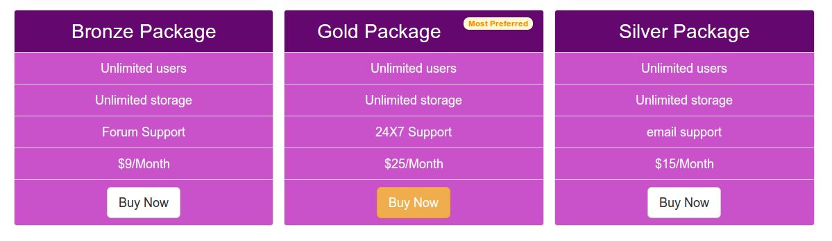
Typical Appearance
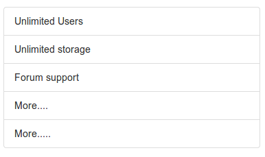
You canview the demo online, below is the example code.
<div class="container">
<div class="row">
  <ul class="list-group col-lg-4">
  <li class="list-group-item">Unlimited Users</li>
  <li class="list-group-item">Unlimited storage</li>
  <li class="list-group-item">Forum support</li>
  <li class="list-group-item">More....</li>
  <li class="list-group-item">More.....</li>
</ul>
</div>
</div>
list-group and list-group-item
list-groupThe CSS rules for the classes are as follows
.list-group {
  padding-left: 0;
  margin-bottom: 20px;
}

.list-group-item {
  position: relative;
  display: block;
  padding: 10px 15px;
  margin-bottom: -1px;
  background-color: #FFFFFF;
  border: 1px solid #DDDDDD;
}

.list-group-item:first-child {
  border-top-right-radius: 4px;
  border-top-left-radius: 4px;
}

.list-group-item:last-child {
  margin-bottom: 0;
  border-bottom-right-radius: 4px;
  border-bottom-left-radius: 4px;
}
Badges
You can useBadgescomponent to contain a list-group. The following code demonstrates how to implement this.
<div class="container">
<div class="row">
  <ul class="list-group col-lg-4">
  <li class="list-group-item"><span class="badge">Very important</span>Unlimited Users</li>
  <li class="list-group-item">Unlimited storage</li>
  <li class="list-group-item">Forum support</li>
  <li class="list-group-item">More....</li>
  <li class="list-group-item">More.....</li>
</ul>
</div>
</div>
You canclick here to view the demo online. The following shows the CSS code for positioning badges in a list group.
.list-group-item > .badge {
  float: right;
}

.list-group-item > .badge + .badge {
  margin-right: 5px;
}
Please note that due to float:right, the actual content inside list group items is forced to the right.
Linked Items
<div class="container">
<div class="row">
  <div class="list-group col-lg-4">
  <a href="../index.html" class="list-group-item active">
    The pricing list
  </a>
  <a href="../index.html" class="list-group-item">Unlimited users</a>
  <a href="../index.html" class="list-group-item">Unlimited storage</a>
  <a href="../index.html" class="list-group-item">email support</a>
  <a href="../index.html" class="list-group-item">More...</a>
</div>
</div>
</div>
You canclick here to view the demo online. The following shows the CSS code for positioning linked items in a list group.
a.list-group-item {
  color: #555555;
}

a.list-group-item .list-group-item-heading {
  color: #333333;
}

a.list-group-item:hover,
a.list-group-item:focus {
  text-decoration: none;
  background-color: #F5F5F5;
}

a.list-group-item.active,
a.list-group-item.active:hover,
a.list-group-item.active:focus {
  z-index: 2;
  color: #FFFFFF;
  background-color: #428BCA;
  border-color: #428BCA;
}

a.list-group-item.active .list-group-item-heading,
a.list-group-item.active:hover .list-group-item-heading,
a.list-group-item.active:focus .list-group-item-heading {
  color: inherit;
}

a.list-group-item.active .list-group-item-text,
a.list-group-item.active:hover .list-group-item-text,
a.list-group-item.active:focus .list-group-item-text {
  color: #E1EDF7;
}
Custom Content
View the example online, this example demonstrates a list group with custom content. The following shows the HTML and CSS code appearing in Bootstrap's CSS.
<div class="container">
<div class="row">
  <div class="list-group col-lg-4">
  <a href="../index.html" class="list-group-item active">
    <h4 class="list-group-item-heading">List group item heading</h4>
    <p class="list-group-item-text">...</p>
  </a>
</div>
</div>
</div>
CSS Code
.list-group-item-heading {
  margin-top: 0;
  margin-bottom: 5px;
}

.list-group-item-text {
  margin-bottom: 0;
  line-height: 1.3;
}
Pricing Table
Now, we will take the basic structure of the list group component and turn it into a simple and attractive pricing table.
Below is the basic HTML code we used to create the pricing table. Note that we have added a button in the last list item. For the leftmost and rightmost columns, we use Bootstrap's default buttons. For the middle column, we add a button with a different class (warning) to make it look different. In addition, we also added a badge to the first list item of the middle column.
<!DOCTYPE html>
<html>
  <head>
    <title>Bootstrap 101 模板</title>
    <meta name="viewport" content="width=device-width, initial-scale=1.0">
    <!-- Bootstrap -->
    <link href="dist/css/bootstrap.min.css.html" rel="stylesheet" media="screen"><!-- HTML5 Shim and Respond.js IE8 support of HTML5 elements and media queries -->
    <!-- WARNING: Respond.js doesn't work if you view the page via file:// -->
    <!--[if lt IE 9]>
      <script src="https://oss.maxcdn.com/libs/html5shiv/3.7.0/html5shiv.js"></script>
      <script src="https://oss.maxcdn.com/libs/respond.js/1.3.0/respond.min.js"></script>
    <![endif]-->
  </head>
  <body>
  <div class="container">
  <div class="row">
  <ul class="list-group col-lg-4">
  <li class="list-group-item">Bronze Package</li>
  <li class="list-group-item">Unlimited users</li>
  <li class="list-group-item">Unlimited storage</li>
  <li class="list-group-item">Forum Support</li>
  <li class="list-group-item">$9/Month</li>
  <li class="list-group-item"><a href="../index.html"><button class="btn btn-lg btn-default">Buy Now</button></a></li>
</ul>
<!--second-->
<ul class="list-group col-lg-4">
  <li class="list-group-item">Gold Package<span class="badge">Most Preferred</span></li>
  <li class="list-group-item">Unlimited users</li>
  <li class="list-group-item">Unlimited storage</li>
  <li class="list-group-item">24X7 Support</li>
  <li class="list-group-item">$25/Month</li>
  <li class="list-group-item"><a href="../index.html"><button class="btn btn-warning btn-lg">Buy Now</button></a></li>
</ul>
<!--third-->
<ul class="list-group col-lg-4">
  <li class="list-group-item">Silver Package</li>
  <li class="list-group-item">Unlimited users</li>
  <li class="list-group-item">Unlimited storage</li>
  <li class="list-group-item">email support</li>
  <li class="list-group-item">$15/Month</li>
  <li class="list-group-item"><a href="../index.html"><button class="btn btn-lg btn-default">Buy Now</button></a></li>
</ul>
</div>
</div>
    <!-- jQuery (对Bootstrap的 JavaScript插件来说是必要的--->
    <script src="https://code.jquery.com/jquery.js"></script>
    <!-- 包括所有已编译的插件(如下),或者根据需要包括单个文件 -->
    <script src="dist/js/bootstrap.min.js.html"></script>
  </body>
</html>
Now, we will directly customize the look and feel by adding CSS classes. The first snippet of CSS code will add some top padding to the page.
body {
  padding-top: 70px
  }
Then, by adding the following CSS code, we will customize the background color, font color, text alignment, and font size of the list item content.
ul.list-group.col-lg-4 > li {
  background-color: #C952CA;
  color: white;
  text-align: center;
  font-size:125%;
  }
But if we want the first list item in the middle column to look different, we need to add the following CSS code. We use:first-childpseudo-elements to access the desired list item.
ul.list-group.col-lg-4 > li.list-group-item:first-child{
  background-color: #64086F;
  font-size: 200%;
  }
To make the badge look distinctive, we then add the following CSS code.
  .badge {
  background-color: #FAFAD2;
  color:#FF8C00;
  }
Other Extensions