Bootstrap Alerts and Errors
Introduction
Bootstrap allows you to define styles for successful execution, warning, and error messages for your website or app. In this tutorial, you will learn how to do this.
Create a Simple Alert
Using the CSS class "alert", located at lines 2123 to 2175 in bootstrap.css (version 2.0.1), you can create a simple alert. You can add an optional close icon to it.
When you click the close icon in the alert box, the alert box closes. To achieve this interactive effect, you must add two JavaScript files, jquery.js and alert.js. You can add them before the closing tag of the body element.
Bootstrap Example of Creating a Simple Alert
Example
<html lang="en">
<head>
<meta charset="utf-8">
<title>Basic Alert Example</title>
<meta name="description" content="Creating basic alerts with Twitter Bootstrap. Examples of alerts and errors with Twitter Bootstrap">
<link href="../twitter-bootstrap/twitter-bootstrap-v2/docs/assets/css/bootstrap.css.html" rel="stylesheet">
<style type="text/css">
body {
padding: 50px;
}
</style>
</head>
<body>
<div class="container">
<div class="row">
<div class="span4">
<div class="alert">
<a class="close" data-dismiss="alert">×</a>
<strong>Warning!</strong> Best check yo self, you're not looking too good.
</div>
</div>
</div>
</div>
<script src="twitter-bootstrap-v2/docs/assets/js/jquery.js.html"></script>
<script src="twitter-bootstrap-v2/docs/assets/js/bootstrap-alert.js.html"></script>
</body>
</html>
Please note that the code between lines 18 and 21 is required. These are only for demonstration purposes.
Output
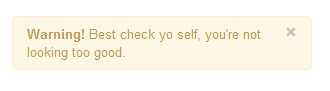
View Online
View the above example in a different browser window.
Extend the Simple Alert
By using two additional CSS classes, "alert-block" and "alert-heading", you can extend the simple alert demonstrated earlier. This allows you to better control the text to be displayed, and you can add a text heading before the alert text.
When you click the close icon in the alert box, the alert box closes. To achieve this interactive effect, you must add two JavaScript files, jquery.js and alert.js. You can add them before the closing tag of the body element.
Bootstrap Example of Extending the Simple Alert
Example
<html lang="en">
<head>
<meta charset="utf-8">
<title>Example of Extending the Simple Alert</title>
<meta name="description" content="Extending simple alert with twitter bootstrap.">
<link href="../twitter-bootstrap/twitter-bootstrap-v2/docs/assets/css/bootstrap.css.html" rel="stylesheet">
<style type="text/css">
body {
padding: 50px;
}
</style>
</head>
<body>
<div class="container">
<div class="row">
<div class="span4">
<div class="alert alert-block">
<a class="close" data-dismiss="alert">×</a>
<h4 class="alert-heading">Warning!</h4>
What are you doing?! this will delete all files!!
</div>
</div>
</div>
</div>
<script src="twitter-bootstrap-v2/docs/assets/js/jquery.js.html"></script>
<script src="twitter-bootstrap-v2/docs/assets/js/bootstrap-alert.js.html"></script>
</body>
</html>
Output
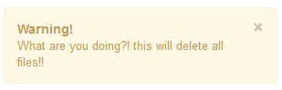
View Online
View the above example in a different browser window.
Create Alerts for Error, Success, and Information
Bootstrap allows you to create appropriate alerts when errors or dangers, successes, and information occur. For errors, you need the CSS class "alert-error". For success, you need the "alert-success" class. For information, you need the class "alert-info". Of course, as illustrated in the previous examples, you need the JS files jquery.js and alert.js.
Bootstrap Examples of Alerts for Error, Success, and Information
Example
<html lang="en">
<head>
<meta charset="utf-8">
<title>Bootstrap Example of Alerts for Error, Success, and Information</title>
<meta name="description" content="Example alerts on error success and information with Twitter bootstrap.">
<link href="../twitter-bootstrap/twitter-bootstrap-v2/docs/assets/css/bootstrap.css.html" rel="stylesheet">
<style type="text/css">
body {
padding: 50px;
}
</style>
</head>
<body>
<div class="alert alert-error">
<a class="close" data-dismiss="alert">×</a>
<strong>Error!</strong>This is a fatal error.
</div>
<div class="alert alert-success">
<a class="close" data-dismiss="alert">×</a>
<strong>Success!</strong>You have successfully done it.
</div>
<div class="alert alert-info">
<a class="close" data-dismiss="alert">×</a>
<strong>Info!</strong>Watch this, but you may forget.
</div>
<script src="twitter-bootstrap-v2/docs/assets/js/jquery.js.html"></script>
<script src="twitter-bootstrap-v2/docs/assets/js/bootstrap-alert.js.html"></script>
</body>
</html>
Output

View Online
View the above example in a different browser window.
Click here to download all the HTML, CSS, JS, and image files used in this tutorial.
Other Extensions