Bootstrap 警告とエラー
简介
Bootstrap を使用すると、Web サイトまたはアプリの成功実行、警告、およびエラー情報のスタイルを定義できます。このチュートリアルでは、その方法を学びます。
簡単な警告メッセージを作成する
CSSクラス "alert"(bootstrap.css の 2123 行から 2175 行、バージョン 2.0.1)を使用すると、簡単な警告メッセージを作成できます。オプションの閉じるアイコンを追加することもできます。
警告ボックス内の閉じるアイコンをクリックすると、警告ボックスが閉じます。このインタラクションを実現するには、jquery.js と alert.js の2つのJavaScriptファイルを追加する必要があります。これらは body 要素の終了タグの前に追加できます。
Bootstrapで簡単な警告メッセージを作成する例
实例
<html lang="en">
<head>
<meta charset="utf-8">
<title>基本的な警告情報の例</title>
<meta name="description" content="Creating basic alerts with Twitter Bootstrap. Examples of alerts and errors with Twitter Bootstrap">
<link href="../twitter-bootstrap/twitter-bootstrap-v2/docs/assets/css/bootstrap.css.html" rel="stylesheet">
<style type="text/css">
body {
padding: 50px;
}
</style>
</head>
<body>
<div class="container">
<div class="row">
<div class="span4">
<div class="alert">
<a class="close" data-dismiss="alert">×</a>
<strong>Warning!</strong> Best check yo self, you're not looking too good.
</div>
</div>
</div>
</div>
<script src="twitter-bootstrap-v2/docs/assets/js/jquery.js.html"></script>
<script src="twitter-bootstrap-v2/docs/assets/js/bootstrap-alert.js.html"></script>
</body>
</html>
行番号18から21までのコードが必須であることに注意してください。これらは実際のデモンストレーションのためのものです。
输出
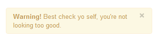
オンラインで表示
簡単な警告メッセージを拡張する
さらに2つのCSSクラス "alert-block " と "alert-heading" を使用すると、前述の簡単な警告メッセージを拡張できます。表示するテキストをより細かく制御でき、警告テキストの前にテキスト見出しを追加することもできます。
警告ボックス内の閉じるアイコンをクリックすると、警告ボックスが閉じます。このインタラクションを実現するには、jquery.js と alert.js の2つのJavaScriptファイルを追加する必要があります。これらは body 要素の終了タグの前に追加できます。
Bootstrapで簡単な警告メッセージを拡張する例
实例
<html lang="en">
<head>
<meta charset="utf-8">
<title>簡単な警告メッセージを拡張する例</title>
<meta name="description" content="Extending simple alert with twitter bootstrap.">
<link href="../twitter-bootstrap/twitter-bootstrap-v2/docs/assets/css/bootstrap.css.html" rel="stylesheet">
<style type="text/css">
body {
padding: 50px;
}
</style>
</head>
<body>
<div class="container">
<div class="row">
<div class="span4">
<div class="alert alert-block">
<a class="close" data-dismiss="alert">×</a>
<h4 class="alert-heading">Warning!</h4>
What are you doing?! this will delete all files!!
</div>
</div>
</div>
</div>
<script src="twitter-bootstrap-v2/docs/assets/js/jquery.js.html"></script>
<script src="twitter-bootstrap-v2/docs/assets/js/bootstrap-alert.js.html"></script>
</body>
</html>
输出
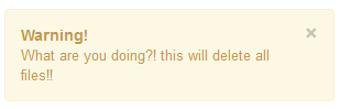
オンラインで表示
エラー(error)、成功(success)、情報(information)発生時に警告を作成する
Bootstrap を使用すると、エラーや危険、成功、情報が発生したときに適切な警告を作成できます。エラー(error)には、CSSクラス "alert-error" が必要です。成功(success)には、"alert-success" クラスが必要です。情報(information)には、クラス "alert-info" が必要です。もちろん、前の例で説明したように、JSファイルの jquery.js と alert.js が必要です。
Bootstrapのエラー、成功、情報の警告の例
实例
<html lang="en">
<head>
<meta charset="utf-8">
<title>Bootstrap エラー、成功、および情報の警告例</title>
<meta name="description" content="Example alerts on error success and information with Twitter bootstrap.">
<link href="../twitter-bootstrap/twitter-bootstrap-v2/docs/assets/css/bootstrap.css.html" rel="stylesheet">
<style type="text/css">
body {
padding: 50px;
}
</style>
</head>
<body>
<div class="alert alert-error">
<a class="close" data-dismiss="alert">×</a>
<strong>Error!</strong>This is a fatal error.
</div>
<div class="alert alert-success">
<a class="close" data-dismiss="alert">×</a>
<strong>Success!</strong>You have successfully done it.
</div>
<div class="alert alert-info">
<a class="close" data-dismiss="alert">×</a>
<strong>Info!</strong>Watch this, but you may forget.
</div>
<script src="twitter-bootstrap-v2/docs/assets/js/jquery.js.html"></script>
<script src="twitter-bootstrap-v2/docs/assets/js/bootstrap-alert.js.html"></script>
</body>
</html>
输出

オンラインで表示
ここをクリックして、本チュートリアルで使用するすべてのHTML、CSS、JSおよび画像ファイルをダウンロードしてください。
其他扩展