Bootstrap Layout
Introduction
In this tutorial, you will learn how to use the Bootstrap toolkit to create fixed layouts and fluid layouts. The tutorial is based on Bootstrap version 2.0.
In version 2.0, Bootstrap added responsive features for mobile phones, tablets, laptops, small desktops, large wide-screen desktops, etc.
You can make the layout responsive by adding the bootstrap-responsive.css file (located under docs\assets\css) to the page.
Bootstrap Fixed Layout
If you want to create a web page or app based on fixed pixel numbers, see this section of the tutorial.
Usage
<body>
  <div class="container">
    ...
  </div>
</body>
Explanation
Lines 261 to 273 of bootstrap.css (located under docs\assets\css in the main folder of bootstrap) render styles for the main container, thereby creating a fixed layout. The purpose of a fixed layout is to create a 940-pixel (default) wide layout for a web page or app.
Bootstrap Fixed Layout Example
The following code creates a fixed layout for a web page. For customization, in addition to the default styles, you also need to create a new css file example-fixed-layout.css, located in the same folder as bootstrap.css.
CSS Code
body {
padding-top: 60px;
padding-bottom: 40px;
}
.nav li {
padding-top: 5px;
}
.leaderboard {
padding: 60px;
margin-bottom: 30px;
background-image: url('/twitter-bootstrap/images/gridbg.gif');
background-repeat:repeat;
-webkit-border-radius: 6px;
-moz-border-radius: 6px;
border-radius: 6px;
}
.leaderboard h1 {
font-size: 40px;
margin-bottom: 5px;
line-height: 1;
letter-spacing: -1px;
color:#FF6600;
}
.leaderboard p {
font-size: 18px;
font-weight: 200;
line-height: 27px;
}
HTML Code
Example
<html lang="en">
<head>
<meta charset="utf-8">
<title>Example of fixed layout using Bootstrap version 2.0</title>
<meta name="viewport" content="width=device-width, initial-scale=1.0">
<meta name="description" content="Example of Fixed Layout with Bootstrap version 2.0 from w3cschool.cc">
<meta name="author" content="">
<!-- Le styles -->
<link href="../bootstrap/twitter-bootstrap-v2/docs/assets/css/bootstrap.css.html" rel="stylesheet">
<link href="../bootstrap/twitter-bootstrap-v2/docs/assets/css/example-fixed-layout.css.html" rel="stylesheet">
<!-- Le HTML5 shim, for IE6-8 support of HTML5 elements -->
<!--[if lt IE 9]>
<script src="//html5shim.googlecode.com/svn/trunk/html5.js"></script>
<![endif]-->
<!-- Le fav and touch icons -->
<link rel="shortcut icon" href="../bootstrap/twitter-bootstrap-v2/docs/examples/images/favicon.ico.html">
<link rel="apple-touch-icon" href="../bootstrap/twitter-bootstrap-v2/docs/examples/images/apple-touch-icon.png.html">
<link rel="apple-touch-icon" sizes="72x72" href="../bootstrap/twitter-bootstrap-v2/docs/examples/images/apple-touch-icon-72x72.png.html">
<link rel="apple-touch-icon" sizes="114x114" href="../bootstrap/twitter-bootstrap-v2/docs/examples/images/apple-touch-icon-114x114.png.html">
</head>
<body>
<div class="navbar navbar-fixed-top">
<div class="navbar-inner">
<div class="container">
<a class="btn btn-navbar" data-toggle="collapse" data-target=".nav-collapse">
<span class="icon-bar"></span>
<span class="icon-bar"></span>
<span class="icon-bar"></span>
</a>
<a class="brand" href="../index.html">
<img src="../images/w3r.png.html" width="111" height="30" alt="w3cschool logo" /></a>
<div class="nav-collapse">
<ul class="nav">
<li class="active">
<a href="../index.html">Home</a></li>
<li>
<a href="../index.html">About</a></li>
<li>
<a href="../index.html">Contact</a></li>
</ul>
</div>
<!--/.nav-collapse --></div>
</div>
</div>
<div class="container">
<!-- Main hero unit for a primary marketing message or call to action -->
<div class="leaderboard">
<h1>w3cschool Web Store</h1>
<p>Try and purchase HTML5, JS, Ruby, PHP-MySQL based web apps to enhance your productivity at affordable price.</p>
<p>
<a class="btn btn-success btn-large">Sign Up for a 30 day free trial</a></p>
</div>
<!-- Example row of columns -->
<div class="row">
<div class="span4">
<h2>HTML5 and JS Apps</h2>
<p>Donec id elit non mi porta gravida at eget metus. Fusce dapibus, tellus ac cursus commodo, tortor mauris condimentum nibh,ut fermentum massa justo sit amet risus. Etiam porta sem malesuada magna mollis euismod. Donec sed odio dui.</p>
<p>
<a class="btn btn-success btn-large" href="../index.html">View apps</a></p>
</div>
<div class="span4">
<h2>Ruby Apps</h2>
<p>Donec id elit non mi porta gravida at eget metus. Fusce dapibus, tellus ac cursus commodo, tortor mauris condimentum nibh,ut fermentum massa justo sit amet risus. Etiam porta sem malesuada magna mollis euismod. Donec sed odio dui.</p>
<p>
<a class="btn btn-success btn-large" href="../index.html">View apps</a></p>
</div>
<div class="span4">
<h2>PHP MySQL Apps</h2>
<p>Donec sed odio dui. Cras justo odio, dapibus ac facilisis in, egestas eget quam. Vestibulum id ligula porta felis euismod semper. Fusce dapibus, tellus ac cursus commodo, tortor mauris condimentum nibh, ut fermentum massa justo sit amet risus.</p>
<p>
<a class="btn btn-success btn-large" href="../index.html">View apps</a></p>
</div>
</div>
<hr>
<footer>
<p>© Company 2012</p>
</footer>
</div>
<!-- /container -->
<!-- Le javascript==================================================- ->
<!-- Placed at the end of the document so the pages load faster -->
<script src="../bootstrap/twitter-bootstrap-v2/docs/assets/js/jquery.js.html"></script>
<script src="../bootstrap/twitter-bootstrap-v2/docs/assets/js/bootstrap-transition.js.html"></script>
<script src="../bootstrap/twitter-bootstrap-v2/docs/assets/js/bootstrap-alert.js.html"></script>
<script src="../bootstrap/twitter-bootstrap-v2/docs/assets/js/bootstrap-modal.js.html"></script>
<script src="../bootstrap/twitter-bootstrap-v2/docs/assets/js/bootstrap-dropdown.js.html"></script>
<script src="../bootstrap/twitter-bootstrap-v2/docs/assets/js/bootstrap-scrollspy.js.html"></script>
<script src="../bootstrap/twitter-bootstrap-v2/docs/assets/js/bootstrap-tab.js.html"></script>
<script src="../bootstrap/twitter-bootstrap-v2/docs/assets/js/bootstrap-tooltip.js.html"></script>
<script src="../bootstrap/twitter-bootstrap-v2/docs/assets/js/bootstrap-popover.js.html"></script>
<script src="../bootstrap/twitter-bootstrap-v2/docs/assets/js/bootstrap-button.js.html"></script>
<script src="../bootstrap/twitter-bootstrap-v2/docs/assets/js/bootstrap-collapse.js.html"></script>
<script src="../bootstrap/twitter-bootstrap-v2/docs/assets/js/bootstrap-carousel.js.html"></script>
<script src="../bootstrap/twitter-bootstrap-v2/docs/assets/js/bootstrap-typeahead.js.html"></script>
</body>
</html>
Output
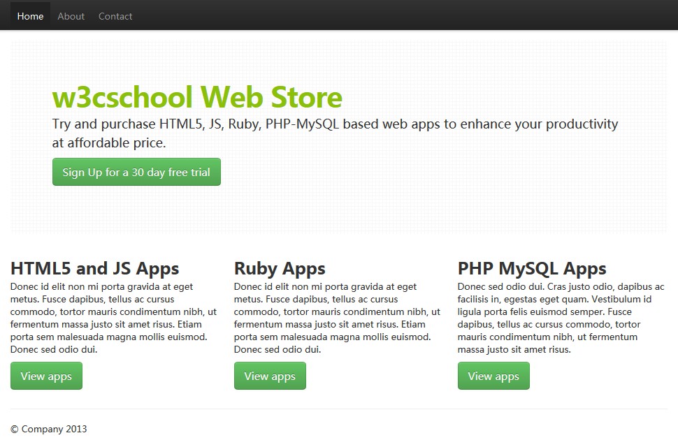
View Online
View the above example in different browser windows.
Bootstrap Fluid Layout
If you want to create a non-fixed layout, i.e., a percentage-based layout to make the layout more flexible, see this section of the tutorial.
Usage
<div class="container-fluid">
  <div class="row-fluid">
    <div class="span2">
      <!--Sidebar content-->
    </div>
    <div class="span10">
      <!--Body content-->
    </div>
  </div>
</div>
Explanation
Lines 274 to 285 of bootstrap.css (located under docs\assets\css in the main folder of bootstrap) render styles for the main container, thereby creating a fluid layout. The purpose of a fluid layout is to create a percentage-based layout (e.g., width=20%) for a web page or app.
Bootstrap Fluid Layout Example
The following code creates a fluid layout for a web page. For customization, in addition to the default styles, you also need to create a new css file example-fluid-layout.css, located in the same folder as bootstrap.css.
CSS Code
 body {
        padding-top: 60px;
        padding-bottom: 40px;
      }
      .nav li {
      padding-top: 5px;
      }

      .sidebar-nav {
        padding: 9px 0;
      }
      .leaderboard {
  padding: 60px;
  margin-bottom: 30px;
  background-image: url('/twitter-bootstrap/images/gridbg.gif');
  background-repeat:repeat;
  -webkit-border-radius: 6px;
  -moz-border-radius: 6px;
  border-radius: 6px;
}
.leaderboard h1 {
  font-size: 40px;
  margin-bottom: 5px;
  line-height: 1;
  letter-spacing: -1px;
  color:#FF6600;
}
.leaderboard p {
  font-size: 18px;
  font-weight: 200;
  line-height: 27px;
}

.well {
background-image: url('/twitter-bootstrap/images/gridbg.gif');
  background-repeat:repeat;
  -webkit-border-radius: 6px;
  -moz-border-radius: 6px;
  border-radius: 6px;
}

.nav .nav-header {
font-size: 18px;
color:#FF9900;
}
HTML Code
Example
<html lang="en">
<head>
<meta charset="utf-8">
<title>Example of fixed layout using Bootstrap version 2.0</title>
<meta name="viewport" content="width=device-width, initial-scale=1.0">
<meta name="description" content="Example of Fluid Layout with Bootstrap version 2.0 from w3cschool.cc">
<meta name="author" content="">
<!-- Le styles -->
<link href="../bootstrap/twitter-bootstrap-v2/docs/assets/css/bootstrap.css.html" rel="stylesheet">
<link href="../bootstrap/twitter-bootstrap-v2/docs/assets/css/example-fluid-layout.css.html" rel="stylesheet">
<!-- Le HTML5 shim, for IE6-8 support of HTML5 elements -->
<!--[if lt IE 9]>
<script src="//html5shim.googlecode.com/svn/trunk/html5.js"></script>
<![endif]-->
<!-- Le fav and touch icons -->
<link rel="shortcut icon" href="../bootstrap/twitter-bootstrap-v2/docs/examples/images/favicon.ico.html">
<link rel="apple-touch-icon" href="../bootstrap/twitter-bootstrap-v2/docs/examples/images/apple-touch-icon.png.html">
<link rel="apple-touch-icon" sizes="72x72" href="../bootstrap/twitter-bootstrap-v2/docs/examples/images/apple-touch-icon-72x72.png.html">
<link rel="apple-touch-icon" sizes="114x114" href="../bootstrap/twitter-bootstrap-v2/docs/examples/images/apple-touch-icon-114x114.png.html"></head>
<body>
<div class="navbar navbar-fixed-top">
<div class="navbar-inner">
<div class="container-fluid">
<a class="btn btn-navbar" data-toggle="collapse" data-target=".nav-collapse">
<span class="icon-bar"></span>
<span class="icon-bar"></span>
<span class="icon-bar"></span>
</a>
<a class="brand" href="../index.html">
<img src="../images/w3r.png.html" width="111" height="30" alt="w3cschool logo" /></a>
<div class="nav-collapse">
<ul class="nav">
<li class="active">
<a href="../index.html">Home</a></li>
<li>
<a href="../index.html">About</a></li>
<li>
<a href="../index.html">Contact</a></li>
</ul>
<p class="navbar-text pull-right">Logged in as
<a href="../index.html">username</a></p>
</div>
<!--/.nav-collapse --></div>
</div>
</div>
<div class="container-fluid">
<div class="row-fluid">
<div class="span3">
<div class="well sidebar-nav">
<ul class="nav nav-list">
<li class="nav-header">Frontend</li>
<li class="active">
<a href="../index.html">HTML 4.01</a></li>
<li>
<a href="../index.html">HTML5</a></li>
<li>
<a href="../index.html">CSS</a></li>
<li>
<a href="../index.html">JavaScript</a></li>
<li>
<a href="../index.html">Twitter Bootstrap</a></li>
<li>
<a href="../index.html">Firebug</a></li>
<li class="nav-header">Backend</li>
<li>
<a href="../index.html">PHP</a></li>
<li>
<a href="../index.html">SQL</a></li>
<li>
<a href="../index.html">MySQL</a></li>
<li>
<a href="../index.html">PostgreSQL</a></li>
<li>
<a href="../index.html">MongoDB</a></li>
</ul>
</div><!--/.well -->
</div><!--/span-->
<div class="span9">
<div class="leaderboard">
<h1>Learn. Practice. Develop.</h1>
<p>w3cschool offers web development tutorials. We believe in Open Source. Love standards. And prioritize simplicity and readability while serving content.</p>
<p>
<a class="btn btn-success btn-large">Join w3cschool now</a></p>
</div>
<div class="row-fluid">
<div class="span4">
<h2>Learn</h2>
<p>Donec id elit non mi porta gravida at eget metus. Fusce dapibus, tellus ac cursus commodo, tortor mauris condimentum nibh, ut fermentum massa justo sit amet risus. Etiam porta sem malesuada magna mollis euismod. Donec sed odio dui.</p>
<p>
<a class="btn btn-success btn-large" href="../index.html">Start Learning now</a></p>
</div><!--/span-->
<div class="span4">
<h2>Practice</h2>
<p>Donec id elit non mi porta gravida at eget metus. Fusce dapibus, tellus ac cursus commodo, tortor mauris condimentum nibh, ut fermentum massa justo sit amet risus. Etiam porta sem malesuada magna mollis euismod. Donec sed odio dui.</p>
<p>
<a class="btn btn-success btn-large" href="../index.html">Start percticing now</a></p>
</div>
<!--/span-->
<div class="span4">
<h2>Develop</h2>
<p>Donec id elit non mi porta gravida at eget metus. Fusce dapibus, tellus ac cursus commodo, tortor mauris condimentum nibh, ut fermentum massa justo sit amet risus. Etiam porta sem malesuada magna mollis euismod. Donec sed odio dui.</p>
<p>
<a class="btn btn-success btn-large" href="../index.html">Start developing now</a></p>
</div><!--/span-->
</div><!--/row-->
<hr>
<footer>
<p>© Company 2012</p>
</footer>
</div>
</div>
</div><!--/.fluid-container-->
<!-- Le javascript==================================================- ->
<!-- Placed at the end of the document so the pages load faster -->
<script src="../bootstrap/twitter-bootstrap-v2/docs/assets/js/jquery.js.html"></script>
<script src="../bootstrap/twitter-bootstrap-v2/docs/assets/js/bootstrap-transition.js.html"></script>
<script src="../bootstrap/twitter-bootstrap-v2/docs/assets/js/bootstrap-alert.js.html"></script>
<script src="../bootstrap/twitter-bootstrap-v2/docs/assets/js/bootstrap-modal.js.html"></script>
<script src="../bootstrap/twitter-bootstrap-v2/docs/assets/js/bootstrap-dropdown.js.html"></script>
<script src="../bootstrap/twitter-bootstrap-v2/docs/assets/js/bootstrap-scrollspy.js.html"></script>
<script src="../bootstrap/twitter-bootstrap-v2/docs/assets/js/bootstrap-tab.js.html"></script>
<script src="../bootstrap/twitter-bootstrap-v2/docs/assets/js/bootstrap-tooltip.js.html"></script>
<script src="../bootstrap/twitter-bootstrap-v2/docs/assets/js/bootstrap-popover.js.html"></script>
<script src="../bootstrap/twitter-bootstrap-v2/docs/assets/js/bootstrap-button.js.html"></script>
<script src="../bootstrap/twitter-bootstrap-v2/docs/assets/js/bootstrap-collapse.js.html"></script>
<script src="../bootstrap/twitter-bootstrap-v2/docs/assets/js/bootstrap-carousel.js.html"></script>
<script src="../bootstrap/twitter-bootstrap-v2/docs/assets/js/bootstrap-typeahead.js.html"></script>
</body>
</html>
Output
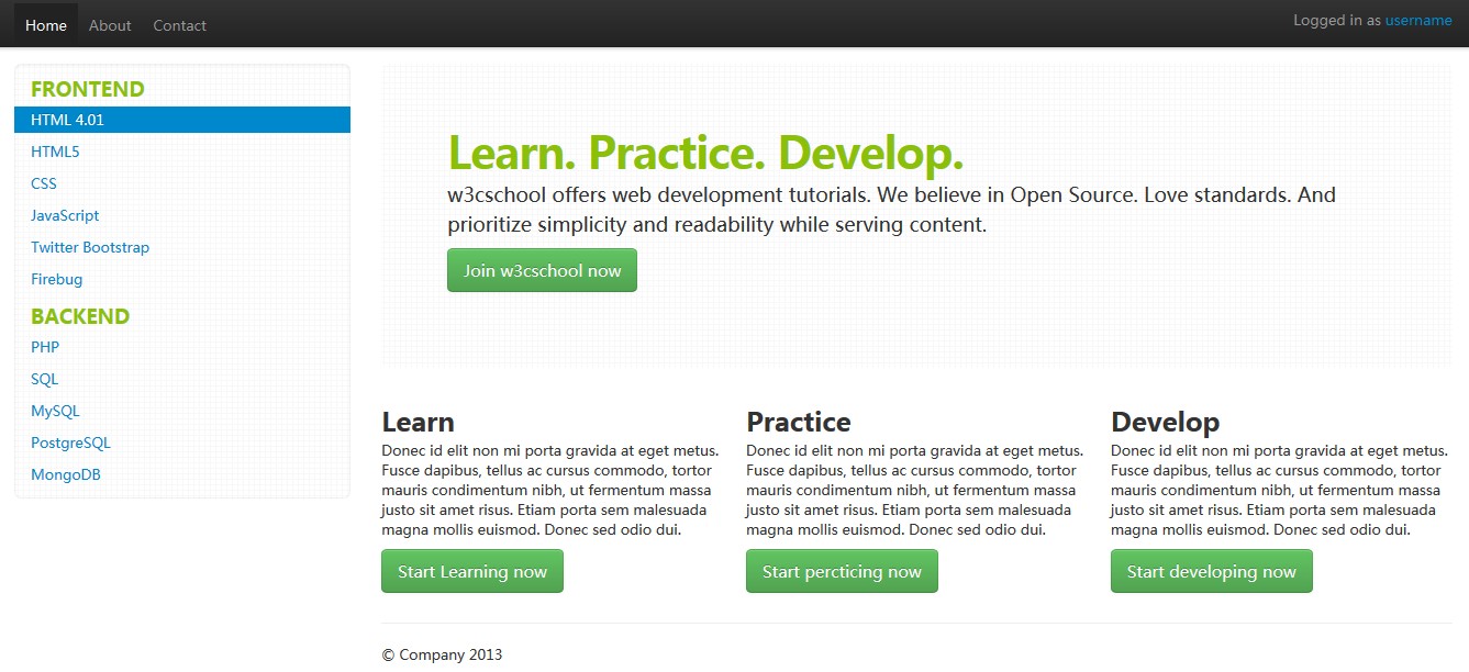
View Online
View the above example in different browser windows.
Click here to download all HTML, CSS, JS and image files used in this tutorial.
Other Extensions