Pandas Data Visualization
Data visualization is an important part of data analysis. It helps us better understand and interpret patterns, trends, and relationships in data.
Through graphs, charts, and other forms, data visualization transforms complex numbers and statistical information into easy-to-understand images, making it easier to make decisions.
Pandas provides integration withMatplotlibandSeabornand other visualization libraries, making data visualization simple and efficient.
In Pandas, data visualization functionality is mainly implemented throughDataFrame.plot()andSeries.plot()methods. These methods are actually wrappers around the Matplotlib library, simplifying the process of drawing charts.
| Chart Type | Description | Method |
|---|---|---|
| Line chart | Shows the trend of data over time or other continuous variables | df.plot(kind='line') |
| Bar chart | Compares data across different categories | df.plot(kind='bar') |
| Horizontal bar chart | Compares data across different categories, but bars are arranged horizontally | df.plot(kind='barh') |
| Histogram | Displays the distribution of data | df.plot(kind='hist') |
| Scatter plot | Shows the relationship between two numerical variables | df.plot(kind='scatter', x='col1', y='col2') |
| Box plot | Displays data distribution, including median, quartiles, etc. | df.plot(kind='box') |
| Density plot | Shows the density distribution of data | df.plot(kind='kde') |
| Pie chart | Shows the proportion of different parts in the whole | df.plot(kind='pie') |
| Area chart | Shows cumulative values of data | df.plot(kind='area') |
The basic functions and methods of Pandas data visualization can meet most daily data visualization needs. However, to achieve more complex visualizations, you can combine Matplotlib and Seaborn for finer chart customization.
I. Pandas Data Visualization Overview
Pandas provides theplot()methods that can easily draw different types of charts, including line charts, bar charts, histograms, scatter plots, etc.plot()The methods have many parameters, allowing customization of chart style, colors, labels, etc.
1. Basicplot()Methods
| Parameter | Description |
|---|---|
kind |
Chart type, supports'line', 'bar', 'barh', 'hist', 'box', 'kde', 'density', 'area', 'pie'and other types |
x |
Set the data column for the x-axis |
y |
Set the data column for the y-axis |
title |
Title of the chart |
xlabel |
x-axis label |
ylabel |
y-axis label |
color |
Set the color of the chart |
figsize |
Set the size of the chart (width, height) |
legend |
Whether to display the legend |
2. Common Chart Types
| Chart Type | Description | Common Usage |
|---|---|---|
| Line chart | Used to display data trends over time | df.plot(kind='line') |
| Bar chart | Used to display comparison data between categories | df.plot(kind='bar') |
| Horizontal bar chart | Similar to a bar chart, but the bars are horizontal | df.plot(kind='barh') |
| Histogram | Used to display the distribution of data (frequency distribution) | df.plot(kind='hist') |
| Scatter plot | Used to display the relationship between two numerical variables | df.plot(kind='scatter', x='col1', y='col2') |
| Box plot | Used to display data distribution, outliers, and quartiles | df.plot(kind='box') |
| Density plot | Used to display the density distribution of data | df.plot(kind='kde') |
| Pie chart | Used to display the proportion of each part to the whole | df.plot(kind='pie') |
| Area chart | Used to display cumulative values (similar to a line chart, but with filled color) | df.plot(kind='area') |
II. Data Visualization Examples
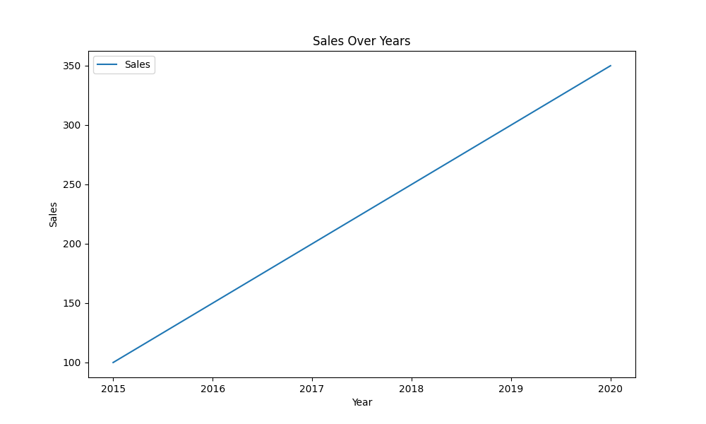
1. Line Plot
Line charts are commonly used to show the trend of data over time.
Example
import matplotlib.pyplot as plt
# Sample data
data = {'Year': [2015, 2016, 2017, 2018, 2019, 2020],
'Sales': [100, 150, 200, 250, 300, 350]}
df = pd.DataFrame(data)
# Plot line chart
df.plot(kind='line', x='Year', y='Sales', title='Sales Over Years', xlabel='Year', ylabel='Sales', figsize=(10, 6))
plt.show()
Output:
2. Bar Chart
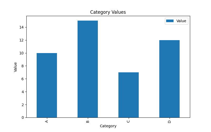
Bar charts are used to show comparisons between different categories, especially suitable for discrete data.
Example
import matplotlib.pyplot as plt
# Sample data
data = {'Category': ['A', 'B', 'C', 'D'],
'Value': [10, 15, 7, 12]}
df = pd.DataFrame(data)
# Plot bar chart
df.plot(kind='bar', x='Category', y='Value', title='Category Values', xlabel='Category', ylabel='Value', figsize=(8, 5))
plt.show()
Output:
3. Scatter Plot
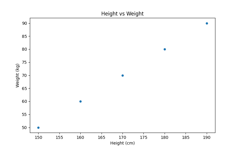
Scatter plots are used to show the relationship between two numerical variables.
Example
import matplotlib.pyplot as plt
# Sample data
data = {'Height': [150, 160, 170, 180, 190],
'Weight': [50, 60, 70, 80, 90]}
df = pd.DataFrame(data)
# Plot scatter plot
df.plot(kind='scatter', x='Height', y='Weight', title='Height vs Weight', xlabel='Height (cm)', ylabel='Weight (kg)', figsize=(8, 5))
plt.show()
Output:
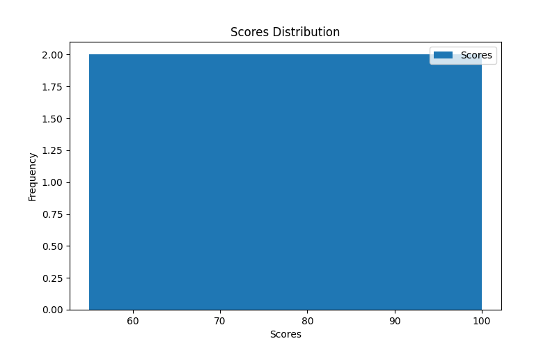
4. Histogram
Histograms are used to display the distribution of data, especially for describing the frequency distribution of data.
Example
import matplotlib.pyplot as plt
# Sample data
data = {'Scores': [55, 70, 85, 90, 60, 75, 80, 95, 100, 65]}
df = pd.DataFrame(data)
# Plot histogram
df.plot(kind='hist', y='Scores', bins=5, title='Scores Distribution', xlabel='Scores', figsize=(8, 5))
plt.show()
Output:
5. Box Plot
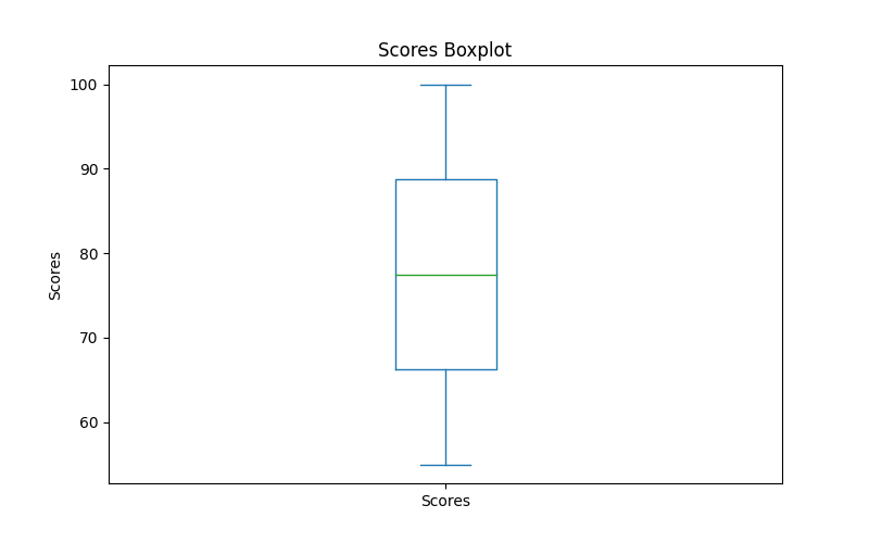
Box plots are used to display the distribution of data, including the median, quartiles, and outliers.
Example
import matplotlib.pyplot as plt
# Sample data
data = {'Scores': [55, 70, 85, 90, 60, 75, 80, 95, 100, 65]}
df = pd.DataFrame(data)
# Plot box plot
df.plot(kind='box', title='Scores Boxplot', ylabel='Scores', figsize=(8, 5))
plt.show()
Output:
6. Pie Chart
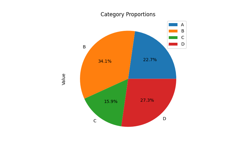
Pie charts are used to show the proportion of each part to the whole.
Example
import matplotlib.pyplot as plt
# Sample data
data = {'Category': ['A', 'B', 'C', 'D'],
'Value': [10, 15, 7, 12]}
df = pd.DataFrame(data)
# Plot pie chart
df.plot(kind='pie', y='Value', labels=df['Category'], autopct='%1.1f%%', title='Category Proportions', figsize=(8, 5))
plt.show()
Output:
III. Seaborn Visualization
Seaborn is an advanced data visualization library based on Matplotlib, providing more beautiful, easier-to-use charts and a richer variety of statistical chart types.
In Pandas, you can use Seaborn directly in conjunction with it.
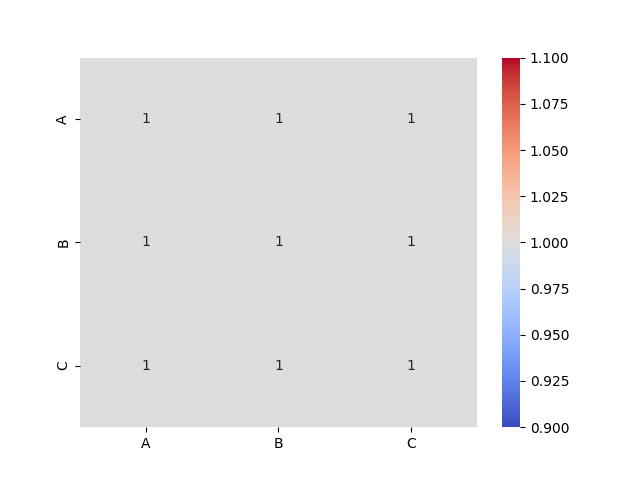
Heatmap:
Example
import seaborn as sns
import matplotlib.pyplot as plt
# Sample data
data = {'A': [1, 2, 3], 'B': [4, 5, 6], 'C': [7, 8, 9]}
df = pd.DataFrame(data)
# Plot heatmap
sns.heatmap(df.corr(), annot=True, cmap='coolwarm')
plt.show()
Output:
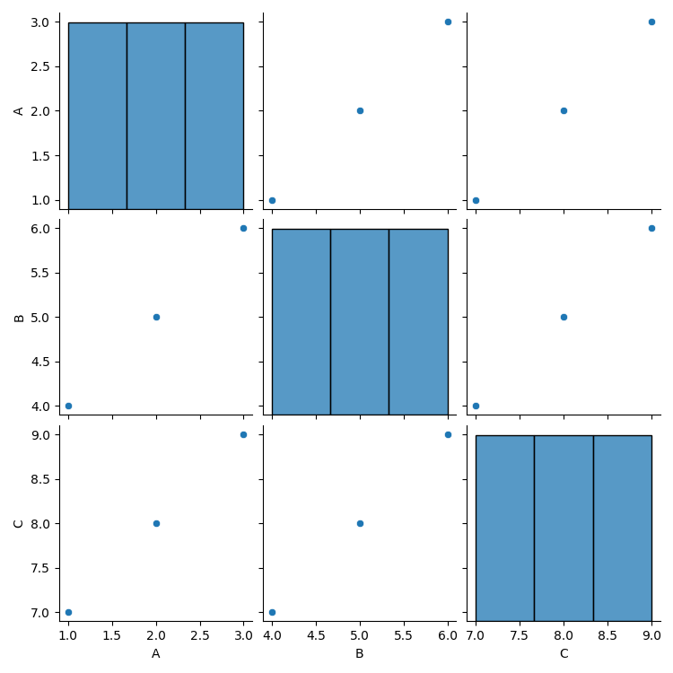
Scatter plot matrix between all numerical features in the dataset:
Example
import seaborn as sns
import matplotlib.pyplot as plt
# Sample data
data = {'A': [1, 2, 3], 'B': [4, 5, 6], 'C': [7, 8, 9]}
df = pd.DataFrame(data)
sns.pairplot(df)
plt.show()
Output:
IV. Matplotlib Advanced Customization
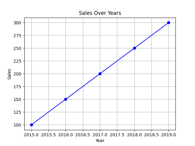
In addition to using the methods provided by Pandas,plot()Matplotlib can also provide more flexible customization features, such as adding titles, labels, setting chart styles, adjusting axes, etc.
Example
import seaborn as sns
import matplotlib.pyplot as plt
# Sample data
data = {'Year': [2015, 2016, 2017, 2018, 2019],
'Sales': [100, 150, 200, 250, 300]}
df = pd.DataFrame(data)
# Plot line chart
plt.plot(df['Year'], df['Sales'], color='blue', marker='o')
# Customization
plt.title('Sales Over Years')
plt.xlabel('Year')
plt.ylabel('Sales')
plt.grid(True)
# Display
plt.show()
Output: