Pandas Correlation Analysis
Correlation analysis is a common and important step in data analysis; it helps us understand the relationships between different variables in data.
In Pandas, data correlation analysis is performed by calculating the correlation coefficients between different variables to understand their relationships.
In Pandas, data correlation is an important analysis task that helps us understand the relationships among various variables in data.
Pandas provides multiple methods to calculate and analyze data correlation. Common correlation methods include the Pearson correlation coefficient (Pearson), Spearman rank correlation coefficient (Spearman), and Kendall rank correlation coefficient (Kendall).
The following correlation methods can help us reveal linear, non-linear, or monotonic relationships between variables:
- Pearson correlation coefficient: Measures the linear relationship between variables, suitable for numeric variables.
- Spearman rank correlation coefficient: Measures the monotonic relationship between variables, suitable for numeric and ordinal variables.
- Kendall rank correlation coefficient: Measures the rank relationship between variables, suitable for small sample data.
- Correlation matrix: Used to view the correlations between variables.
- Heatmap: An effective visualization method that helps us intuitively view the correlations between variables.
What is correlation?
Correlation represents the strength and direction of the relationship between two or more variables. Based on the correlation value, the relationship between variables can be determined.
- Positive correlation: When one variable increases, the other variable also increases. For example, height and weight may have a positive correlation.
- Negative correlation: When one variable increases, the other variable decreases. For example, temperature and heating usage may have a negative correlation.
- No correlation: There is no clear relationship between the two variables.
The value of correlation typically ranges from -1 to 1:
- 1: Perfect positive correlation
- -1: Perfect negative correlation
- 0: No linear correlation
- Close to 1 or -1: Indicates a strong correlation
- Close to 0: Indicates a weak correlation
Methods for calculating correlation in Pandas
Pandas provides theDataFrame.corr()andDataFrame.cov()method to calculate correlation and covariance.
Pandas uses thecorr()method to calculate the relationships between each column in a dataset.
df.corr(method='pearson', min_periods=1)
Parameter description:
- method(Optional): String type, used to specify the method for calculating the correlation coefficient. Default is 'pearson'; you can also choose 'kendall' (Kendall Tau correlation coefficient) or 'spearman' (Spearman rank correlation coefficient).
- min_periods(Optional): Indicates the minimum number of observations required when calculating the correlation coefficient. Default is 1, meaning calculation will be performed as long as there is at least one non-null value. If specified
min_periods, and the number of non-null values in some columns is less than this value, the correlation coefficient for those columns will be set to NaN.
df.corr()The method returns a correlation coefficient matrix. The rows and columns of the matrix correspond to the column names of the DataFrame, and the matrix elements are the correlation coefficients between the corresponding columns.
Common correlation coefficients include the Pearson correlation coefficient and the Spearman rank correlation coefficient:
Pearson correlation coefficient
Pearson, namely the Pearson correlation coefficient, is used to measure the strength and direction of the linear relationship between two variables. Its value ranges from -1 to 1, where -1 indicates a perfect negative correlation, 1 indicates a perfect positive correlation, and 0 indicates no linear correlation.
The Pearson correlation coefficient is used to measure the linear relationship between two variables. The calculation formula is:

Pandas can use thecorr()method to calculate the Pearson correlation coefficient between columns in a DataFrame.
Pearson correlation coefficient
Example
# Sample data
data = {
'Height': [150, 160, 170, 180, 190],
'Weight': [45, 55, 65, 75, 85],
'Age': [20, 25, 30, 35, 40]
}
df = pd.DataFrame(data)
# Calculate Pearson correlation coefficient
correlation = df.corr(method='pearson')
print(correlation)
Output:
        Height  Weight  Age
Height     1.0     1.0  1.0
Weight     1.0     1.0  1.0
Age        1.0     1.0  1.0
Explanation:
corr()The method calculated the Pearson correlation coefficient between each pair of variables.method='pearson'is the default method, indicating the calculation of the Pearson correlation coefficient.- It can be seen that
HeightandWeightandAgeall have a strong positive correlation.
Spearman rank correlation coefficient (Spearman Correlation)
The Spearman correlation coefficient measures the monotonic relationship between two variables (whether linear or non-linear) and is calculated based on the ranks of the variables. The Spearman correlation coefficient has the same value range as the Pearson correlation coefficient: -1 to 1.
Example
# Sample data
data = {
'Height': [150, 160, 170, 180, 190],
'Weight': [45, 55, 65, 75, 85],
'Age': [20, 25, 30, 35, 40]
}
df = pd.DataFrame(data)
# Calculate Spearman rank correlation coefficient
spearman_correlation = df.corr(method='spearman')
print(spearman_correlation)
Output:
        Height  Weight  Age
Height     1.0     1.0  1.0
Weight     1.0     1.0  1.0
Age        1.0     1.0  1.0
Explanation:method='spearman' calculates the Spearman rank correlation coefficient. In this example, because the data grows linearly, the Spearman correlation coefficient is the same as the Pearson correlation coefficient.
Kendall rank correlation coefficient (Kendall Correlation)
The Kendall rank correlation coefficient is also used to measure the monotonic relationship between variables. It is obtained by calculating the concordance between the rankings of two variables.
The Kendall correlation coefficient is more complex to calculate and is suitable for smaller datasets.
Example
# Sample data
data = {
'Height': [150, 160, 170, 180, 190],
'Weight': [45, 55, 65, 75, 85],
'Age': [20, 25, 30, 35, 40]
}
df = pd.DataFrame(data)
# Calculate Kendall rank correlation coefficient
kendall_correlation = df.corr(method='kendall')
print(kendall_correlation)
Output:
        Height  Weight  Age
Height     1.0     1.0  1.0
Weight     1.0     1.0  1.0
Age        1.0     1.0  1.0
Explanation:method='kendall' calculates the Kendall rank correlation coefficient. In this case, the data changes monotonically, so the calculation result is the same as Pearson and Spearman.
Correlation matrix
A correlation matrix is a symmetric matrix, where each value in the matrix represents the correlation coefficient between two variables.
You can use the corr() method to directly calculate the correlation matrix of all variables in a DataFrame.
Example
# Sample data
data = {
'Height': [150, 160, 170, 180, 190],
'Weight': [45, 55, 65, 75, 85],
'Age': [20, 25, 30, 35, 40]
}
df = pd.DataFrame(data)
# Calculate correlation matrix
correlation_matrix = df.corr()
print(correlation_matrix)
Output:
        Height  Weight  Age
Height     1.0     1.0  1.0
Weight     1.0     1.0  1.0
Age 1.0 1.0 1.0Explanation:The correlation matrix helps us quickly identify which variables have strong linear or monotonic relationships. In practical analysis, the correlation matrix is very helpful for feature selection and dimensionality reduction.
Correlation heatmap (Correlation Heatmap)
To present the correlation matrix more intuitively, a heatmap can be used to visualize the correlations between variables.
Using the seaborn library to draw a correlation heatmap is a common practice.
Example
import matplotlib.pyplot as plt
import pandas as pd
# Sample data
data = {
'Height': [150, 160, 170, 180, 190],
'Weight': [45, 55, 65, 75, 85],
'Age': [20, 25, 30, 35, 40]
}
df = pd.DataFrame(data)
# Draw correlation heatmap
plt.figure(figsize=(8, 6))
sns.heatmap(df.corr(), annot=True, cmap='coolwarm', fmt='.2f', vmin=-1, vmax=1)
plt.title('Correlation Heatmap')
plt.show()
Displayed as follows:
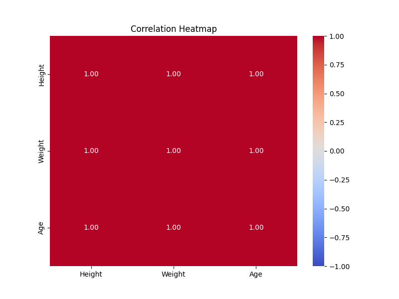
Explanation:sns.heatmap() draws the correlation heatmap. annot=True displays the values on the heatmap, cmap='coolwarm' sets the color range, and vmin=-1, vmax=1 limits the color range to -1 to 1.
Visualizing correlation
Here we will use Python's Seaborn library. Seaborn is a data visualization library based on Matplotlib, focused on statistical graphics, designed to simplify the process of data visualization.
Seaborn provides some simple high-level interfaces that make it easy to draw various statistical charts, including scatter plots, line charts, bar charts, heatmaps, etc., and it has good aesthetic effects.
Install Seaborn:
pip install seaborn
Example
import matplotlib.pyplot as plt
import pandas as pd
# Create a sample DataFrame
data = {'A': [1, 2, 3, 4, 5], 'B': [5, 4, 3, 2, 1]}
df = pd.DataFrame(data)
# Calculate Pearson correlation coefficient
correlation_matrix = df.corr()
# Visualize Pearson correlation coefficient with a heatmap
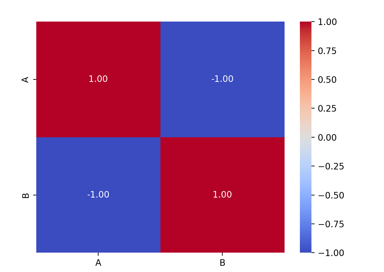
sns.heatmap(correlation_matrix, annot=True, cmap='coolwarm', fmt=".2f")
plt.show()
Explanation:This code will generate a heatmap that uses colors to represent the strength of the correlation coefficients, where positive correlations are shown in warm tones and negative correlations in cool tones.annot=TrueThe parameter displays the specific values on the heatmap.
Applications of correlation analysis
1. Feature selection
In machine learning modeling, correlation analysis is often used for feature selection. By analyzing the correlation between different features, it helps us select the features most relevant to the target variable and remove redundant features that are highly correlated with other features, thereby improving model performance and efficiency.
2. Handling multicollinearity
If the correlation between two or more features is very high (close to 1 or -1), then there is a multicollinearity problem among these features. In regression analysis, multicollinearity can lead to model instability and inaccurate predictions. This problem can be solved by deleting or merging features with high correlation.
Other extensions