Seaborn Tutorial
Seaborn is a Python data visualization library built on top of Matplotlib, focusing on creating various statistical charts to present and understand data more easily.
Seaborn's goal is to simplify the process of statistical data visualization, providing high-level interfaces and beautiful default themes, enabling users to create complex graphics with minimal code.
Seaborn provides simple high-level interfaces that can easily create various statistical charts, including scatter plots, line plots, bar plots, heatmaps, etc., with good aesthetic effects.
Seaborn emphasizes aesthetics in its design, with carefully chosen default themes and color palettes that make plots more attractive.
Installing Seaborn:
pip install seaborn
Seaborn provides a variety of built-in themes and color palettes that can be set to change the appearance of plots.
Example
# Set theme and color palette
sns.set_theme(style="whitegrid", palette="pastel")
By setting the sns.set_theme() function, you can choose different themes and contexts. The following are some built-in themes and contexts in Seaborn:
Theme
darkgrid(default): Dark grid theme.
import seaborn as sns

# 设置为 darkgrid 主题
sns.set_theme(style="darkgrid")
whitegrid: Light grid theme.
import seaborn as sns

# 设置为 whitegrid 主题
sns.set_theme(style="whitegrid")
dark: Dark theme, no grid.
import seaborn as sns

# 设置为 dark 主题
sns.set_theme(style="dark")
white: Light theme, no grid.
import seaborn as sns

# 设置为 white 主题
sns.set_theme(style="white")
ticks: Dark theme with tick marks.
import seaborn as sns

# 设置为 ticks 主题
sns.set_theme(style="ticks")
Context
paper: Suitable for small figures, with smaller labels and lines.
import seaborn as sns

# 设置为 paper 模板
sns.set_theme(context="paper")
notebook(default): Suitable for laptops and similar environments, with medium-sized labels and lines.
import seaborn as sns

# 设置为 notebook 模板
sns.set_theme(context="notebook")
talk: Suitable for presentation slides, with large labels and lines.
import seaborn as sns

# 设置为 talk 模板
sns.set_theme(context="talk")
poster: Suitable for posters, with very large labels and lines.
import seaborn as sns

# 设置为 poster 模板
sns.set_theme(context="poster")
By setting different themes and contexts, you can adjust attributes such as the size, line width, and colors of Seaborn plots to suit different plotting scenarios. These built-in themes and contexts allow users to create attractive and consistent graphics more easily.
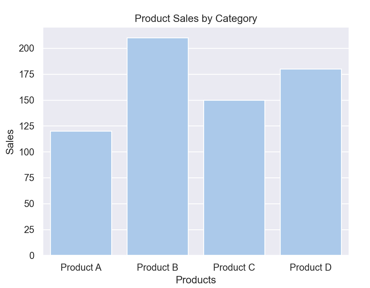
The following example uses Seaborn and Matplotlib to create a simple bar chart showing the sales of different products:
Example
import matplotlib.pyplot as plt
# Set theme and color palette
sns.set_theme(style="darkgrid", palette="pastel")
# Sample data
products = ["Product A", "Product B", "Product C", "Product D"]
sales = [120, 210, 150, 180]
# Create bar chart
sns.barplot(x=products, y=sales)
# Add labels and title
plt.xlabel("Products")
plt.ylabel("Sales")
plt.title("Product Sales by Category")
# Display the chart
plt.show()
The result is shown in the figure below:
Plotting Functions
Seaborn provides multiple plotting functions for creating various statistical charts. The following are the main plotting functions in Seaborn and their corresponding examples:
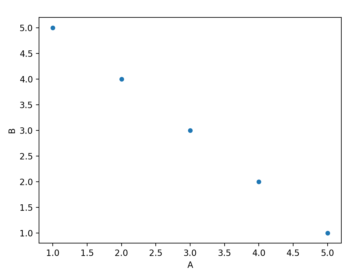
1. Scatter Plot - sns.scatterplot()
Used to create a scatter plot between two variables, with the option to add a trend line.
Example
import matplotlib.pyplot as plt
import pandas as pd
# Create a sample DataFrame
data = {'A': [1, 2, 3, 4, 5], 'B': [5, 4, 3, 2, 1]}
df = pd.DataFrame(data)
# Draw a scatter plot
sns.scatterplot(x='A', y='B', data=df)
plt.show()
The result is shown in the figure below:
2. Line Plot - sns.lineplot()
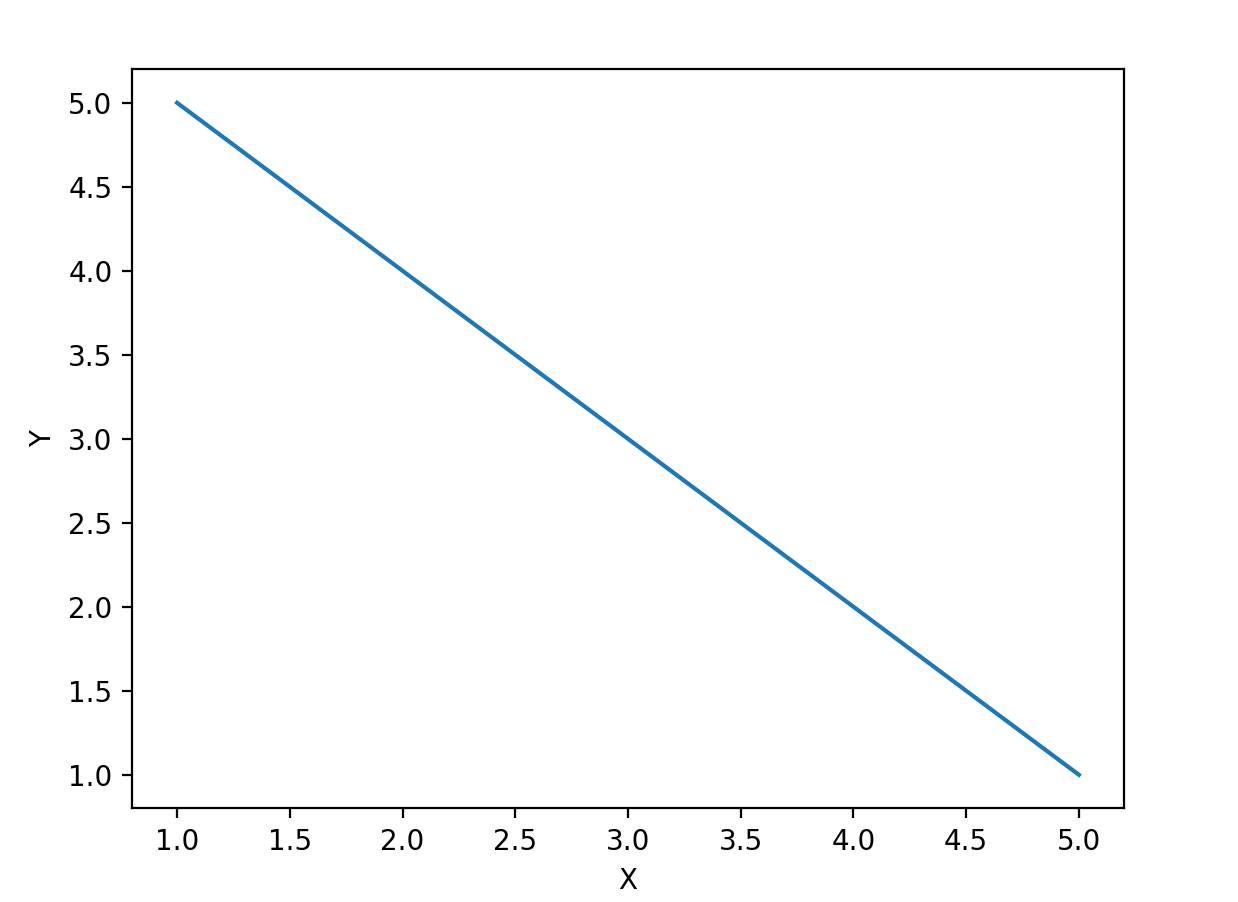
Used to plot trend lines showing how a variable changes with another variable.
Example
import matplotlib.pyplot as plt
import pandas as pd
# Create a sample DataFrame
data = {'X': [1, 2, 3, 4, 5], 'Y': [5, 4, 3, 2, 1]}
df = pd.DataFrame(data)
# Draw a line plot
sns.lineplot(x='X', y='Y', data=df)
plt.show()
The result is shown in the figure below:
3. Bar Plot - sns.barplot()
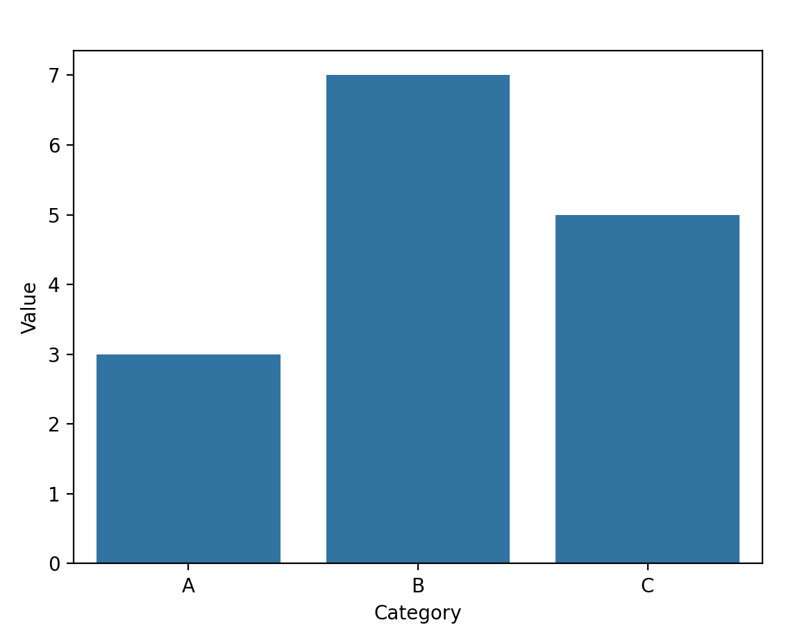
Used to create bar charts showing the mean or other aggregation functions of variables.
Example
import matplotlib.pyplot as plt
import pandas as pd
# Create a sample DataFrame
data = {'Category': ['A', 'B', 'C'], 'Value': [3, 7, 5]}
df = pd.DataFrame(data)
# Draw a bar plot
sns.barplot(x='Category', y='Value', data=df)
plt.show()
The result is shown in the figure below:
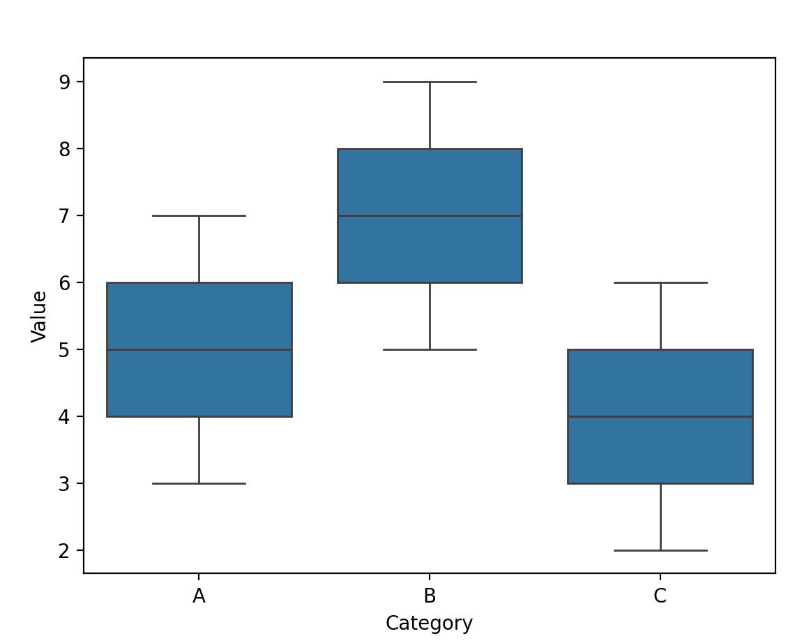
4. Box Plot - sns.boxplot()
Used to visualize the distribution of variables, including the median, quartiles, etc.
Example
import matplotlib.pyplot as plt
import pandas as pd
# Create a sample DataFrame
data = {'Category': ['A', 'A', 'B', 'B', 'C', 'C'], 'Value': [3, 7, 5, 9, 2, 6]}
df = pd.DataFrame(data)
# Draw a box plot
sns.boxplot(x='Category', y='Value', data=df)
plt.show()
The result is shown in the figure below:
5. Heatmap - sns.heatmap()
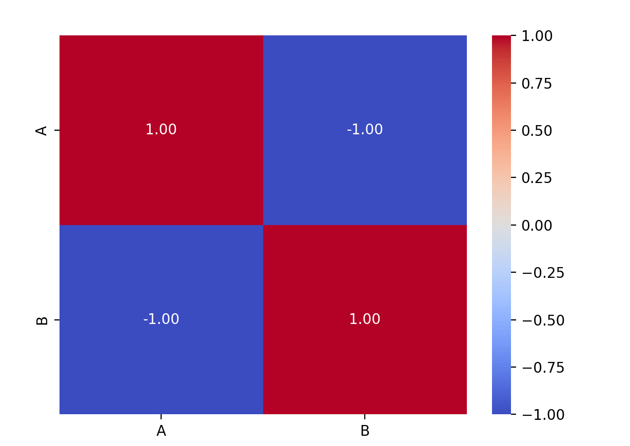
Used to create heatmaps for matrix data, often used to display correlation matrices.
Example
import matplotlib.pyplot as plt
import pandas as pd
# Create a sample DataFrame
data = {'A': [1, 2, 3, 4, 5], 'B': [5, 4, 3, 2, 1]}
df = pd.DataFrame(data)
# Create a correlation matrix
correlation_matrix = df.corr()
# Visualize the correlation matrix using a heatmap
sns.heatmap(correlation_matrix, annot=True, cmap='coolwarm', fmt=".2f")
plt.show()
The result is shown in the figure below:
6. Violin Plot - sns.violinplot()
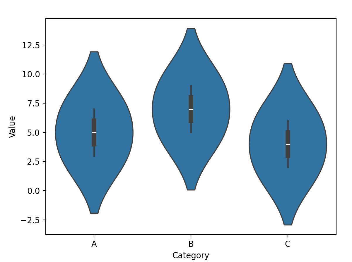
Used to display the shape and density estimation of distributions, combining box plots and kernel density estimation.
Example
import seaborn as sns
import matplotlib.pyplot as plt
import pandas as pd
# Create a sample DataFrame
data = {'Category': ['A', 'A', 'B', 'B', 'C', 'C'], 'Value': [3, 7, 5, 9, 2, 6]}
df = pd.DataFrame(data)
# Draw a violin plot
sns.violinplot(x='Category', y='Value', data=df)
plt.show()
The result is shown in the figure below:
Other ExtensionsFor more information, refer to the official tutorial:https://seaborn.pydata.org/tutorial.html