Bootstrap 5 Input Group
We can use.input-groupthe class to add more styles to form input boxes, such as icons, text, or buttons.
.input-group-textclass to set the style of the text.

Bootstrap Example
<form>
<div class="input-group mb-3">
<span class="input-group-text">@</span>
<input type="text" class="form-control" placeholder="Username">
</div>
<div class="input-group">
<input type="text" class="form-control" placeholder="Your Email">
<span class="input-group-text">@example.com</span>
</div>
</form>
Try it Yourself »
Input Group Size
Use.input-group-smthe class to set a small input group,.input-group-lgclass to set a large input group:
Bootstrap Example
<div class="input-group mb-3 input-group-sm">
<span class="input-group-text">Small</span>
<input type="text" class="form-control">
</div>
<div class="input-group mb-3">
<span class="input-group-text">Default</span>
<input type="text" class="form-control">>
</div>
<div class="input-group mb-3 input-group-lg">
<span class="input-group-text">Large</span>
<input type="text" class="form-control">
</div>
Try it Yourself »
Multiple Inputs and Text
Bootstrap Example
<!--Multiple Inputs-->
<div class="input-group mb-3">
<span class="input-group-text">Person</span>
<input type="text" class="form-control" placeholder="First Name">
<input type="text" class="form-control" placeholder="Last Name">
</div>
<!--Multiple Text Addons-->
<div class="input-group mb-3">
<span class="input-group-text">One</span>
<span class="input-group-text">Two</span>
<span class="input-group-text">Three</span>
<input type="text" class="form-control">
</div>
Try it Yourself »
Checkboxes and Radio Buttons
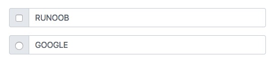
Text information can be replaced with checkboxes and radio buttons:
Bootstrap Example
<div class="input-group mb-3">
<div class="input-group-text">
<input type="checkbox">
</div>
<input type="text" class="form-control" placeholder="EXAMPLE">
</div>
<div class="input-group mb-3">
<div class="input-group-text">
<input type="radio">
</div>
<input type="text" class="form-control" placeholder="GOOGLE">
</div>
Try it Yourself »
Add Button Groups to Input Groups
Bootstrap Example
<div class="input-group mb-3">
<button class="btn btn-outline-primary" type="button">Basic Button</button>
<input type="text" class="form-control" placeholder="Some text">
</div>
<div class="input-group mb-3">
<input type="text" class="form-control" placeholder="Search">
<button class="btn btn-success" type="submit">Go</button>
</div>
<div class="input-group mb-3">
<input type="text" class="form-control" placeholder="Something clever..">
<button class="btn btn-primary" type="button">OK</button>
<button class="btn btn-danger" type="button">Cancel</button>
</div>
Try it Yourself »
Dropdown Menus
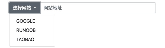
Adding a dropdown menu to an input group does not require using the .dropdown class.
Bootstrap Example
<div class="input-group mt-3 mb-3">
<button type="button" class="btn btn-primary dropdown-toggle" data-bs-toggle="dropdown">Select Website</button>
<ul class="dropdown-menu">
<li><a class="dropdown-item" href="https://www.google.com">GOOGLE</a></li>
<li><a class="dropdown-item" href="https://www.example.com">EXAMPLE</a></li>
<li><a class="dropdown-item" href="https://www.taobao.com">TAOBAO</a></li>
</ul>
<input type="text" class="form-control" placeholder="Website Address">
</div>
Try it Yourself »
Input Group Labels
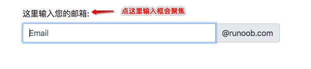
In an input group, you can set a label by placing a label outside the input group. The for attribute of the label must correspond to the id of the input group. Clicking the label will focus the input:
Bootstrap Example
<form>
<label for="demo">Enter your email here:</label>
<div class="input-group mb-3">
<input type="text" class="form-control" placeholder="Email" id="demo" name="email">
<span class="input-group-text">@example.com</span>
</div>
</form>
Try it Yourself »