Bootstrap 5 Alerts
Bootstrap 5 makes it easy to create alert boxes.
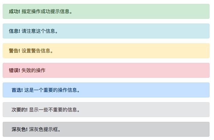
Alerts can use the.alertclass, followed by the.alert-success, .alert-info, .alert-warning, .alert-danger, .alert-primary, .alert-secondary, .alert-lightor.alert-darkclass to achieve:
Example
<div class="alert alert-success">
<strong>Success!</strong>Indicates a successful or positive action.</div>
Try it Yourself »
Alerts with Links
In alerts, add thealert-linkclass to set a link matching the alert color:
Example
<div class="alert alert-success">
<strong>Success!</strong>You should carefully read<a href="#" class="alert-link">this message</a>。
</div>
Try it Yourself »
Closing Alerts
We can add the.alert-dismissibleclass to the div in the alert, and then add theclass="btn-close"anddata-bs-dismiss="alert"class to the close button link to set the alert close action.
Example
<div class="alert alert-success alert-dismissible">
<button type="button" class="btn-close" data-bs-dismiss="alert"></button>
<strong>Success!</strong>Indicates a successful or positive action.</div>
Try it Yourself »
Alert Animations
.fadeand.showThe class is used to set the fade out and fade in effects when closing the alert:
Other Extensions