Bootstrap5 Checkboxes and Radio Buttons
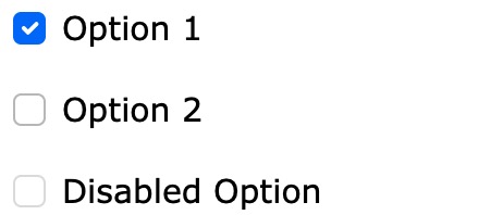
If you want users to select any number of options from a preset list, you can use checkboxes:
Example
<div class="form-check">
<input class="form-check-input" type="checkbox" id="check1" name="option1" value="something" checked>
<label class="form-check-label">Option 1</label>
</div>
Try it Yourself »
Checkboxes use class="form-check" to ensure proper margins between the label and the checkbox.
The .form-check-label class is added to the label element, and the .form-check-input class is added inside the .form-check container to style the checkboxes.
The checked attribute is used to set the default selected option.
Radio Buttons
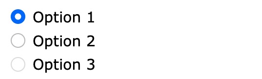
If you want users to select one option from a preset list, you can use radio buttons:
Example
<div class="form-check">
<input type="radio" class="form-check-input" id="radio1" name="optradio" value="option1" checked>Option 1
<label class="form-check-label" for="radio1"></label>
</div>
<div class="form-check">
<input type="radio" class="form-check-input" id="radio2" name="optradio" value="option2">Option 2
<label class="form-check-label" for="radio2"></label>
</div>
<div class="form-check">
<input type="radio" class="form-check-input" disabled>Option 3
<label class="form-check-label"></label>
</div>
Try it Yourself »
Toggle Switches
If you want to turn a checkbox into a toggle switch, you can.form-checkuse the.form-switchclass inside the container:

Example
<div class="form-check form-switch">
<input class="form-check-input" type="checkbox" id="mySwitch" name="darkmode" value="yes" checked>
<label class="form-check-label" for="mySwitch">Dark Mode</label>
</div>
Try it Yourself »