Bootstrap 5 Cards
Bootstrap 5 Card component is a powerful and flexible container for displaying various content such as text, images, lists, buttons, and more.
The Card component has been improved and enhanced in Bootstrap 5, providing more customization options and more flexible layout methods.
Card components are very common in UI design, especially suitable for blogs, social media, dashboards, and other content display pages.
baseStructure
The Bootstrap 5 Card component includes the following common elements:
.card: The outermost container of the card..card-body: The main content area of the card..card-title: The title part of the card..card-text: The text part of the card..card-img-topor.card-img-bottom: The image at the top or bottom of the card.
Card style class description:
| Class Name | Description | Example Usage |
|---|---|---|
.card | The container class of the card, used to wrap the entire card. | <div class="card">...</div> |
.card-body | A container that contains the card content, usually used to place text, titles, etc. | <div class="card-body">...</div> |
.card-title | The card title class, usually containing the main title of the card. | <h5 class="card-title">Card Title</h5> |
.card-text | The card text class, usually containing the body content of the card. | <p class="card-text">Some quick example text...</p> |
.card-img-top | The card image top class, usually used to display the image at the top of the card. | <img src="image.jpg.html" class="card-img-top"> |
.card-img-bottom | The card image bottom class, usually used to display the image at the bottom of the card. | <img src="image.jpg.html" class="card-img-bottom"> |
.card-header | The header area of the card, used to place titles or other content. | <div class="card-header">Card Header</div> |
.card-footer | The footer area of the card, used to place additional information or action buttons, etc. | <div class="card-footer">Card Footer</div> |
.card-link | Used to create links in the card. | <a href="../index.html" class="card-link">Card link</a> |
.card-deck | Deprecated in Bootstrap 5, userowandcolinstead. | <div class="card-deck">...</div> |
.card-group | Deprecated in Bootstrap 5, userowandcolinstead. | <div class="card-group">...</div> |
.card-columns | Uses a multi-column layout, with cards arranged in a flow layout. | <div class="card-columns">...</div> |
.card-subtitle | The subtitle of the card, usually displayed below the title. | <h6 class="card-subtitle mb-2 text-muted">Card subtitle</h6> |
.card-img-overlay | Overlays a content layer on the card image, commonly used to display text or other elements. | <div class="card-img-overlay">Overlay content</div> |
Simple Card
We can use Bootstrap 5's.cardand.card-bodyclass to create a simple card. The card can include a header, content, footer, and various color settings. The example is as follows:

Header and Footer
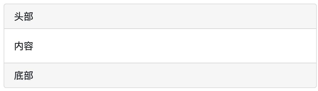
.card-headerclass is used to create the header style of the card,.card-footerclass is used to create the footer style of the card:
Example
Try it Yourself »
Card Colors
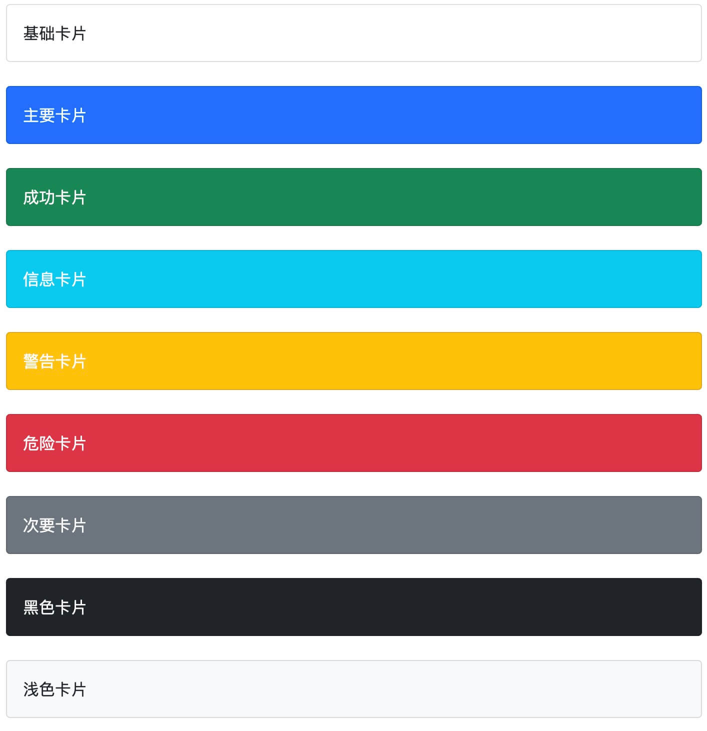
Bootstrap 5 provides multiple background color classes for cards:.bg-primary, .bg-success, .bg-info, .bg-warning, .bg-danger, .bg-secondary, .bg-darkand.bg-light。
Example
Try it Yourself »
Title, Text, and Links
We can use on the header element.card-titleclass to set the title of the card..card-bodyclass is used to set the content of the card body..card-textclass is used to set the card.card-bodyThe `<p>` tag in the class. If it is the last line, the bottom margin can be removed..card-linkclass is used to set the color for links.
Example
Try it Yourself »
Image Cards
We can <img>add.card-img-top(image above the text) or.card-img-bottom(image below the text) to set the image card:
Example
Try it Yourself »
If you want to set the image as a background, you can use.card-img-overlayclass:
Example
Try it Yourself »