Python Tkinter Checkbutton
 Python GUI Programming
The Python Tkinter Checkbutton is used to select the options we need. It has a small square box in front. If selected, it shows a checkmark. You can click it again to remove the checkmark and cancel the selection.
Syntax
The syntax format is as follows:
w = Checkbutton ( master, option=value, ... )
master: The parent container of the button.
options: Optional items, i.e., the configurable properties of the button. These options can be set in the form of key = value and separated by commas.
| No. | Option & Description |
|---|---|
| 1 | activebackground The background color of the button when the mouse hovers over it. |
| 2 | activeforeground The foreground color of the button when the mouse hovers over it. |
| 3 | bg The background color of the button. |
| 4 | bitmap Bitmap |
| 5 | bd The size of the border, defaulting to 2 pixels. |
| 6 | command The associated function, which is executed when the button is clicked. |
| 7 | cursor Cursor shape setting, such as arrow, circle, cross, plus, etc. |
| 8 | disabledforeground The foreground color of the disabled option. |
| 9 | font Text font |
| 10 | fg The foreground color of the option. |
| 11 | height The number of text lines in the checkbutton, defaulting to 1. |
| 12 | highlightcolor The highlight color when focused. |
| 13 | image Whether to use an icon. |
| 14 | justify When displaying multi-line text, sets the alignment between different lines. Options include LEFT, RIGHT, CENTER. |
| 15 | offvalue The value of the Checkbutton is not only 1 or 0; it can be other types of values. You can set the state value of the Checkbutton through the onvalue and offvalue properties. |
| 16 | onvalue The value of the Checkbutton is not only 1 or 0; it can be other types of values. You can set the state value of the Checkbutton through the onvalue and offvalue properties. |
| 17 | padx The padding of the button in the x-axis direction, referring to the distance between the button's content and the button's edge, defaulting to 1 pixel. |
| 18 | pady The padding of the button in the y-axis direction, defaulting to 1 pixel. |
| 19 | relief Border style, sets the 3D effect of the widget. Options include: FLAT, SUNKEN, RAISED, GROOVE, RIDGE. Default is FLAT. |
| 20 | selectcolor The color when selected, defaulting to selectcolor="red". |
| 21 | selectimage The image when selected. |
| 22 | state State, defaulting to state=NORMAL. |
| 23 | text The displayed text. Use "\n" to wrap the text. |
| 24 | underline Underline. By default, the text on the button has no underline. The value is the string index with an underline. When 0, the first character is underlined; when 1, the first two characters are underlined; and so on. |
| 25 | variable Variable. The value of variable is 1 or 0, representing selected or not selected. |
| 26 | width The default width is determined by the text or image of the checkbutton. You can set a specified number of characters. |
| 27 | wraplength Whether to enable wrapping. |
Methods
The following are commonly used methods:| No. | Method & Description |
|---|---|
| 1 | deselect() Clears the selected option of the checkbutton. |
| 2 | flash() Flashes the radio button a few times between the active state color and the normal color, but keeps it in the state it started in. |
| 3 | invoke() You can call this method to get the same operation as when the user clicks the radio button to change its state. |
| 4 | select() Sets the button to selected. |
| 5 | toggle() Toggles between selected and unselected options. |
Example
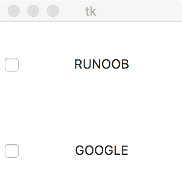
In the example, clicking the button will display a message:
Example
The test output result is as follows:
 Other Extensions