Developing React with VSCode
Visual Studio Code (VS Code) is a free, open-source code editor developed by Microsoft. It supports multiple programming languages and provides features such as syntax highlighting, intelligent code completion, code refactoring, and debugging.
VS Code has a built-in terminal, allowing you to run command-line tools such as npm and yarn directly in the editor, making project building and management convenient.
If you want a richer Vue.js development environment, you can install the Volar and Volar for TypeScript extensions, which provide intelligent suggestions for Vue.js.
If you don't know VS Code yet or haven't installed it, you can refer to:VSCode Tutorial。
Why Choose VS Code for React Development?
- Smart completion: Perfect support for JSX, React Hooks, Props, etc.
- Rich plugins: One-click installation of ESLint, Prettier, code snippets, etc., to boost efficiency.
- Integrated terminal: Run directly in the editor
npm run devand other commands.
- Debugging tools: Built-in debugger + React DevTools combined, a god-level experience.
- Cross-platform: Windows, macOS, and Linux are all perfectly supported.
- Free and open source: Maintained by Microsoft, with an active community.
Download and Install VS Code
-
Visit the official website:https://code.visualstudio.com/
-
Click the bigDownloadbutton, choose your operating system:
- Windows: Download the .exe installer
- macOS: Download the .dmg (drag to Applications)
- Linux: Choose .deb or .rpm based on your distribution
-
Installation process:
- Windows/macOS: Double-click the installer and click Next/Continue all the way.
- Recommended: Check "Add to PATH" and "Register as code editor" (for easy command-line opening).
-
Verify the installation:
- Open VS Code and you will see the welcome screen.
- Windows users can enter the following in the command line
code --versionto test.
Open Your React Project
-
Open VS Code.
-
Method 1: MenuFile → Open Folder, select your project folder (e.g.my-first-react-app)。
-
Method 2 (Recommended): In the terminal, navigate to the project directory, then open with one click:
cd my-first-react-app
code .
(code .The command will open the current folder directly with VS Code.)
npm run devand other commands.Visit the official website:https://code.visualstudio.com/
Click the bigDownloadbutton, choose your operating system:
- Windows: Download the .exe installer
- macOS: Download the .dmg (drag to Applications)
- Linux: Choose .deb or .rpm based on your distribution
Installation process:
- Windows/macOS: Double-click the installer and click Next/Continue all the way.
- Recommended: Check "Add to PATH" and "Register as code editor" (for easy command-line opening).
Verify the installation:
- Open VS Code and you will see the welcome screen.
- Windows users can enter the following in the command line
code --versionto test.
Open VS Code.
Method 1: MenuFile → Open Folder, select your project folder (e.g.my-first-react-app)。
Method 2 (Recommended): In the terminal, navigate to the project directory, then open with one click:
cd my-first-react-app code .
(code .The command will open the current folder directly with VS Code.)
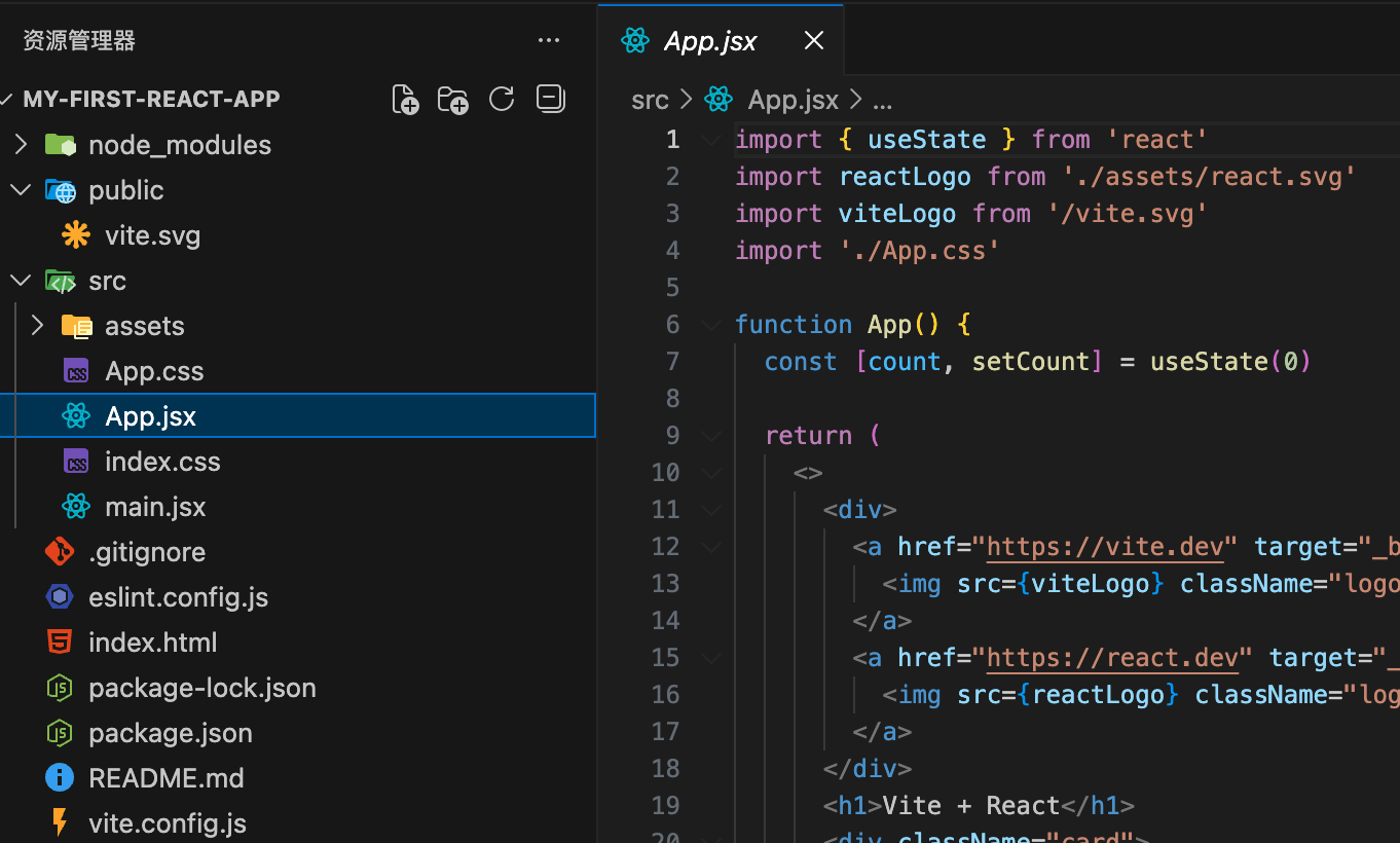
Now you see the file explorer on the left, showing the project structure (e.g., src, public, etc.).
Install Essential Plugins (Extensions)
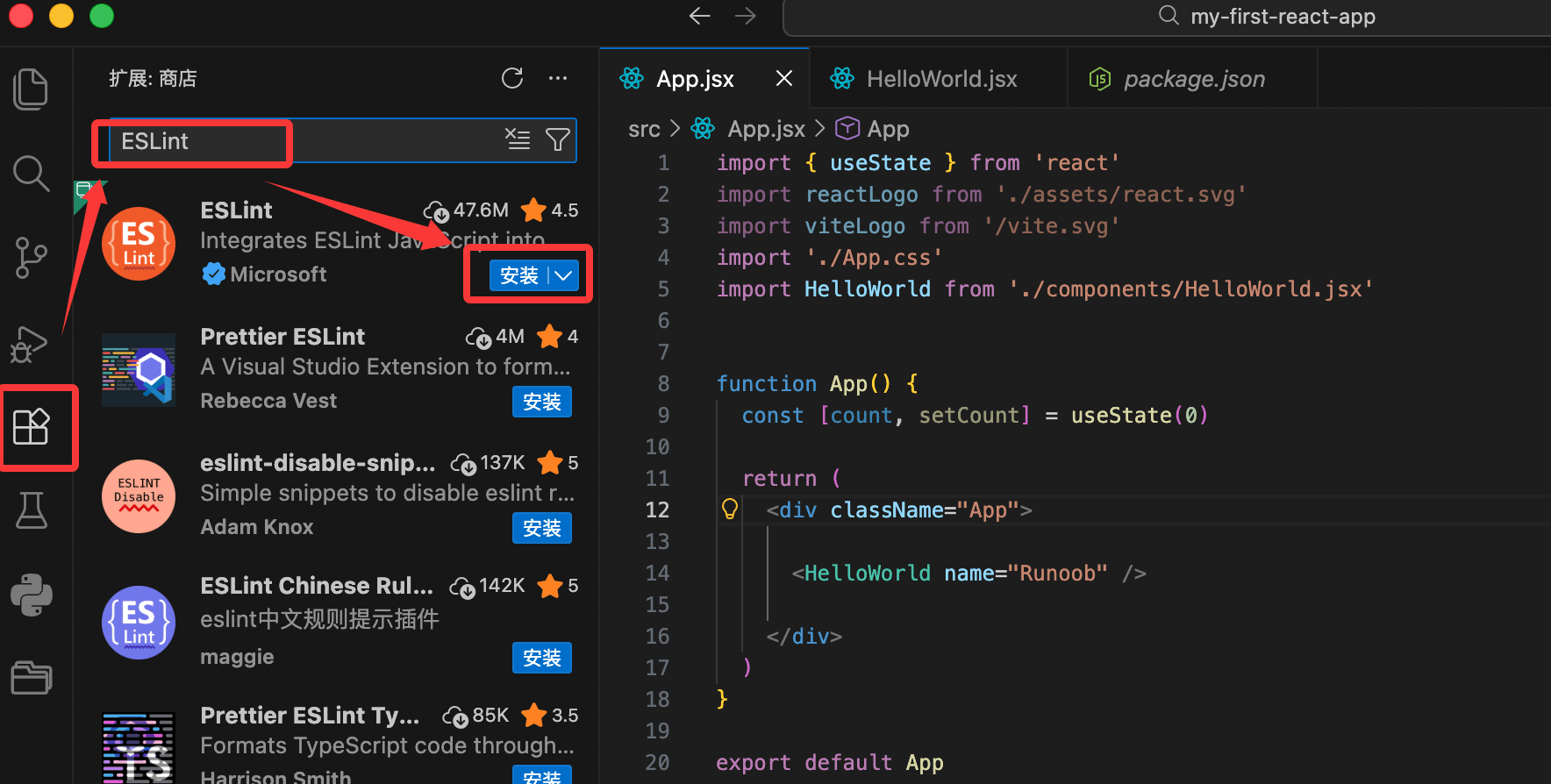
The power of VS Code lies in its extensions. Click theExtensionsicon (four squares) in the left activity bar, or press the shortcutCtrl+Shift+X(macOS: Cmd+Shift+X) to open the Extensions Marketplace.
Search for and install the following extensions (click Install):
-
ESLint(Author: Microsoft)
- Real-time code linting, officially recommended by React.
- After installation, it will mark errors in red in your code.
-
Prettier - Code formatter(Author: Prettier)
- Automatically formats code to keep a consistent style.
-
ES7+ React/Redux/React-Native snippets(Author: dsznajder)
- A code snippet powerhouse! Enter a shortcut to quickly generate components.
- Common snippets:
rafce→ Generate arrow function component + export defaultrfc→ Generate function componentuseState→ Quickly generate useState
-
Path Intellisense(Author: Christian Kohler)
- Automatic import path completion (super useful when importing).
-
Bracket Pair Colorizer 2Or built-in bracket coloring (built into VS Code 1.60+)
- Color-coded brackets make it easier to read nested JSX.
-
GitLens(Optional, but highly recommended)
- Git enhancement, view code commit history.
React-specific recommendations(Optional advanced):
- Tailwind CSS IntelliSense(If using Tailwind)
- React Developer Tools(Browser extension already installed, not needed here)
After installation, restart VS Code (or pressCtrl+Shift+P → Reload Window)。
Configure VS Code to Improve Your React Development Experience
pressCtrl+Shift+P(macOS: Cmd+Shift+P) to open the command palette, type "Preferences: Open Settings (JSON)" to opensettings.json。
Create in the project root directory.vscode/settings.json(project-level configuration recommended), add the following:
{
  // 保存时自动格式化
  "editor.formatOnSave": true,
  // 默认使用 Prettier 格式化
  "editor.defaultFormatter": "esbenp.prettier-vscode",

  // ESLint 自动修复
  "editor.codeActionsOnSave": {
    "source.fixAll.eslint": "explicit"
  },

  // JSX/TSX 文件也应用 Prettier
  "[javascript]": {
    "editor.defaultFormatter": "esbenp.prettier-vscode"
  },
  "[javascriptreact]": {
    "editor.defaultFormatter": "esbenp.prettier-vscode"
  },

  // 显示行号、缩进指南
  "editor.rulers": [80],
  "editor.guides.indentation": true
}
Takes effect after saving. Now every time you save code, Prettier will automatically format, and ESLint will automatically fix common issues.
Verify: Deliberately write non-standard code (e.g., missing semicolons), save it, and see whether it is automatically fixed.
Actually Write React Code: Create a Component from Scratch
In the left Explorer, right-clicksrcfolder → New Folder → createcomponentsfolder.
Right-clickcomponents→ New File → createGreeting.jsx。
Use a code snippet to quickly generate a component:
- Type
rafce(react arrow function component export) - Press Tab to automatically generate the template:
import React from 'react'

const Greeting = () => {
  return (
    <div>Greeting</div>
  )
}

export default Greeting
Modify it into a complete component (demonstrating state and Props):
Example
const Greeting = ({ name = 'Stranger' }) => {
const [count, setCount] = useState(0);
return (
<div style={{ padding: '20px', border: '1px solid #ccc' }}>
<h2>Hello,{name}!</h2>
<p>You have clicked{count}times</p>
<button onClick={() => setCount(count + 1)}>
Click me+1
</button>
</div>
);
};
export default Greeting;
Insrc/App.jsximport and use it in:
Example
// Add this in the return:
<div>
<Greeting name="Example" />
<Greeting /> {/* Use the default name */}
</div>
Save all files (Ctrl+S), switch to the browser, and hot reload will automatically display the new component!
Experience highlights:
- When typing
useState, intelligent completion will provide suggestions. - When importing paths
./components/Greeting.jsx, Path Intellisense will auto-complete. - After saving, Prettier automatically formats indentation.
- If there are errors, ESLint will mark them red in the Problems panel (at the bottom).
Integrated Terminal and Debugging Tips
Built-in terminal: Menu Terminal → New Terminal, orCtrl+`(backtick).
- Run directly
pnpm dev, the server output is right here.
Debugging React code:
- Install the browser extensionReact Developer Tools(if not already installed).
- In VS Code, press F5 to start debugging (you need to configure launch.json first, but for beginners, use the browser DevTools for now).
- In the browser, press F12 → Components tab to view the Props and state of your Greeting component.
Common shortcuts(Must memorize):
- Ctrl + S: Save
- Ctrl + /: Comment line
- Alt + ↑/↓: Move line
- Ctrl + D: Multi-cursor select the same word
- Ctrl + Shift + P: Command palette (universal)
Mini Exercise: Build a Card Component
- Create
components/Card.jsx, userafceto generate. - Implement a card component that accepts three Props: title, content, and imageUrl.
- Use it twice in App.jsx to display different content.
- Add some inline styles to beautify.
After completion, your page will have multiple beautiful cards!
Step 1: Create the Card.jsx Component
-
In
srcUnder the folder, right-click → New Folder → createcomponentsfolder (if it doesn't exist yet). -
Right-click
componentsfolder → New File → createCard.jsx。 -
In
Card.jsxEnter inrafce(Press Tab to auto-generate the template), then modify it to the following code:
Card.jsx File Code:
const Card = ({ title, content, imageUrl }) => {
return (
<div
style={{
width: '300px',
border: '1px solid #ccc',
borderRadius: '12px',
overflow: 'hidden',
boxShadow: '0 4px 12px rgba(0, 0, 0, 0.1)',
margin: '20px auto',
backgroundColor: '#fff',
fontFamily: 'Arial, sans-serif',
}}
>
{imageUrl && (
<img
src={imageUrl}
alt={title}
style={{
width: '100%',
height: '200px',
objectFit: 'cover',
}}
/>
)}
<div style={{ padding: '20px' }}>
<h3 style={{ margin: '0 0 10px 0', color: '#333' }}>{title}</h3>
<p style={{ margin: 0, color: '#666', lineHeight: '1.5' }}>
{content}
</p>
</div>
</div>
);
};
export default Card;
Explanation:
- Use destructured props:
{ title, content, imageUrl }。 - Inline style beautification: rounded corners, shadows, responsive images, spacing, etc., making the cards look modern and professional.
- Conditional image rendering: if there is no
imageUrl, then the image is not displayed (using&&implementation).
Step 2: Modify App.jsx to use the Card component twice
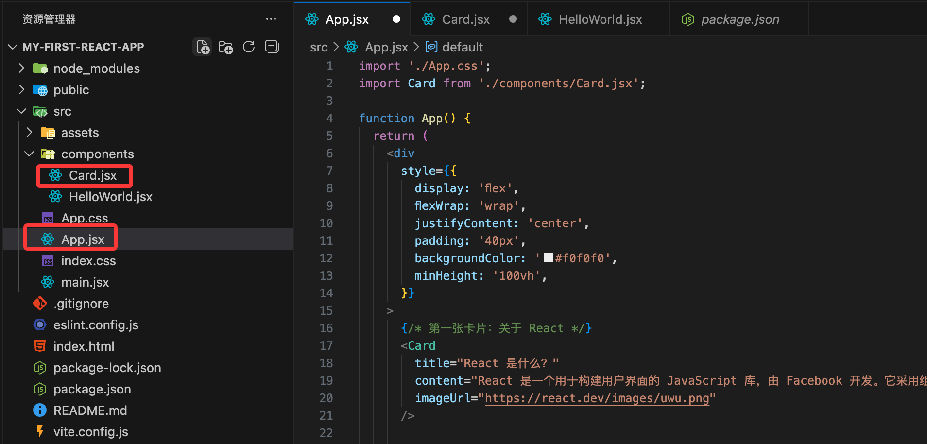
Opensrc/App.jsx, and replace the content with the following code (preserving some of the original structure, cleaning up the default counter, and focusing on card display):
src/App.jsx File Code:
import Card from './components/Card.jsx';
function App() {
return (
<div
style={{
display: 'flex',
flexWrap: 'wrap',
justifyContent: 'center',
padding: '40px',
backgroundColor: '#f0f0f0',
minHeight: '100vh',
}}
>
{/* First card: About React */}
<Card
title="What is React?"
content="React is a JavaScript library for building user interfaces, developed by Facebook. It uses a component-based approach, making code easier to reuse and maintain."
imageUrl="https://react.dev/images/uwu.png"
/>
{/* Second card: About Vite */}
<Card
title="Advantages of Vite"
content="Vite is a new generation front-end build tool. Its development server starts extremely fast and supports Hot Module Replacement (HMR). It is the first choice for modern React projects."
imageUrl="https://vite.dev/logo-without-border.svg"
/>
{/* You can add a third one to try! */}
</div>
);
}
export default App;
Explanation:
- Import
Cardthe component. - Use
<Card />twice, passing different props. - The outer div of App uses flex layout to arrange multiple cards horizontally (responsive wrapping).
- The image URLs use official public images (React's small icon and Vite's logo). No local resources are needed; they load directly online.
Step 3: Run and view the result
- Save all files (Ctrl+S).
- If the development server is not running, execute in the VS Code terminal:
npm run dev
- Open http://localhost:5173 in your browser, and you will see two (or more) beautiful cards arranged in the center, with images, titles, and content!
Effect preview (text description):
- The cards have shadows and rounded corners, looking like Material Design style.
- The image fills the width at the top, and the text section has comfortable spacing.
- The background is light gray, the cards are white, and the visual is clear.