BootstrapMedia Objects
In diesem Kapitel behandeln wir Media Objects in Bootstrap. Diese abstrakten Objektstile werden verwendet, um verschiedene Komponententypen zu erstellen (wie Blog-Kommentare). Wir können eine Mischung aus Text und Bildern in Komponenten verwenden, und die Bilder können links- oder rechtsbündig ausgerichtet werden. Mit Media Objects können Sie Medienobjekte mit weniger Code mit Text mischen.
Sie können die folgenden beiden Formen in HTML-Tags hinzufügen, um Media Objects einzurichten:
- .media: Mit dieser Klasse kann das Medium (Bilder, Videos) in einem Media Object links oder rechts vom Inhaltsblock schweben.
- .media-list: Wenn Sie eine Liste benötigen, bei der jedes Element Teil einer ungeordneten Liste ist, können Sie diese Klasse verwenden. Sie kann für Kommentarlisten und Artikellisten verwendet werden.
Schauen wir uns im Folgenden ein Beispiel an, das die Klasse .media für Media Objects verwendet:
<div class="media">
   <a class="pull-left" href="../index.html">
      <img class="media-object" src="../bootstrap/images/64.jpg.html"
      alt="Media Object">
   </a>
   <div class="media-body">
      <h4 class="media-heading">Media heading</h4>
      This is some sample text. This is some sample text.
      This is some sample text. This is some sample text.
      This is some sample text. This is some sample text.
      This is some sample text. This is some sample text.
   </div>
</div>
<div class="media">
   <a class="pull-left" href="../index.html">
      <img class="media-object" src="../bootstrap/images/64.jpg.html"
      alt="Media Object">
   </a>
   <div class="media-body">
      <h4 class="media-heading">Media heading</h4>
      This is some sample text. This is some sample text.
      This is some sample text. This is some sample text.
      This is some sample text. This is some sample text.
      This is some sample text. This is some sample text.
      <div class="media">
         <a class="pull-left" href="../index.html">
            <img class="media-object" src="../bootstrap/images/64.jpg.html"
            alt="Media Object">
         </a>
         <div class="media-body">
            <h4 class="media-heading">Media heading</h4>
            This is some sample text. This is some sample text.
            This is some sample text. This is some sample text.
            This is some sample text. This is some sample text.
            This is some sample text. This is some sample text.
         </div>
      </div>
   </div>
</div>
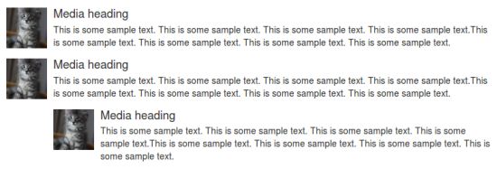
Die Wirkung des obigen Beispiels ist unten dargestellt:
Schauen wir uns im Folgenden ein Beispiel an, das die Klasse .media-list für Media Objects verwendet:
<ul class="media-list">
   <li class="media">
      <a class="pull-left" href="../index.html">
         <img class="media-object" src="../bootstrap/images/64.jpg.html"
         alt="Generic placeholder image">
      </a>
      <div class="media-body">
         <h4 class="media-heading">Media heading</h4>
         <p>This is some sample text. This is some sample text.
            This is some sample text. This is some sample text.
            This is some sample text. This is some sample text.
            This is some sample text. This is some sample text.</p>
         <!-- Nested media object -->
         <div class="media">
            <a class="pull-left" href="../index.html">
               <img class="media-object" src="../bootstrap/images/64.jpg.html"
               alt="Generic placeholder image">
            </a>
            <div class="media-body">
               <h4 class="media-heading">Nested media heading</h4>
               This is some sample text. This is some sample text.
               This is some sample text. This is some sample text.
               This is some sample text. This is some sample text.
               This is some sample text. This is some sample text.
               <!-- Nested media object -->
               <div class="media">
                  <a class="pull-left" href="../index.html">
                     <img class="media-object" src="../bootstrap/images/64.jpg.html"
                     alt="Generic placeholder image">
                  </a>
                  <div class="media-body">
                     <h4 class="media-heading">Nested media heading</h4>
                     This is some sample text. This is some sample text.
                     This is some sample text. This is some sample text.
                     This is some sample text. This is some sample text.
                     This is some sample text. This is some sample text.
                  </div>
               </div>
            </div>
         </div>
         <!-- Nested media object -->
         <div class="media">
            <a class="pull-left" href="../index.html">
               <img class="media-object" src="../bootstrap/images/64.jpg.html"
               alt="Generic placeholder image">
            </a>
            <div class="media-body">
               <h4 class="media-heading">Nested media heading</h4>
               This is some sample text. This is some sample text.
               This is some sample text. This is some sample text.
               This is some sample text. This is some sample text.
               This is some sample text. This is some sample text.
            </div>
         </div>
      </div>
   </li>
   <li class="media">
      <a class="pull-right" href="../index.html">
         <img class="media-object" src="../bootstrap/images/64.jpg.html"
         alt="Generic placeholder image">
      </a>
      <div class="media-body">
         <h4 class="media-heading">Media heading</h4>
         This is some sample text. This is some sample text.
         This is some sample text. This is some sample text.
         This is some sample text. This is some sample text.
         This is some sample text. This is some sample text.
      </div>
   </li>
</ul>
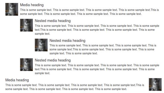
Die Wirkung des obigen Beispiels ist unten dargestellt: