BootstrapObjets média
Dans ce chapitre, nous allons discuter des objets média dans Bootstrap. Ces styles d'objets abstraits sont utilisés pour construire divers types de composants (comme les commentaires de blog). Nous pouvons utiliser un mélange de texte et d'images dans les composants, et les images peuvent être alignées à gauche ou à droite. Les objets média vous permettent de mélanger des objets média avec du texte en utilisant moins de code.
Vous pouvez ajouter les deux formes suivantes dans les balises HTML pour configurer des objets média :
- .media: Cette classe permet au média (images, vidéos) dans un objet média de flotter à gauche ou à droite du bloc de contenu.
- .media-list: Si vous avez besoin d'une liste où chaque élément fait partie d'une liste non ordonnée, vous pouvez utiliser cette classe. Elle peut être utilisée pour les listes de commentaires et les listes d'articles.
Ci-dessous, regardons un exemple utilisant la classe .media pour les objets média :
<div class="media">
   <a class="pull-left" href="../index.html">
      <img class="media-object" src="../bootstrap/images/64.jpg.html"
      alt="Media Object">
   </a>
   <div class="media-body">
      <h4 class="media-heading">Media heading</h4>
      This is some sample text. This is some sample text.
      This is some sample text. This is some sample text.
      This is some sample text. This is some sample text.
      This is some sample text. This is some sample text.
   </div>
</div>
<div class="media">
   <a class="pull-left" href="../index.html">
      <img class="media-object" src="../bootstrap/images/64.jpg.html"
      alt="Media Object">
   </a>
   <div class="media-body">
      <h4 class="media-heading">Media heading</h4>
      This is some sample text. This is some sample text.
      This is some sample text. This is some sample text.
      This is some sample text. This is some sample text.
      This is some sample text. This is some sample text.
      <div class="media">
         <a class="pull-left" href="../index.html">
            <img class="media-object" src="../bootstrap/images/64.jpg.html"
            alt="Media Object">
         </a>
         <div class="media-body">
            <h4 class="media-heading">Media heading</h4>
            This is some sample text. This is some sample text.
            This is some sample text. This is some sample text.
            This is some sample text. This is some sample text.
            This is some sample text. This is some sample text.
         </div>
      </div>
   </div>
</div>
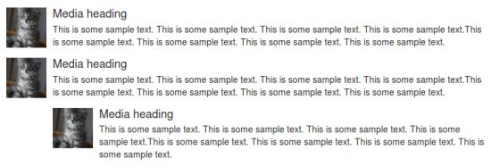
L'effet de l'exemple ci-dessus est illustré ci-dessous :
Ci-dessous, examinons un exemple utilisant la classe .media-list pour les objets média :
<ul class="media-list">
   <li class="media">
      <a class="pull-left" href="../index.html">
         <img class="media-object" src="../bootstrap/images/64.jpg.html"
         alt="Generic placeholder image">
      </a>
      <div class="media-body">
         <h4 class="media-heading">Media heading</h4>
         <p>This is some sample text. This is some sample text.
            This is some sample text. This is some sample text.
            This is some sample text. This is some sample text.
            This is some sample text. This is some sample text.</p>
         <!-- Nested media object -->
         <div class="media">
            <a class="pull-left" href="../index.html">
               <img class="media-object" src="../bootstrap/images/64.jpg.html"
               alt="Generic placeholder image">
            </a>
            <div class="media-body">
               <h4 class="media-heading">Nested media heading</h4>
               This is some sample text. This is some sample text.
               This is some sample text. This is some sample text.
               This is some sample text. This is some sample text.
               This is some sample text. This is some sample text.
               <!-- Nested media object -->
               <div class="media">
                  <a class="pull-left" href="../index.html">
                     <img class="media-object" src="../bootstrap/images/64.jpg.html"
                     alt="Generic placeholder image">
                  </a>
                  <div class="media-body">
                     <h4 class="media-heading">Nested media heading</h4>
                     This is some sample text. This is some sample text.
                     This is some sample text. This is some sample text.
                     This is some sample text. This is some sample text.
                     This is some sample text. This is some sample text.
                  </div>
               </div>
            </div>
         </div>
         <!-- Nested media object -->
         <div class="media">
            <a class="pull-left" href="../index.html">
               <img class="media-object" src="../bootstrap/images/64.jpg.html"
               alt="Generic placeholder image">
            </a>
            <div class="media-body">
               <h4 class="media-heading">Nested media heading</h4>
               This is some sample text. This is some sample text.
               This is some sample text. This is some sample text.
               This is some sample text. This is some sample text.
               This is some sample text. This is some sample text.
            </div>
         </div>
      </div>
   </li>
   <li class="media">
      <a class="pull-right" href="../index.html">
         <img class="media-object" src="../bootstrap/images/64.jpg.html"
         alt="Generic placeholder image">
      </a>
      <div class="media-body">
         <h4 class="media-heading">Media heading</h4>
         This is some sample text. This is some sample text.
         This is some sample text. This is some sample text.
         This is some sample text. This is some sample text.
         This is some sample text. This is some sample text.
      </div>
   </li>
</ul>
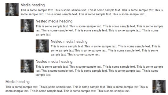
L'effet de l'exemple ci-dessus est illustré ci-dessous :