SVG Shadow
<feOffset>
<feOffset>It is an element in SVG filters, used to create an offset effect on an image. It can be used to create shadows, outlines, and other visual effects. Its function is to move each pixel of the input image by a certain distance along the specified horizontal and vertical directions, and then use the resulting image as the output of the filter effect.
Basic Syntax
<feOffset dx="x-offset" dy="y-offset" />
dxThe attribute defines the offset of the shadow in the horizontal direction.dyThe attribute defines the offset of the shadow in the vertical direction.
The following code defines an offset filter, then applies it to a red-filled rectangle, so that the rectangle presents a shadow with an offset effect. The shadow is offset by 5 pixels in both the horizontal and vertical directions.
Example
<!-- Define offset filter -->
<filter id="offset_filter">
<feOffset dx="5" dy="5" />
</filter>
<!-- Rectangle applying the offset filter -->
<rect x="50" y="50" width="100" height="80" fill="red" filter="url(#offset_filter)" />
</svg>
<feDropShadow>
SVG shadow effects can be achieved with the<feDropShadow>element, which can add shadow effects to SVG graphic elements, making them look more three-dimensional and realistic.
Basic Syntax
<feDropShadow dx="offset-x" dy="offset-y" stdDeviation="blur-radius" flood-color="color" flood-opacity="opacity" />
dxThe attribute defines the offset of the shadow in the horizontal direction.dyThe attribute defines the offset of the shadow in the vertical direction.stdDeviationThe attribute defines the blur radius of the shadow, usually used to control the blurriness of the shadow.flood-colorThe attribute defines the color of the shadow, defaulting to black.flood-opacityThe attribute defines the opacity of the shadow, defaulting to 1 (fully opaque).
The following code defines a shadow filter, then applies it to a red-filled rectangle, so that the rectangle presents a gray shadow effect. The shadow is offset by 5 pixels in the horizontal and vertical directions, the blur radius is 5 pixels, the shadow color is gray, and the opacity is 0.5.
Example
<!-- Define shadow filter -->
<filter id="shadow_filter">
<feDropShadow dx="5" dy="5" stdDeviation="5" flood-color="gray" flood-opacity="0.5" />
</filter>
<!-- Rectangle applying the shadow filter -->
<rect x="50" y="50" width="100" height="80" fill="red" filter="url(#shadow_filter)" />
</svg>
Example 1
The <feOffset> element is used to create shadow effects. The idea is to take an SVG graphic (image or element) and move it a little on the xy plane.
The first example offsets a rectangle (with <feOffset>), then blends the offset image on top (with <feBlend>):
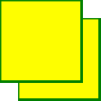
Below is the SVG code:
Example
<defs>
<filter id="f1" x="0" y="0" width="200%" height="200%">
<feOffset result="offOut" in="SourceGraphic" dx="20" dy="20" />
<feBlend in="SourceGraphic" in2="offOut" mode="normal" />
</filter>
</defs>
<rect width="90" height="90" stroke="green" stroke-width="3"
fill="yellow" filter="url(#f1)" />
</svg>
Try it Yourself »
Click to view:View SVG file。
Code explanation:
- The id attribute of the <filter> element defines a unique name for a filter.
- The filter attribute of the <rect> element is used to link the element to the "f1" filter.
Example 2
Now, the offset image can be made blurry (with <feGaussianBlur>):
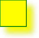
Below is the SVG code:
Example
<defs>
<filter id="f1" x="0" y="0" width="200%" height="200%">
<feOffset result="offOut" in="SourceGraphic" dx="20" dy="20" />
<feGaussianBlur result="blurOut" in="offOut" stdDeviation="10" />
<feBlend in="SourceGraphic" in2="blurOut" mode="normal" />
</filter>
</defs>
<rect width="90" height="90" stroke="green" stroke-width="3"
fill="yellow" filter="url(#f1)" />
</svg>
Try it Yourself »
Click to view:View SVG file。
Code explanation:
- The stdDeviation attribute of the <feGaussianBlur> element defines the amount of blur.
Example 3
Now, make a black shadow:
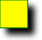
Below is the SVG code:
Example
<defs>
<filter id="f1" x="0" y="0" width="200%" height="200%">
<feOffset result="offOut" in="SourceAlpha" dx="20" dy="20" />
<feGaussianBlur result="blurOut" in="offOut" stdDeviation="10" />
<feBlend in="SourceGraphic" in2="blurOut" mode="normal" />
</filter>
</defs>
<rect width="90" height="90" stroke="green" stroke-width="3"
fill="yellow" filter="url(#f1)" />
</svg>
Try it Yourself »
Click to view:View SVG file。
Code explanation:
- The attribute of the <feOffset> element is changed to "SourceAlpha" to use the remnant in the Alpha channel instead of the entire RGBA pixel.
Example 4
Now add a color to the shadow:
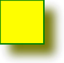
Below is the SVG code:
Example
<defs>
<filter id="f1" x="0" y="0" width="200%" height="200%">
<feOffset result="offOut" in="SourceGraphic" dx="20" dy="20" />
<feColorMatrix result="matrixOut" in="offOut" type="matrix"
values="0.2 0 0 0 0 0 0.2 0 0 0 0 0 0.2 0 0 0 0 0 1 0" />
<feGaussianBlur result="blurOut" in="matrixOut" stdDeviation="10" />
<feBlend in="SourceGraphic" in2="blurOut" mode="normal" />
</filter>
</defs>
<rect width="90" height="90" stroke="green" stroke-width="3"
fill="yellow" filter="url(#f1)" />
</svg>
Try it Yourself »
Click to view:View SVG file。
Code explanation:
- The <feColorMatrix> filter is used to transform the offset image to a color closer to black. The three values of the "0.2" matrix are multiplied by the red, green, and blue channels. Reducing their values brings the color to black (black is 0).
Notes
<feOffset>The element can be combined with other filter effects, such as blur, color matrix, etc.The offset amount of the offset effect
dxanddycan be positive (meaning offset to the right or downward) or negative (meaning offset to the left or upward).<feOffset>The element is usually used to create shadow effects; combined with other filter effects, it can achieve more complex visual effects.
By using the<feOffset>element, you can create offset effects for SVG graphic elements, making them appear more vivid and three-dimensional.