ECharts Data Visual Mapping
Data visualization, simply put, is presenting data in the form of charts; the professional expression is the mapping process from data to visual elements.
Each chart type in ECharts has this mapping process built-in. The bar chart we learned earlier maps data to length.
In addition, ECharts provides the visualMap component to offer universal visual mapping. The visual elements available in the visualMap component include:
- Graphic type (symbol)
- Graphic size (symbolSize)
- Color (color)
- Opacity
- Color transparency (colorAlpha)
- Color lightness (colorLightness)
- Color saturation (colorSaturation)
- Hue (colorHue)
Data and dimensions
In ECharts, data is generally stored inseries.dataIn.
Different chart types have different data formats, but their common feature is that they are all collections of data items (dataItem). Each data item contains a data value (value) and other optional information. Each data value can be a single numeric value (one-dimensional) or an array (multi-dimensional).
The most common form of series.data is a linear table, i.e., an ordinary array:
data: [
{ // Each item here is a data item (dataItem)
value: 2323, // This is the data value of the data item (value)
itemStyle: {...}
},
1212, // It can also directly be the value of dataItem, which is more common.
2323, // Each value is 'one-dimensional'.
4343,
3434
]
}
series: {
data: [
{ // Each item here is a data item (dataItem)
value: [3434, 129, San Marino], // This is the data value of the data item (value)
itemStyle: {...}
},
[1212, 5454, 'Vatican'], // It can also directly be the value of dataItem, which is more common.
[2323, 3223, 'Nauru'], // Each value is 'three-dimensional', each column is a dimension.
[4343, 23, 'Tuvalu'] // For a bubble chart, the first dimension is commonly mapped to the x-axis,
// Map the second dimension to the y-axis,
// Map the third dimension to the bubble radius (symbolSize)
]
}
In charts, the first one or two dimensions of value are often mapped by default, for example, the first dimension is mapped to the x-axis and the second dimension to the y-axis. If you want to display more dimensions, you can use visualMap.
visualMap component
The visualMap component defines mapping specified dimensions of data to corresponding visual elements.
Multiple visualMap components can be defined, thus enabling visual mapping of multiple dimensions in the data simultaneously.
The visualMap component can be defined as piecewise (visualMapPiecewise) or continuous (visualMapContinuous), distinguished by the type. For example:
visualMap: [
{ // The first visualMap component
type: 'continuous', // Define as continuous visualMap
...
},
{ // The second visualMap component
type: 'piecewise', // Define as piecewise visualMap
...
}
],
...
};
The piecewise visual mapping component has three modes:
- Continuous data evenly divided into segments: automatically split into several pieces evenly based on visualMap-piecewise.splitNumber.
- Continuous data custom segmentation: define each piece's range based on visualMap-piecewise.pieces.
- Discrete data is segmented by category: categories are defined in visualMap-piecewise.categories.
The piecewise visual mapping component is displayed as shown in the figure below:
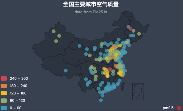
Visual mapping configuration
In visualMap, you can specify that specified dimensions of data are mapped to corresponding visual elements.
Example 1
visualMap: [
{
type: 'piecewise'
min: 0,
max: 5000,
dimension: 3, // The fourth dimension of series.data (i.e., value[3]) is mapped
seriesIndex: 4, // Map the fourth series.
inRange: { // Visual configuration for the selected range
color: ['blue', '#121122', 'red'], // Defines the color list of the graphic color mapping,
// The minimum data value maps to 'blue',
// The maximum value maps to 'red',
// The rest are automatically calculated linearly.
symbolSize: [30, 100] // Defines the mapping range for the graphic size,
// Map data minimum to 30,
// Map the maximum value to 100,
// The rest are automatically calculated linearly.
},
outOfRange: { // Visual configuration outside the selected range
symbolSize: [30, 100]
}
},
...
]
};
Example 2
visualMap: [
{
...,
inRange: { // Visual configuration for the selected range
colorLightness: [0.2, 1], // Map to brightness. That is, adjust the brightness of the original color.
// The original color may be a color selected from the global palette; the visualMap component does not care.
symbolSize: [30, 100]
},
...
},
...
]
};
For more details, seevisualMap.inRangeandvisualMap.outOfRange。
other extensions