Minimalism can be described as removing the unnecessary and focusing on the essentials. In other words, minimalism cuts through the clutter and goes straight to the point.
Since it is minimalism, the final appearance is naturally simplicity itself. Careful thinking, repeated attempts, and a lot of time are all incorporated into this simplicity. Now, let's break down minimalism and learn from it.
01. Stay Consistent
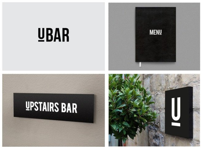
For brand identity, minimalist logos are very practical. Take this bar brand designed by Simon McWhinnie, for example. The logo graphics and colors adopt a minimalist style, perfectly integrating with other extended elements and products, creating a cohesive look that makes the brand image very memorable.
02. Find Hidden Connections

If you think minimalism makes design lose its creativity, you are greatly mistaken. In fact, only when you are not trapped by complex visuals do you have the opportunity to cleverly discover hidden connections among design elements. Opera Australia designed by Interbrand is a great example. They cleverly used minimalism to find the interesting relationships among the letters in "OPERA", "OPERA AUSTRALIA", and "OZ OPERA".
03. Utilize Spatial Relationships
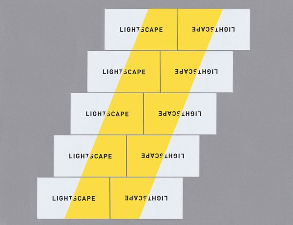
In minimalism, you can discover and utilize its unique sense of space. Design does not have to be limited to itself; it can relate to surrounding elements and combine to form a more "open" visual. Take this set of business cards designed by Trevor Finnegan, for example. Look at the effect when they are combined together.
04. Think Outside the Box
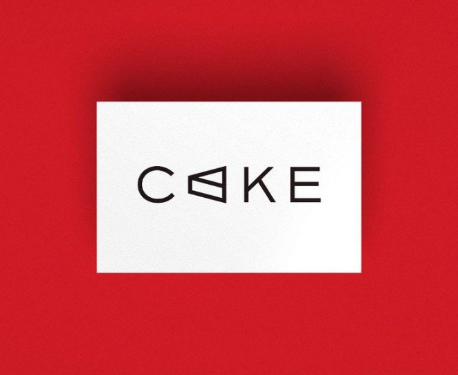
Minimalism does not mean abandoning all graphic and illustration elements; rather, it means being more cautious about when and where to use them. Like this logo designed by Frame Creative, the graphic elements are cleverly integrated with the brand name. If you can use this approach flexibly, you can create a visual that is both simple and illustrative.
05. Focus on Efficiency

Minimalism simplifies complexity and focuses on communication itself. This business card designed by Jake Frey is a great example. All the information is condensed into a few short lines, abandoning flashiness and improving efficiency.
06. The Power of Grids
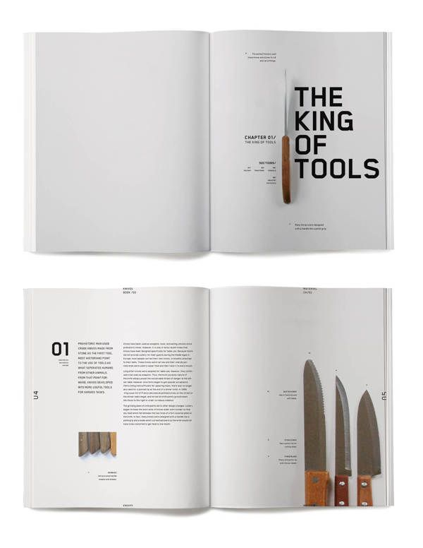
Fellow designers may already know the uses of grids, and some even consider it crucial to design. This is even more true for minimalism. Since there are not too many elements in the design, it's time to play around with the grid system. Take a look at this layout designed by Jessica Giboin. The precise grid system makes the text, titles, and various graphic elements form a clean, simple, and highly effective design.
07. Value Functionality

Minimalism can be called the champion of functionality. A clean, clear, and tidy design allows smooth visual navigation and puts all needed information at a glance. This layout designed by James Kape is a great example. The minimalist design and clear typographic hierarchy make the table of contents page easy to read and highly functional.
08. Seek Balance
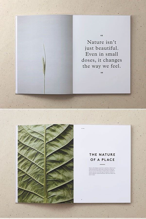
The balance between visual elements such as photos and text in a layout is very important. A good design must ensure that no element takes up too large a share of the layout without a specific reason. In this layout designed by Mother Design, we can see that a few emphasized large text elements are combined with simpler images, while images with more complex textures are usually paired with large blocks of text, thus achieving visual balance.
Source: http://www.w2bc.com/Article/29601