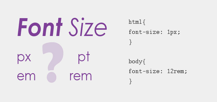
In CSS, choosing the appropriate unit for achievingresponsive design,andand usabilityis crucial.
px、emandremare the three most commonly used length units. Their main difference lies inthe reference benchmarkbeing different.
1. px (Pixel - Pixel)
pxis anabsolute unit(on screen displays). It represents a physical pixel point on the screen.
- Characteristics: Fixed size, does not change with browser settings or parent element font size.
- Advantages: Precise, easy to control, suitable for scenarios requiring "pixel-level" alignment (such as border lines, small icons).
- Disadvantages: Lacks flexibility, not conducive to responsive layout. If the user enlarges the font in the browser, layouts using
pxmay not adjust accordingly.
2. em (Relative to Element - Relative Unit)
emis arelative unit, and its reference is thecurrent element'sorparent element'sfont size (font-size)。
- Calculation rules:
- If used on
font-size, the reference is theparent element'sfont size. - If used on other properties (such as
width、padding、margin), the reference is thecurrent element'sown font size.
- Disadvantage: compound stacking effect. If multiple layers are nested and all use
em, the calculation becomes very complex.
Example:
If the parent element is20px, and the child element is set tofont-size: 1.5em;, then the actual size of the child element is .
3. rem (Root em - Root Relative Unit)
remis also arelative unit, but it only references theroot element(i.e., the<html>tag)'s font size.
- Calculation rule: No matter how deeply elements are nested,
1remalways equals<html>offont-size。 - Advantages:
- High predictability: Avoids
emthe stacking and nesting problem of em. - Responsive-friendly: Just modify
htmlthe root element's font size, and the entire page'sremlayout will scale proportionally.
- Default value: Most browsers' default root font size is
16px, so by default1rem = 16px。
Core Difference Comparison Table
| Unit | Type | Reference | Applicable Scenarios |
|---|---|---|---|
| px | Absolute unit | Physical screen pixel | Borders, shadows, elements that do not need scaling |
| em | Relative unit | Current/parent element font size | Local component scaling (e.g., button margins change with text size) |
| rem | Relative unit | <html>Root element font size |
Overall page layout, spacing, responsive typography |
Summary and Recommendations
- First choice:
remFor typography and layout: This ensures that your webpage can scale gracefully when users adjust the browser font size. - Second choice:
pxFor fixed details: For example,1pxborder lines, which you don't want to become blurry or disappear due to scaling. - Use sparingly:
emOnly for local use: Only consider using em when an element's Padding or Margin must scale synchronously with the element's text size (e.g., adaptive buttons).em。
A small tip:
For ease of calculation, many developers sethtmlthe root element's font size to62.5%(i.e., ). This way, when writing code,1.4remdirectly corresponds to14px, simple and intuitive.