Meta Section
1. Viewport Width
<meta name="viewport" content="width=device-width,initial-scale=1.0,minimum-scale=1.0,maximum-scale=1.0,user-scalable=no"/>
Wherewidth=device-widthis to set the viewport width to the device viewport width; you can also set a fixed width, for example:width=640would be a width of 640px (commonly seen in WeChat);
initial-scale=1.0: sets the zoom ratio to 1.0;
minimum-scale=1.0andmaximum-scale=1.0: minimum zoom ratio and maximum zoom ratio;
user-scalable=no: prohibits users from freely zooming,user-scalablethe default value isyes 。
Tip: The one above includes all parameters. For common use, havinguser-scalable=nomeans you don't need to useminimum-scale=1.0andmaximum-scale=1.0to force-disable zooming.
<meta name="viewport" content="width=device-width,initial-scale=1.0,user-scalable=no"/>
2. Auto-recognize Formats
<meta name="format-detection" content="telephone=no"/>
contentThe parameters inside:telephone=nois to disable the browser from automatically recognizing phone numbers,email=nois to disable the browser from automatically recognizing Email.
3. Complete Template
<meta name="viewport" content="width=device-width,initial-scale=1.0,user-scalable=no"/>
<meta name="format-detection" content="telephone=no"/>
<meta name="format-detection" content="email=no"/>
CSS Section
body {
    font-family: "Helvetica Neue", Helvetica, STHeiTi, sans-serif; /*使用无衬线字体*/
}

a, img {
    -webkit-touch-callout: none; /*禁止长按链接与图片弹出菜单*/
}

html, body {
    -webkit-user-select: none; /*禁止选中文本*/
    user-select: none;
}

button,input,optgroup,select,textarea {
    -webkit-appearance:none; /*去掉webkit默认的表单样式*/
}

a,button,input,optgroup,select,textarea {
    -webkit-tap-highlight-color:rgba(0,0,0,0); /*去掉a、input和button点击时的蓝色外边框和灰色半透明背景*/
}

input::-webkit-input-placeholder {
    color:#ccc; /*修改webkit中input的planceholder样式*/
}

input:focus::-webkit-input-placeholder {
    color:#f00; /*修改webkit中focus状态下input的planceholder样式*/
}

body {
    -webkit-text-size-adjust: 100%!important; /*禁止IOS调整字体大小*/
}

input::-webkit-input-speech-button {
    display: none; /*隐藏Android的语音输入按钮*/
}
Flex Basics Section
Here, assume the flex container is.box, and the child elements are.item 。
1. Define the container as a flex layout
.box{
    display: -webkit-flex; /*webkit*/
    display: flex;
}

/*行内flex*/
.box{
    display: -webkit-inline-flex; /*webkit*/
    display:inline-flex;
}
2. Container Styles
.box{
    flex-direction: row | row-reverse | column | column-reverse;
    /*主轴方向:左到右(默认) | 右到左 | 上到下 | 下到上*/

    flex-wrap: nowrap | wrap | wrap-reverse;
    /*换行:不换行(默认) | 换行 | 换行并第一行在下方*/

    flex-flow: <flex-direction> || <flex-wrap>;
    /*主轴方向和换行简写*/

    justify-content: flex-start | flex-end | center | space-between | space-around;
    /*主轴对齐方式:左对齐(默认) | 右对齐 | 居中对齐 | 两端对齐 | 平均分布*/

    align-items: flex-start | flex-end | center | baseline | stretch;
    /*交叉轴对齐方式:顶部对齐(默认) | 底部对齐 | 居中对齐 | 上下对齐并铺满 | 文本基线对齐*/

    align-content: flex-start | flex-end | center | space-between | space-around | stretch;
    /*多主轴对齐:顶部对齐(默认) | 底部对齐 | 居中对齐 | 上下对齐并铺满 | 上下平均分布*/
}
3. Child Element Styles
.item{
    order: <integer>;
    /*排序:数值越小,越排前,默认为0*/

    flex-grow: <number>; /* default 0 */
    /*放大:默认0(即如果有剩余空间也不放大,值为1则放大,2是1的双倍大小,以此类推)*/

    flex-shrink: <number>; /* default 1 */
    /*缩小:默认1(如果空间不足则会缩小,值为0不缩小)*/

    flex-basis: <length> | auto; /* default auto */
    /*固定大小:默认为0,可以设置px值,也可以设置百分比大小*/

    flex: none | [ <'flex-grow'> <'flex-shrink'>? || <'flex-basis'> ]
    /*flex-grow, flex-shrink 和 flex-basis的简写,默认值为0 1 auto,*/

    align-self: auto | flex-start | flex-end | center | baseline | stretch;
    /*单独对齐方式:自动(默认) | 顶部对齐 | 底部对齐 | 居中对齐 | 上下对齐并铺满 | 文本基线对齐*/
}
Tips and Tricks Section
1. Custom Apple Icon
Place a file in the root directory of the websiteapple-touch-icon.pngfile. When Apple devices save the website as a bookmark or desktop shortcut, this file will be used as the icon. The recommended file size is: 180px × 180px.
2. Custom favicon:
<link rel="icon" href="../favicon.ico" mce_href="../favicon.ico" type="image/x-icon">
3. Define Browser Click Behavior:
<a href="020-10086.html">打电话给:020-10086</a>
<a href="10086.html">发短信给: 10086</a>
<a href="[email protected]">发送邮件: [email protected]</a>
4. Define Upload File Types and Formats
<input type=file accept="image/*">
In the file upload box above,acceptyou can restrict the type of uploaded files; the parameter isimage/*means all image types. Clicking it will pop up the gallery. You can also specify an image format by setting the parameter toimage/pngwould restrict the image type to png; if the parameter isvideo/*it means selecting video;acceptYou can also set multiple file formats; the syntax isaccept="image/gif, image/jpeg" ;
5. Usebox-shadowChange (block) the yellow after form autofill
input:-webkit-autofill, textarea:-webkit-autofill, select:-webkit-autofill{
    box-shadow:inset 0 0 0 1000px #fff;
}
6. Use CSS to achieve ellipsis text truncation
white-space: nowrap;
text-overflow: ellipsis;
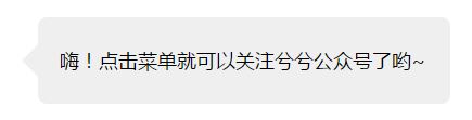
7. Use border to draw small triangles
The principle is: the top/bottom and left/right borders join at a diagonal angle. Using this feature, make one side of the border transparent, set the other side to the desired color, and hide the opposite side, and it becomes a small arrow shape.
border-width: 10px 10px 10px 0; //左箭头
border-color: transparent #fff;
border-style: solid;
width: 0;
Tooltip writing:
<!--html-->
<div class="box">嗨!点击菜单就可以关注兮兮公众号了哟~</div>
/*--css--*/
.box{
    position: relative;
    padding: 0 20px;
    width: 380px;
    height: 80px;
    border-radius: 8px;
    background: #EFEFEF;
    font-size: 18px;
    line-height: 80px;
}
.box:after{
    position: absolute;
    top: 50%;
    left: -15px;
    z-index: 1;
    display: block;
    margin-top: -15px;
    width: 0;
    border-color: transparent #EFEFEF;
    border-style: solid;
    border-width: 15px 15px 15px 0;
    content: "";
}
Article source:Mobile WEB Front-end Development Resource Integration - Xixi
Article author: Bon
Copyright notice: Free reprint - Non-commercial - No derivative works - Keep attribution (Creative Commons 3.0 License) Please indicate the source for reprinting.