ECharts, open-sourced from Baidu's commercial front-end data visualization team, is based on HTML5 Canvas. It is a pure JavaScript chart library that provides intuitive, vivid, interactive, and customizable data visualization charts. Innovative features such as drag-and-drop recalculation, data view, and value range roaming greatly enhance the user experience and empower users to mine and integrate data.——In the era of big data, it's time to redefine data charts
Architecture
ECharts (Enterprise Charts - Commercial Product Chart Library)Provides a chart library for common commercial products, based onZRenderCreating basic components such as coordinate systems, legends, tooltips, and toolboxes, and building on top of these are line charts (area charts), bar charts (strip charts), scatter plots (bubble charts), pie charts (donut charts), K-line charts, maps, chord diagrams, and force-directed layout diagrams. It also supports stacking in any dimension and mixed display of multiple chart types.
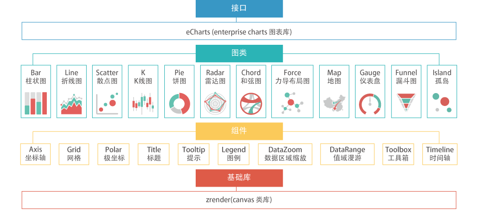
Mixed charts are more expressive and interesting. The charts provided by ECharts (9 categories, 14 types in total) support arbitrary mixing:
Line charts (area charts), bar charts (strip charts), scatter plots (bubble charts), K-line charts, pie charts (donut charts), radar charts, maps, chord diagrams, and force-directed layout diagrams.
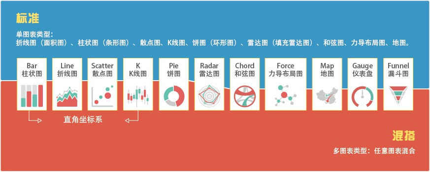
A standard chart in mixed mode:
Contains a unique legend, toolbox, data area zoom, and value range roaming modules, plus a Cartesian coordinate system (which can contain one or more category axes and one or more value axes, up to four axes in total: top, bottom, left, right)
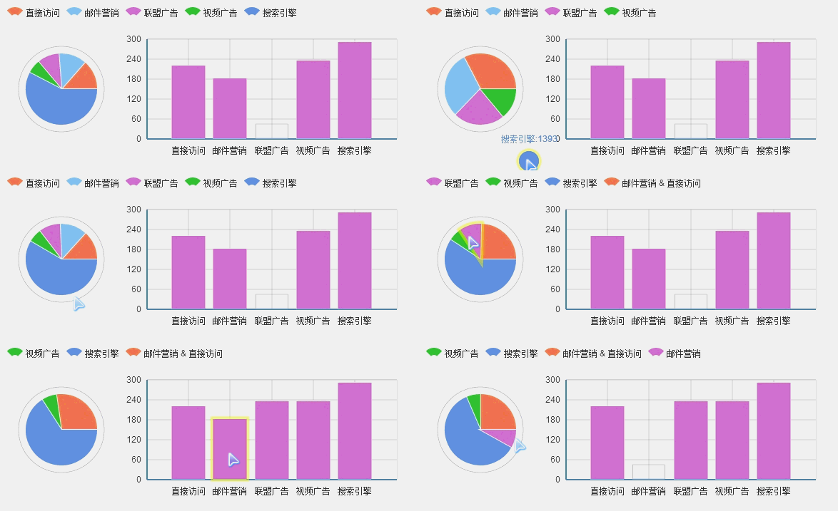
Drag-and-drop recalculation
The drag-and-drop recalculation feature (patented) brings a user experience never before seen in statistical charts, allowing users to effectively extract and integrate statistical data, even exchange data between multiple charts, and empowering users to mine and integrate data.
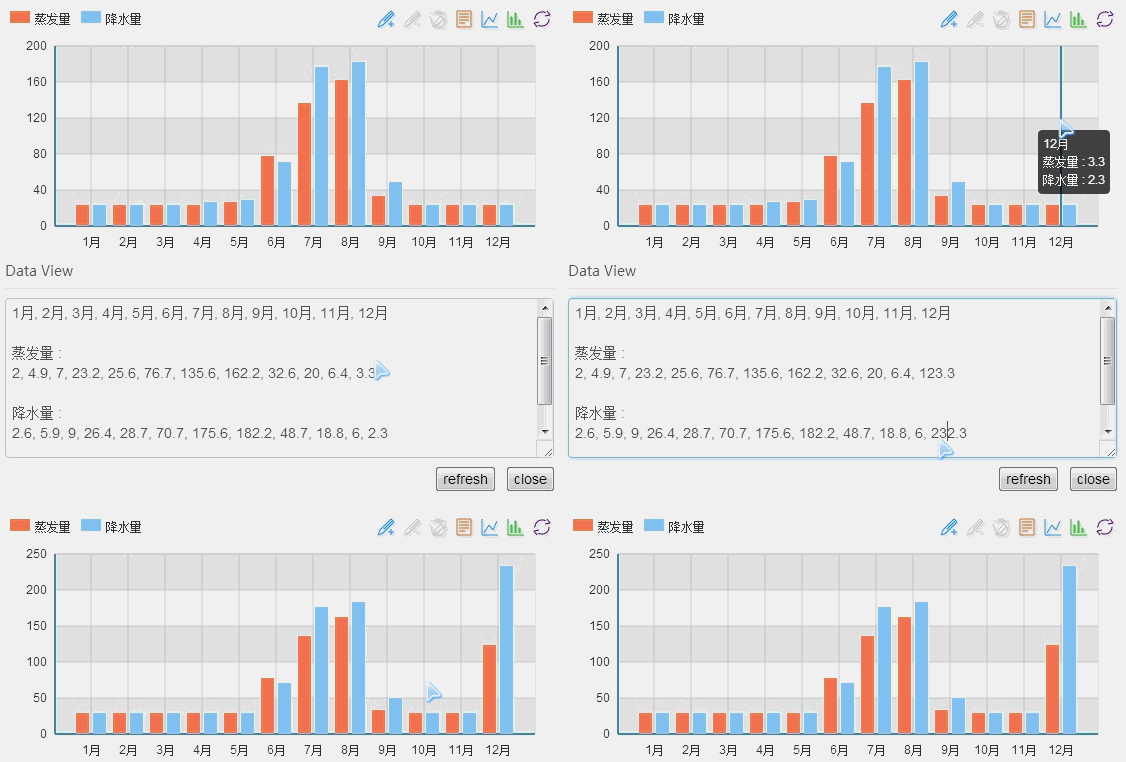
Data view
If the data you present matters enough to users, they won't be satisfied with just viewing visual charts. Do you need to cater to their needs for downloading, saving, sharing, processing, and integrating existing data one by one?
Perhaps you just need to provide a comma-separated data text and they'll understand - that's ECharts' data view! Of course, you can override the data view's output method to present data in your own unique way.
If your users are advanced enough, you can even enable the data view's editing feature. Compared with drag-and-drop recalculation, this is batch data modification!
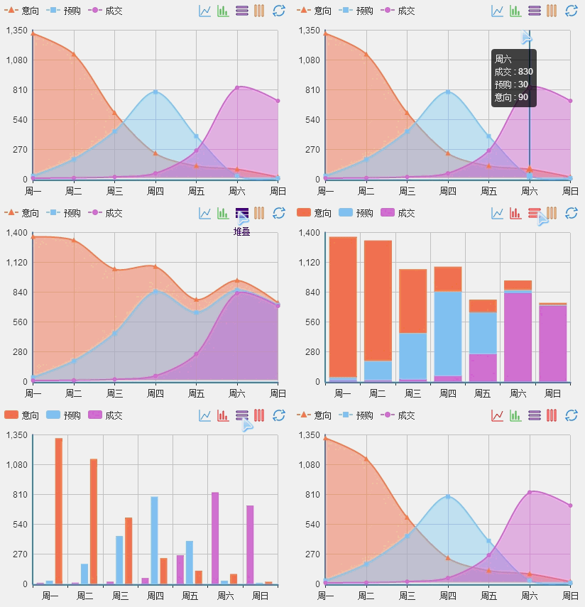
Dynamic type switching
Many chart types have similar expressive capabilities, but due to differences in data, presentation requirements, and personal preferences, the final charts can look very different. For example, choosing between line charts and bar charts, or deciding whether series data should be stacked or laid flat, is always a headache.
ECharts provides dynamic type switching, allowing users to freely switch to the chart type and stacking state they need.
Legend toggle
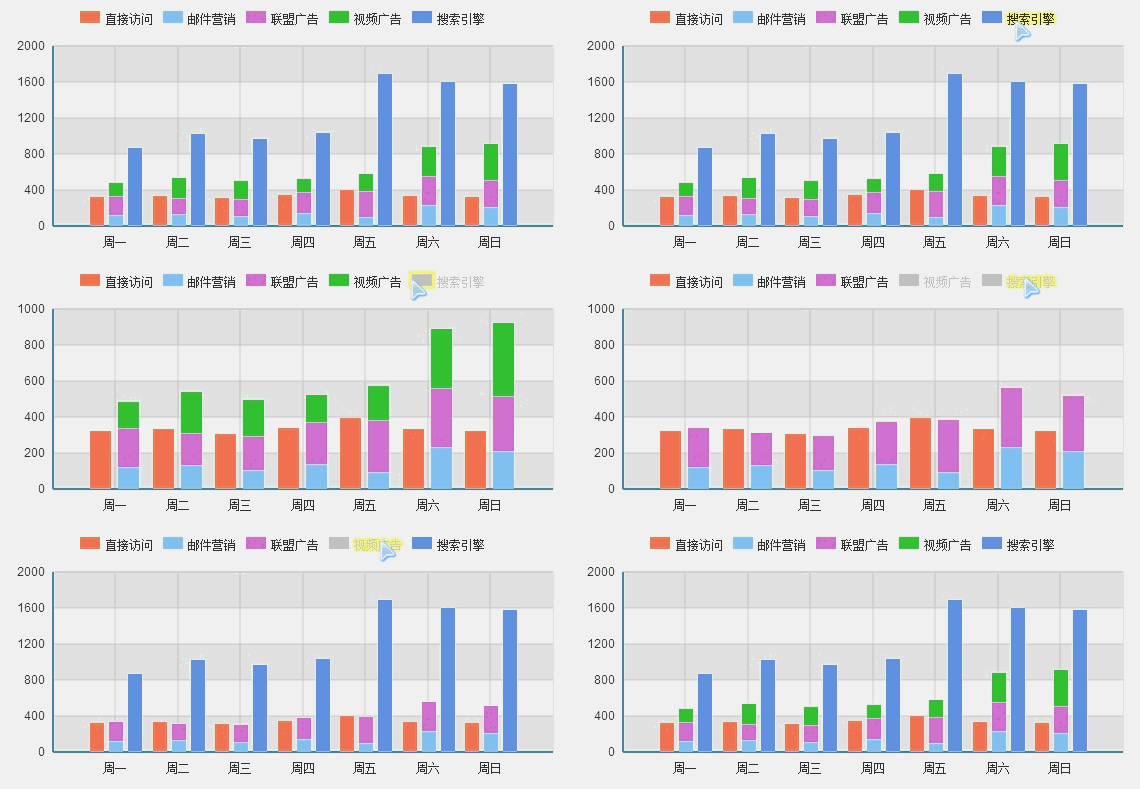
Displaying multiple series simultaneously presents rich content, but how do you let users switch to the specific series they care about?
ECharts provides a convenient and fast multi-dimensional legend toggle, allowing you to switch to the data series you care about at any time.
Data area selection
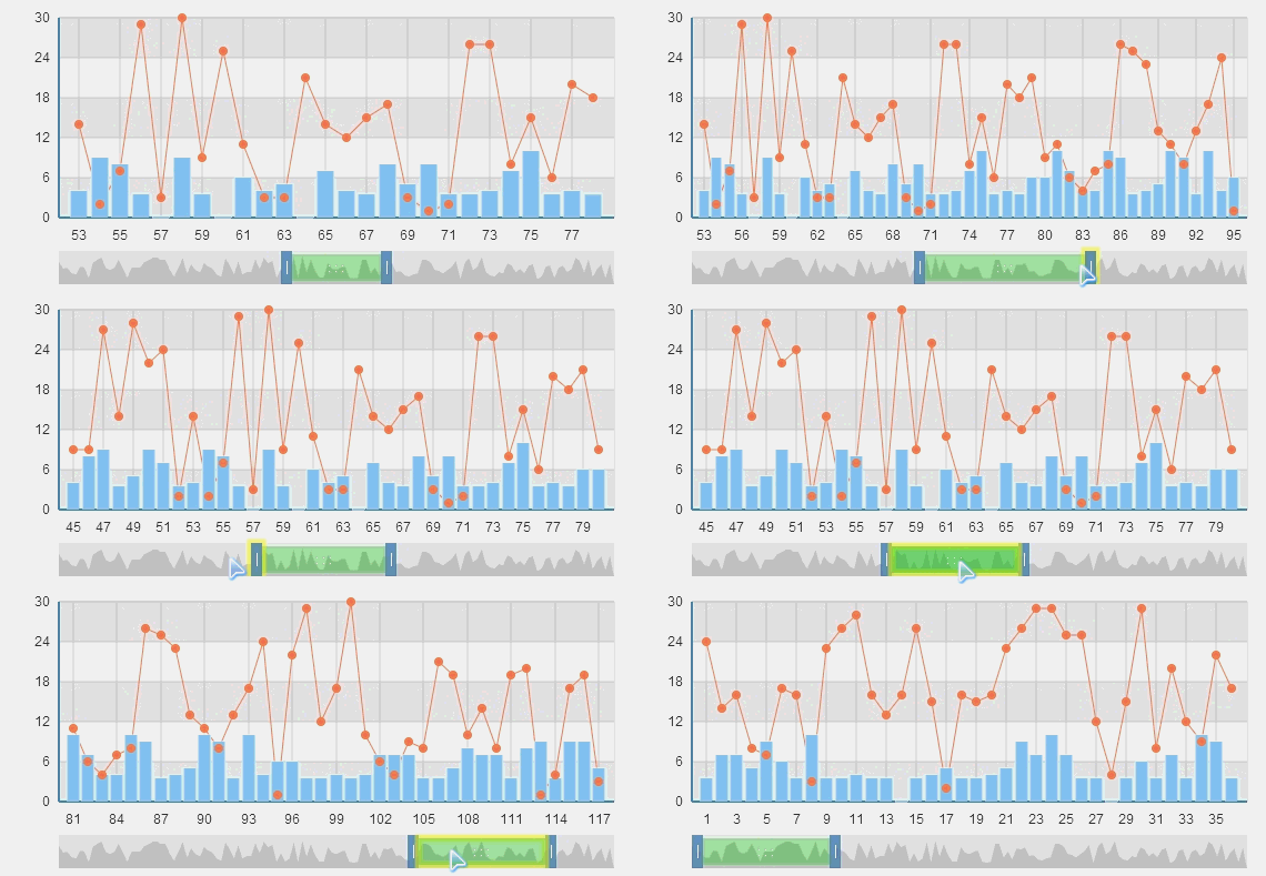
Data can be infinite, but display space is always limited. The data area selection component provides the ability to roam through large data volumes, allowing users to select and display the data area they care about.
Combined with dynamic mean (extreme value) mark lines and markers, it demonstrates powerful data analysis capabilities.
Multi-chart linkage
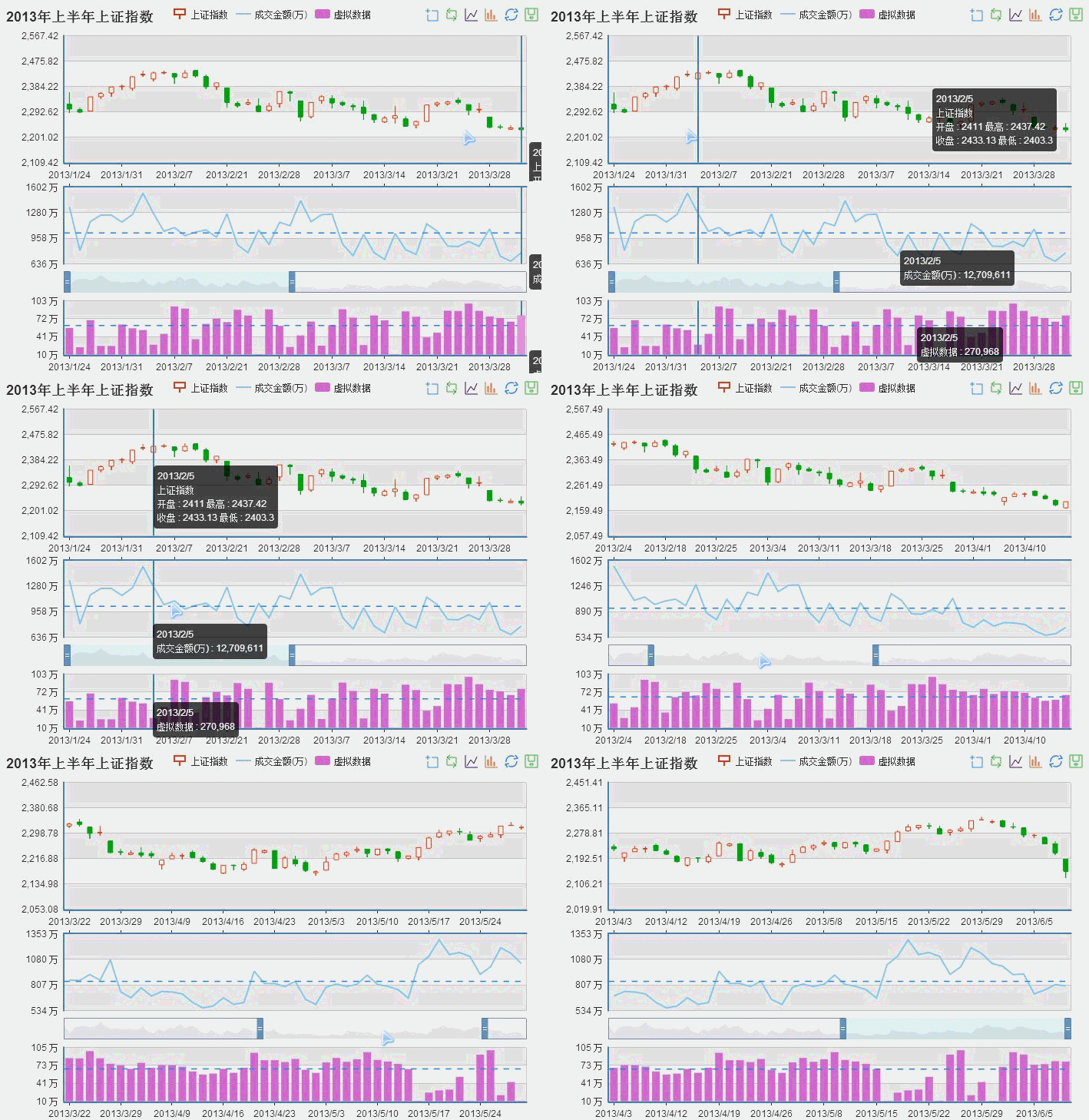
Displaying multiple series in the same Cartesian coordinate system can sometimes create confusion, but they have strong correlations and cannot be separated?
ECharts provides multi-chart linkage capability (connect), which does much more than just showing hover details. Connected charts share component events and automatically stitch images when saving.
Value range roaming
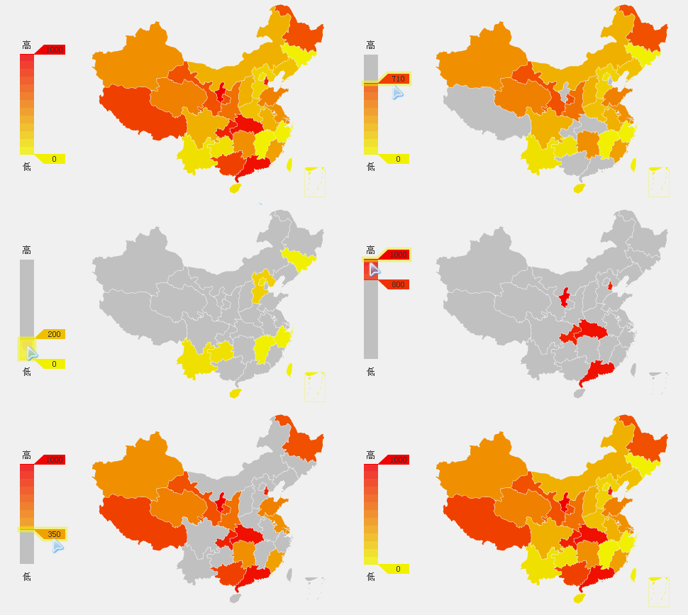
Coordinate-based charts (such as maps and scatter plots) can visually display data distribution by using color changes to represent value magnitudes.
But how do you focus on the values you care about? We created a feature called value range roaming, allowing you to easily filter values.
Glow effects
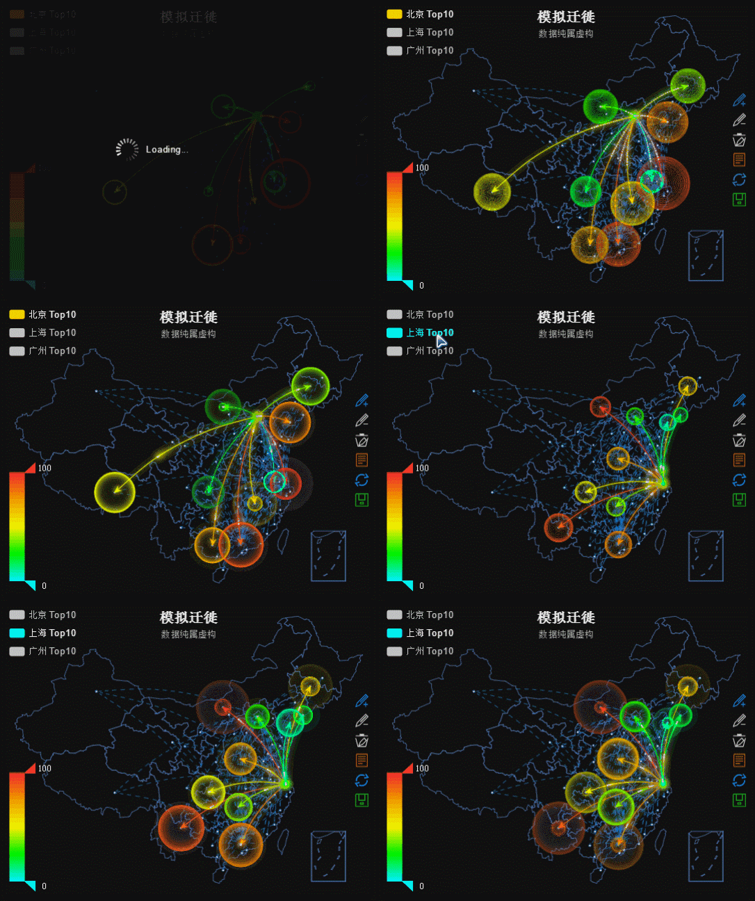
We know that many times we need some eye-catching capabilities.
ECharts supports glow effects for markers and mark lines. Especially when used on maps, it can easily achieve Baidu migration data visualization effects.
Large-scale scatter plot
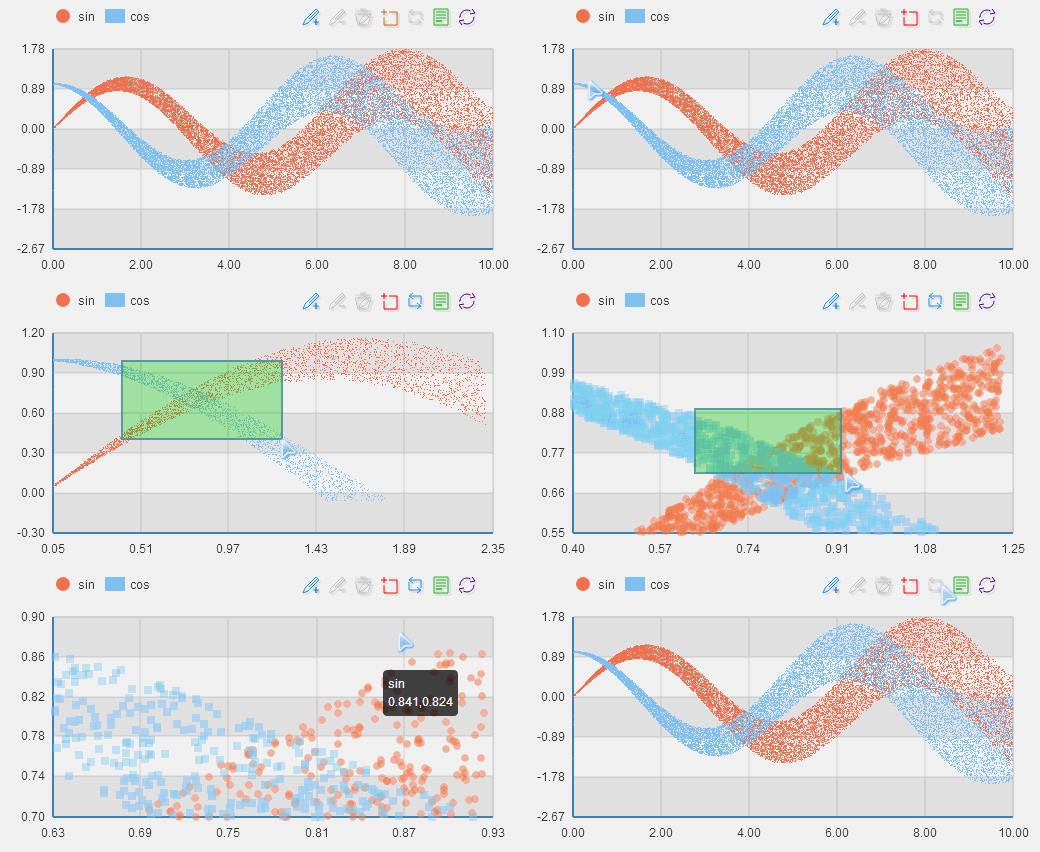
How do you display millions of discrete data points to find their distribution and clustering? It seems like there's no choice other than using professional statistical tools (like MATLAB)?
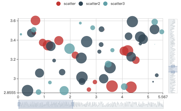
No, ECharts invented a pixel-based large-scale scatter plot (patented). A 900 x 400 scatter area can display 360,000 data sets without repetition. For regular applications, modern browsers are sufficient to easily display millions of scatter data points!
Dynamic data addition
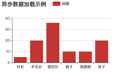
If you need to display real-time changing data, this dynamic interface will be very helpful to you.
var myChart = echarts.init(document.getElementById('main'));

$.get('data.json').done(function (data) {
    myChart.setOption({
        title: {
            text: '异步数据加载示例'
        },
        tooltip: {},
        legend: {
            data:['销量']
        },
        xAxis: {
            data: ["衬衫","羊毛衫","雪纺衫","裤子","高跟鞋","袜子"]
        },
        yAxis: {},
        series: [{
            name: '销量',
            type: 'bar',
            data: [5, 20, 36, 10, 10, 20]
        }]
    });
});
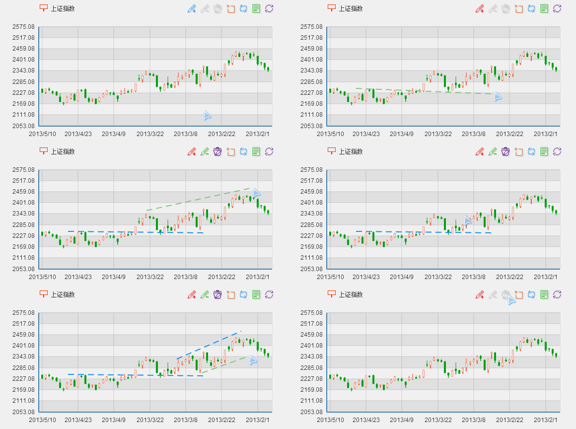
Mark line assistance
Trend line? Average line? Future trends? Correction values? Users with needs naturally know the purpose~
Providing mark line assistance is an essential feature in K-line charts! Yes, K-line charts are under development~
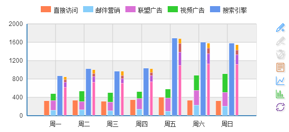
Multi-dimensional stacking
Supports multi-series, multi-dimensional data stacking. Combined with auto-scaling graphic entities and Cartesian coordinate systems, it can present more meaningful statistical charts~
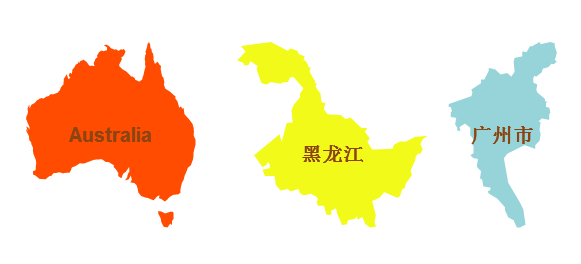
Sub-region map mode
Map types support world, china, and 34 provinces, municipalities, and autonomous regions nationwide. It also supports sub-region mode, which extends the main map type to include contained sub-region maps, easily outputting simplified maps of 176 countries and regions worldwide and over 600 provinces and cities nationwide.
GeoJSON map extension
The built-in maps are driven by map data generated from standard GeoJSON geographic data compressed with an efficient compression algorithm (about 30% of the size of standard GeoJSON). If the built-in map types or data do not meet your project needs, you can simply dynamically register to create the new types you need.
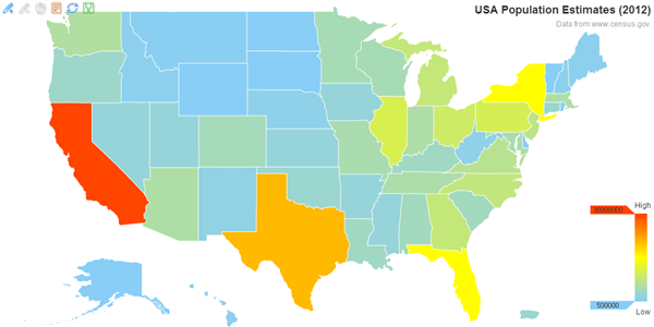
Markers & Mark lines
Adding additional markers is a common feature, such as marking specific positions on maps, marking extreme points on line charts, or marking trend lines in bar charts. All ECharts chart types support markers and mark lines, and inherently respond to interactions from components such as legend toggles and value range roaming.
Personalized customization
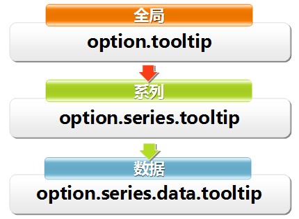
500+ configurable options combined with multi-level control design meet highly customized personalization needs.
Event interaction
Can capture user interaction and data change events to achieve linkage between charts and the outside world.
Related resources
- ECharts Tutorial:https://www.example.com/echarts/echarts-tutorial.html
- ECharts Download:https://github.com/apache/incubator-echarts
- ECharts Official Website:https://www.echartsjs.com/zh/index.html
- HTML5 Canvas Tutorial:https://www.example.com/html/html5-canvas.html
- ZRender:https://www.example.com/w3cnote/html5-canvas-zrender.html