Tailwind CSS Introduction
Tailwind CSS is a utility-first CSS framework. Unlike traditional frameworks (such as Bootstrap, Foundation), it has no predefined components, but instead provides a series of atomic CSS classes that allow you to apply styles directly in HTML.
Tailwind CSS is a utility-first framework, meaning it provides a large number of predefined classes rather than preset components. This allows developers to build almost any design without writing CSS.
Tailwind CSS is suitable for developers who like to control styles using classes directly in HTML. It makes rapid prototyping and developing custom designs simple and fast. However, its "no preset" approach also means more class names to memorize and a potentially steep learning curve.
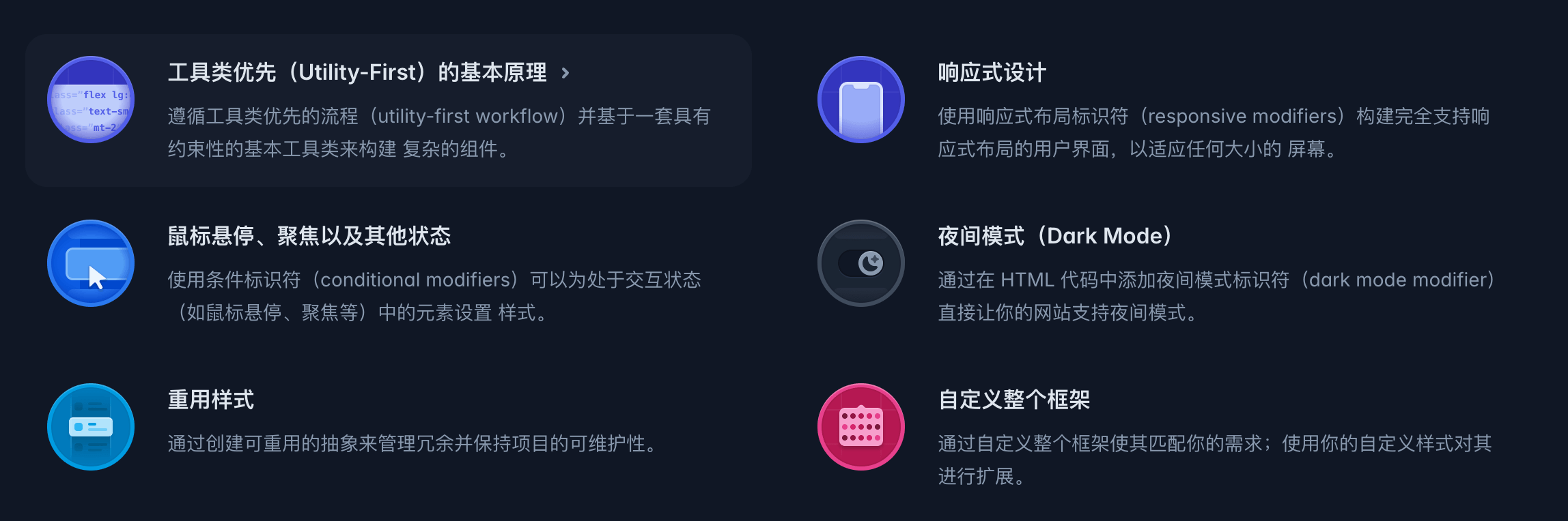
Core Features:
-
Utility-First: Follow a utility-first workflow, using constrained basic utility classes to build complex components.
-
Responsive Design: Use responsive modifiers to build user interfaces that fully support responsive layouts, adapting to screens of any size.
-
Hover, Focus, and Other States: Use conditional modifiers to style elements in interactive states (such as hover, focus, etc.).
-
Dark Mode: Add dark mode modifiers to your HTML code to directly enable dark mode support on your website.
-
Reusing Styles: Manage redundancy and maintain project maintainability by creating reusable abstractions.
-
Customizing the Entire Framework: Customize the entire framework to match your needs, extending it with your own custom styles.
The following is a simple Tailwind CSS example:<div>The element displays as a box with a blue background, white text, medium padding, and large rounded corners, with the content "Hello, Tailwind CSS!".
Tailwind CSS Examples
Try it »
Explanation:
bg-blue-500: Sets the background color to blue, specifically level 500 in the blue palette.text-white: Sets the text color to white.p-4: Sets the padding to a medium size (16px).rounded-lg: Sets the border radius to a large size (8px).
Tailwind CSS differs from traditional frameworks (such as Bootstrap, Foundation) in that it has no predefined components, but instead provides a series of atomic CSS classes that allow you to apply styles directly in HTML.
| Features | Tailwind CSS | Bootstrap |
|---|---|---|
| Styling Approach | Atomic class names | Component-based structure |
| Customization | Powerful and flexible | Depends on variables, complex to extend |
| Learning cost | Low, just understand class names | Requires familiarity with components and grid system |
| Community ecosystem | Rapidly growing, rich plugins | Mature but somewhat traditional |
| Size optimization | Supports PurgeCSS to remove unused styles | Requires manual optimization |
Core Concepts of Tailwind CSS
Utility-First
- Each class performs only one specific task, such as
text-centeris for centering,mt-4is for adding top margin. - Class names are simple and intuitive; you hardly need to memorize complex CSS properties.
No Component Limitations
- Does not provide ready-made components like buttons or navigation bars. All styles are achieved through combinations of class names.
- Provides great freedom, suitable for custom design needs.
Rapid Development
- Write styles directly in HTML without frequently switching to CSS files.
- Reduces problems of style overriding and redundant CSS.
Applicable Scenarios for Tailwind CSS
Rapid Prototyping
Quickly design and adjust pages without worrying about style refactoring.Team Collaboration
Use a unified configuration file, avoid style conflicts, and keep maintenance costs low.Responsive Layout
Built-in responsive design support, easily achieving multi-device compatibility.Medium and Large Projects
Use tools (such as PurgeCSS) to optimize output CSS files, adapting to complex project requirements.