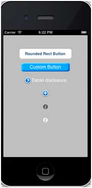
ボタンの使用
ボタンはユーザー操作を処理するために使用されます。タッチイベントを取得し、メッセージをターゲットオブジェクトに送信します。
角丸矩形ボタン

xib でのボタンのプロパティ
Utility area(ユーティリティエリア、ウィンドウの右側)のプロパティインスペクタで xib ボタンのプロパティを変更できます。
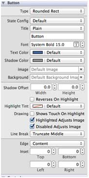
ボタンタイプ
- UIButtonTypeCustom
- UIButtonTypeRoundedRect
- UIButtonTypeDetailDisclosure
- UIButtonTypeInfoLight
- UIButtonTypeInfoDark
- UIButtonTypeContactAdd
重要なプロパティ
- imageView
- titleLabel
重要なメソッド
+ (id)buttonWithType:(UIButtonType)buttonType
- (UIImage *)backgroundImageForState:(UIControlState)state
- (UIImage *)imageForState:(UIControlState)state
- (void)setTitle:(NSString *)title forState:(UIControlState)state
- (void)addTarget:(id)target action:(SEL)action forControlEvents: (UIControlEvents) controlEventsカスタムメソッド addDifferentTypesOfButton を追加
-(void)addDifferentTypesOfButton
{
    // A rounded Rect button created by using class method
    UIButton *roundRectButton = [UIButton buttonWithType:
    UIButtonTypeRoundedRect];
    [roundRectButton setFrame:CGRectMake(60, 50, 200, 40)];
    // sets title for the button
    [roundRectButton setTitle:@"Rounded Rect Button" forState:
    UIControlStateNormal];
    [self.view addSubview:roundRectButton];

    UIButton *customButton = [UIButton buttonWithType: UIButtonTypeCustom];
    [customButton setBackgroundColor: [UIColor lightGrayColor]];
    [customButton setTitleColor:[UIColor blackColor] forState:
    UIControlStateHighlighted];
    //sets background image for normal state
    [customButton setBackgroundImage:[UIImage imageNamed:
    @"Button_Default.png"]
    forState:UIControlStateNormal];
    //sets background image for highlighted state
    [customButton setBackgroundImage:[UIImage imageNamed:
    @"Button_Highlighted.png"]
    forState:UIControlStateHighlighted];
    [customButton setFrame:CGRectMake(60, 100, 200, 40)];
    [customButton setTitle:@"Custom Button" forState:UIControlStateNormal];
    [self.view addSubview:customButton];

    UIButton *detailDisclosureButton = [UIButton buttonWithType:
    UIButtonTypeDetailDisclosure];
    [detailDisclosureButton setFrame:CGRectMake(60, 150, 200, 40)];
    [detailDisclosureButton setTitle:@"Detail disclosure" forState:
    UIControlStateNormal];
    [self.view addSubview:detailDisclosureButton];

    UIButton *contactButton = [UIButton buttonWithType:
    UIButtonTypeContactAdd];
    [contactButton setFrame:CGRectMake(60, 200, 200, 40)];
    [self.view addSubview:contactButton];

    UIButton *infoDarkButton = [UIButton buttonWithType:
    UIButtonTypeInfoDark];
    [infoDarkButton setFrame:CGRectMake(60, 250, 200, 40)];
    [self.view addSubview:infoDarkButton];

    UIButton *infoLightButton = [UIButton buttonWithType:
    UIButtonTypeInfoLight];
    [infoLightButton setFrame:CGRectMake(60, 300, 200, 40)];
    [self.view addSubview:infoLightButton];
}
注意:
プロジェクトに "Button_Default.png" と "Button_Highlighted.png" という名前の画像を追加します。これは、プロジェクトファイルが一覧表示されているナビゲーションエリアに画像をドラッグすることで行えます。
ViewController.m 内の viewDidLoad を次のように更新します
(void)viewDidLoad
{
    [super viewDidLoad];
    //The custom method to create our different types of button is called
    [self addDifferentTypesOfButton];
    //Do any additional setup after loading the view, typically from a nib
}
出力
アプリケーションを実行すると、以下の出力が得られます: