CSS radial-gradient() function
Example
The following example demonstrates a radial gradient - color stops evenly distributed:
#grad {
background-image: radial-gradient(red, green, blue);
}
Try it Yourself »
Definition and usage
The radial-gradient() function uses a radial gradient to create an "image".
A radial gradient is defined by its center point.
To create a radial gradient you must set two color stops.
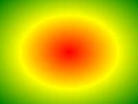
Radial Gradient Example
Supported version: CSS3
Browser Support
The numbers in the table indicate the first browser version number that supports the function.
The number specified by "webkit", "moz", or "o" is the first version number prefix that supports the function.
| Function | |||||
|---|---|---|---|---|---|
| radial-gradient() | 26.0 10.0 -webkit- |
10.0 | 16.0 3.6 -moz- |
6.1 5.1 -webkit- |
12.1 11.6 -o- |
CSS Syntax
background-image: radial-gradient(shape size at position, start-color, ..., last-color);
| Value | Description |
|---|---|
| shape | Determine the circle type:
|
| size | Defines the size of the gradient. Possible values:
|
| position | Defines the position of the gradient. Possible values:
|
| start-color, ..., last-color | Used to specify the start and end colors of the gradient. |
More Examples
Example
Color stops unevenly distributed:
#grad {
background-image: radial-gradient(red 5%, green 15%, blue 60%);
}
Try it Yourself »
Example
Circular radial gradient:
#grad {
background-image: radial-gradient(circle, red, yellow, green);
}
Try it Yourself »
Example
Using different size keywords:
#grad1 {
background-image: radial-gradient(closest-side at 60% 55%, blue, green, yellow, black);
}
#grad2 {
background-image: radial-gradient(farthest-side at 60% 55%, blue, green, yellow, black);
}
Try it Yourself »
CSS Tutorial:CSS3 Gradients
other extensions