CSS3 Flexible Box (Flex Box)
Flexbox is a new layout mode in CSS3.
CSS3 Flexible Box (Flexible Box or flexbox) is a layout mode that ensures elements behave appropriately when the page needs to adapt to different screen sizes and device types.
The purpose of introducing the flexbox layout model is to provide a more efficient way to arrange, align, and distribute empty space among child elements within a container.
Browser Support
The numbers in the table indicate the version number of the first browser that supports the property.
The -webkit- or -moz- immediately following the number is the prefix for the specified browser.
| Property | |||||
|---|---|---|---|---|---|
| Basic support (single-line flexbox) |
29.0 21.0 -webkit- |
11.0 | 22.0 18.0 -moz- |
6.1 -webkit- | 12.1 -webkit- |
| Multi-line flexbox | 29.0 21.0 -webkit- |
11.0 | 28.0 | 6.1 -webkit- | 17.0 15.0 -webkit- 12.1 |
CSS3 Flexbox Content
Flexbox consists of a flex container and flex items.
A flex container is defined as a flex container by setting the display property to flex or inline-flex.
The flex container contains one or more flex items.
Note:Everything outside the flex container and inside flex items is rendered as normal. Flexbox only defines how flex items are laid out within the flex container.
Flex items are usually displayed in one line within the flexbox. By default, each container has only one line.
The following elements show flex items displayed in one line, from left to right:
Example
Try it Yourself »
Of course, we can change the arrangement.
If we setdirectionThe property isrtl(right-to-left), the arrangement of flex items also changes, and the page layout changes accordingly:
Example
Try it Yourself »
flex-direction
flex-directionThe property specifies the position of flex items within the parent container.
Syntax
flex-direction: row | row-reverse | column | column-reverse
flex-directionThe values are:
- row: Arranged horizontally from left to right (left-aligned), the default arrangement.
- row-reverse: Reverse horizontal arrangement (right-aligned, from back to front, with the last item placed first).
- column: vertical arrangement.
- column-reverse: Reverse vertical arrangement, from back to front, with the last item placed at the top.
The following example demonstratesrow-reverseUsage:
Example
Try it Yourself »
The following example demonstratescolumnUsage:
Example
Try it Yourself »
The following example demonstratescolumn-reverseUsage:
Example
Try it Yourself »
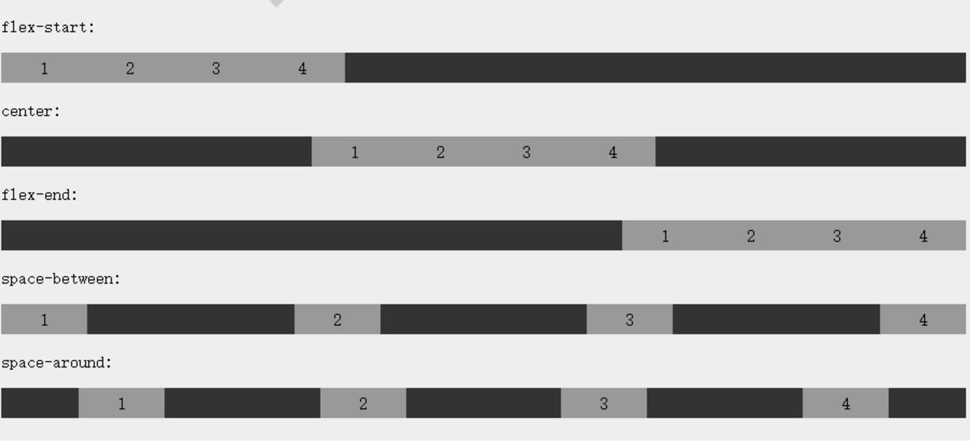
justify-content property
The justify-content property is applied to the flex container to align flex items along the main axis of the flex container.
The syntax for justify-content is as follows:
justify-content: flex-start | flex-end | center | space-between | space-around
Explanation of each value:
- flex-start:
Flex items are packed tightly toward the start of the line. This is the default value. The main-start margin edge of the first flex item is placed on the main-start edge of the line, and subsequent flex items are placed flush in order.
- flex-end:
Flex items are packed tightly toward the end of the line. The main-end margin edge of the first flex item is placed on the main-end edge of the line, and subsequent flex items are placed flush in order.
- center:
Flex items are packed tightly toward the center. (If the remaining free space is negative, the flex items will overflow equally in both directions.)
- space-between:
Flex items are evenly distributed across the line. If the remaining space is negative or there is only one flex item, this value is equivalent to flex-start. Otherwise, the margin of the first flex item aligns with the main-start edge of the line, and the margin of the last flex item aligns with the main-end edge of the line, then the remaining flex items are distributed along the line with equal spacing between adjacent items.
- space-around:
Flex items are evenly distributed along the line, with half of the spacing space left on both sides. If the remaining space is negative or there is only one flex item, this value is equivalent to center. Otherwise, flex items are distributed along the line with equal spacing between them (for example, 20px), while half the spacing (1/2*20px=10px) is left between the first and last items and the flex container.
Effect preview:
The following example demonstratesflex-endUsage:
Example
Try it Yourself »
The following example demonstratescenterUsage:
Example
Try it Yourself »
The following example demonstratesspace-betweenUsage:
Example
Try it Yourself »
The following example demonstratesspace-aroundUsage:
Example
Try it Yourself »
align-items Property
align-itemsSets or retrieves the alignment of flexbox elements in the direction of the cross axis (vertical axis).
Syntax
align-items: flex-start | flex-end | center | baseline | stretch
Explanation of each value:
- flex-start: The boundary of the flexbox element's cross-axis (vertical axis) start position is flush against the cross-axis start edge of the line.
- flex-end: The boundary of the flexbox element's cross-axis (vertical axis) start position is flush against the cross-axis end edge of the line.
- center: The flexbox element is centered on the cross axis (vertical axis) of the line. (If the line size is smaller than the flexbox element's size, it will overflow equally in both directions.)
- baseline: If the inline axis and cross axis of the flexbox elements are the same, this value is equivalent to 'flex-start'. In other cases, this value participates in baseline alignment.
- stretch: If the value of the property specifying the cross-axis size is 'auto', this value will make the item's margin box size as close as possible to the line's size, while still respecting the constraints of the 'min/max-width/height' properties.
The following example demonstratesstretch(默认值)Usage:
Example
Try it Yourself »
The following example demonstratesflex-startUsage:
Example
Try it Yourself »
The following example demonstratesflex-endUsage:
Example
Try it Yourself »
The following example demonstratescenterUsage:
Example
Try it Yourself »
The following example demonstratesbaselineUsage:
Example
Try it Yourself »
flex-wrap property
flex-wrapThe property is used to specify the wrapping behavior of the flex container's child elements.
Syntax
flex-wrap: nowrap|wrap|wrap-reverse|initial|inherit;
Explanation of each value:
- nowrap- Default. The flex container is a single line. In this case, flex items may overflow the container.
- wrap- The flex container is multiple lines. In this case, the overflowing parts of flex items will be placed on new lines, and line breaks will occur inside the items.
- wrap-reverse- Reverse wrap arrangement.
The following example demonstratesnowrapUsage:
Example
Try it Yourself »
The following example demonstrateswrapUsage:
Example
Try it Yourself »
The following example demonstrateswrap-reverseUsage:
Example
Try it Yourself »
align-content property
align-contentThe property is used to modify
flex-wrapThe behavior of the property. Similar toalign-items, but it does not set the alignment of flex items; rather, it sets the alignment of each line.
Syntax
align-content: flex-start | flex-end | center | space-between | space-around | stretch
Explanation of each value:
stretch- Default. Each line will stretch to occupy the remaining space.flex-start- Lines are stacked toward the start position of the flex container.flex-end- Lines are stacked toward the end position of the flex container.center- Lines are stacked toward the center position of the flex container.space-between- Lines are evenly distributed in the flex container.space-around- Lines are evenly distributed in the flex container, with half the size of the spacing between child elements retained at both ends.
The following example demonstratescenterUsage:
Example
Try it Yourself »
Flex child element properties
Sorting
Syntax
order:
Explanation of each value:
- <integer>: An integer value is used to define the order, with smaller values placed first. Negative values are allowed.
orderThe property sets the attributes of flex items within the flex container:
Example
Try it Yourself »
align
Setting the "margin" value to "auto" automatically takes up the remaining space in the flex container. Therefore, setting the vertical margin value to "auto" can make flex items fully centered in both axis directions of the flex container.
The following example sets on the first flex item:margin-right: auto;. It places the remaining space on the right side of the element:
Example
Try it Yourself »
Perfect centering
The following example will perfectly solve the centering problem we usually encounter.
With flexbox, centering becomes very simple; you just need to setmargin: auto;It can make flex items fully centered in both axis directions:
Example
Try it Yourself »
align-self
align-selfThe property is used to set the alignment of the flex item itself in the direction of the cross axis (vertical axis).
Syntax
align-self: auto | flex-start | flex-end | center | baseline | stretch
Explanation of each value:
- auto: If the value of 'align-self' is 'auto', its computed value is the 'align-items' value of the element's parent. If it has no parent, the computed value is 'stretch'.
- flex-start: The boundary of the flexbox element's cross-axis (vertical axis) start position is flush against the cross-axis start edge of the line.
- flex-end: The boundary of the flexbox element's cross-axis (vertical axis) start position is flush against the cross-axis end edge of the line.
- center: The flexbox element is centered on the cross axis (vertical axis) of the line. (If the line size is smaller than the flexbox element's size, it will overflow equally in both directions.)
- baseline: If the inline axis and cross axis of the flexbox elements are the same, this value is equivalent to 'flex-start'. In other cases, this value participates in baseline alignment.
- stretch: If the value of the property specifying the cross-axis size is 'auto', this value will make the item's margin box size as close as possible to the line's size, while still respecting the constraints of the 'min/max-width/height' properties.
The following example demonstrates the effects of different align-self values applied to flex items:
Example
Try it Yourself »
flex
flexThe property is used to specify how flex items allocate space.
Syntax
flex: auto | initial | none | inherit | [ flex-grow ] || [ flex-shrink ] || [ flex-basis ]
Explanation of each value:
- auto: computed value is 1 1 auto
- initial: computed value is 0 1 auto
- none: computed value is 0 0 auto
- inherit: inherits from the parent element
- [ flex-grow ]: Defines the expansion ratio of a flexbox element.
- [ flex-shrink ]: Defines the contraction ratio of a flexbox element.
- [ flex-basis ]: Defines the default basis value of a flexbox element.
In the following example, the first flex item occupies 2/4 of the space, and the other two each occupy 1/4 of the space:
Example
Try it Yourself »

More Examples
Using Flexbox to create responsive pages
CSS3 Flexbox Properties
The following table lists the properties commonly used in flexbox:
| Property | Description |
|---|---|
| display | Specifies the box type of the HTML element. |
| flex-direction | Specifies the arrangement of child elements within the flex container. |
| justify-content | Sets the alignment of flexbox elements in the direction of the main axis (horizontal axis). |
| align-items | Sets the alignment of flexbox elements in the direction of the cross axis (vertical axis). |
| flex-wrap | Sets whether the flex container's child elements wrap when they exceed the parent container. |
| align-content | Modifies the behavior of the flex-wrap property, similar to align-items, but instead of setting child element alignment, it sets line alignment. |
| flex-flow | Shorthand for flex-direction and flex-wrap. |
| order | Sets the arrangement order of the flex container's child elements. |
| align-self | Used on flex items. Overrides the container's align-items property. |
| flex | Sets how the flex container's child elements allocate space. |