CSS3 2D transformation
CSS3 Transforms
CSS3 transforms can move, scale, rotate, lengthen, or stretch elements.

How does it work?
The effect of a transform is to change an element's shape, size, and position.
You can use 2D or 3D transforms to transform your elements.
Move the mouse over the following elements to see the 2D and 3D transform effects:
Browser Support
Numbers in the table indicate the first browser version that supports the property.
Numbers followed by -webkit-, -ms-, or -moz- indicate the first browser version that supported the prefixed property.
| Property | |||||
|---|---|---|---|---|---|
| transform | 36.0 4.0 -webkit- |
10.0 9.0 -ms- |
16.0 3.5 -moz- |
3.2 -webkit- | 23.0 15.0 -webkit- 12.1 10.5 -o- |
| transform-origin (two-value syntax) |
36.0 4.0 -webkit- |
10.0 9.0 -ms- |
16.0 3.5 -moz- |
3.2 -webkit- | 23.0 15.0 -webkit- 12.1 10.5 -o- |
Internet Explorer 10, Firefox, and Opera support the transform property.
Chrome and Safari require the -webkit- prefixed version.
Note:Internet Explorer 9 requires the -ms- prefixed version.
2D transformation
In this chapter you will learn about 2D transformation methods:
- translate()
- rotate()
- scale()
- skew()
- matrix()
In the next chapter you will learn about 3D transformations.


Example
Try it Yourself »
translate() Method
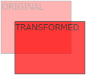
The translate() method moves an element from its current position, according to the parameters given for the left (X-axis) and top (Y-axis) positions.
Example
Try it Yourself »
The translate value (50px, 100px) moves the element 50 pixels from the left and 100 pixels from the top.
rotate() method
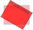
The rotate() method rotates an element clockwise by a given degree. Negative values are allowed, which rotate the element counterclockwise.
Example
Try it Yourself »
The rotate value (30deg) rotates the element 30 degrees clockwise.
scale() method
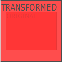
The scale() method increases or decreases the size of an element, depending on the parameters for width (X-axis) and height (Y-axis):
Example
Try it Yourself »
scale(2,3) transforms the width to 2 times its original size and the height to 3 times its original size.
skew() method
Syntax
transform:skew(<angle> [,<angle>]);
Contains two parameter values, representing the skew angles along the X-axis and Y-axis. If the second parameter is empty, it defaults to 0. Negative parameters indicate skewing in the opposite direction.
- skewX(<angle>); represents skewing only along the X-axis (horizontal direction).
- skewY(<angle>); represents skewing only along the Y-axis (vertical direction).
Example
Try it Yourself »
skew(30deg,20deg)element inXaxis andYSkews 20 degrees and 30 degrees along the axes.
matrix() method
The matrix() method combines all 2D transform methods into one.
The matrix method has six parameters, including rotation, scaling, moving (translation), and skewing functions.
Example
Use the matrix() method to rotate the div element by 30°.
Try it Yourself »
New transformation properties
The following lists all the transformation properties:
| Property | Description | CSS |
|---|---|---|
| transform | Applies to elements for 2D or 3D transformations. | 3 |
| transform-origin | Allows you to change the position of the transformed element. | 3 |
2D conversion methods
| Function | Description |
|---|---|
| matrix(n,n,n,n,n,n) | Defines a 2D transform using a matrix of six values. |
| translate(x,y) | Defines a 2D transform, moving an element along the X and Y axes. |
| translateX(n) | Defines a 2D transform, moving an element along the X-axis. |
| translateY(n) | Defines a 2D transform, moving an element along the Y-axis. |
| scale(x,y) | Defines a 2D scale transform, changing the element's width and height. |
| scaleX(n) | Defines a 2D scale transform, changing the element's width. |
| scaleY(n) | Defines a 2D scale transform, changing the element's height. |
| rotate(angle) | Defines a 2D rotation, specifying the angle in the parameter. |
| skew(x-angle,y-angle) | Defines a 2D skew transform along the X and Y axes. |
| skewX(angle) | Defines a 2D skew transform along the X-axis. |
| skewY(angle) | Defines a 2D skew transform along the Y-axis. |