CSS Web Layout

Web Layout

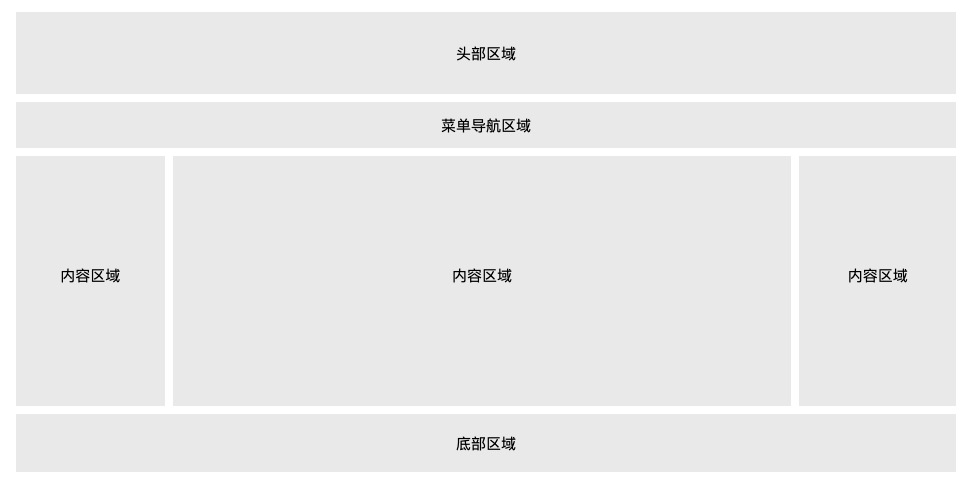
There are many ways to lay out web pages, generally divided into the following parts:Header area, menu navigation area, content area, footer area。

Header area

The header area is located at the top of the entire webpage and is generally used to set the title or logo of the webpage:

CSS3 Examples

.header { background-color: #F1F1F1; text-align: center; padding: 20px; }

Try it Yourself »

Menu navigation area

The menu navigation bar contains some links that can guide users to browse other pages:

CSS3 Examples

/*Navigation bar*/ .topnav { overflow: hidden; background-color: #333; } /*Navigation links*/ .topnav a { float: left; display: block; color: #f2f2f2; text-align: center; padding: 14px 16px; text-decoration: none; } /*Links - Change Color*/ .topnav a:hover { background-color: #ddd; color: black; }

Try it Yourself »

Content area

The content area generally has three forms:

  • 1 column: generally used for mobile devices
  • 2 columns: generally used for tablet devices
  • 3 columns: generally used for PC desktop devices
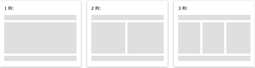
We will create a 3-column layout that will become a 1-column layout on small screens (responsive):

CSS3 Examples

/*Create three equal columns*/ .column { float: left; width: 33.33%; } /*Clear floats after columns*/ .row:after { content: ""; display: table; clear: both; } /*Responsive layout - change to a vertical layout when less than 600 px*/ @media screen and (max-width: 600px) { .column { width: 100%; } }

Try it Yourself »

Tip:To set two columns, you can set width to 50%. To create 4 columns, you can set it to 25%.

Tip:If you want to learn more about @media rules, you can checkCSS3 Media Queries。

Tip:A more advanced way now is to use CSS Flexbox to create column layouts, but Internet Explorer 10 and earlier versions do not support this method. IE6-10 can use the float method.

For more content on CSS Flexbox, you can checkCSS3 Flexible Box (Flex Box)。

Unequal columns

For unequal columns, the content area is generally set in the middle part, which is also the largest and most important. The left and right sides can be used for navigation and other related content. The total width of these three columns is 100%.

CSS3 Examples

.column { float: left; } /*Left and right sidebar widths*/ .column.side { width: 25%; } /*Middle column width*/ .column.middle { width: 50%; } /*Responsive layout - set vertical layout when width is less than 600px*/ @media screen and (max-width: 600px) { .column.side, .column.middle { width: 100%; } }

Try it Yourself »

Footer area

The footer area is at the very bottom of the webpage and generally contains copyright information, contact information, etc.

CSS3 Examples

.footer { background-color: #F1F1F1; text-align: center; padding: 10px; }

Try it Yourself »

Responsive web layout

Through the above learning, let's create a responsive page. The page layout will adjust according to the size of the screen:

CSS3 Examples

* { box-sizing: border-box; } body { font-family: Arial; padding: 10px; background: #f1f1f1; } /*Header title*/ .header { padding: 30px; text-align: center; background: white; } .header h1 { font-size: 50px; } /*Navigation bar*/ .topnav { overflow: hidden; background-color: #333; } /*Navbar links*/ .topnav a { float: left; display: block; color: #f2f2f2; text-align: center; padding: 14px 16px; text-decoration: none; } /*Link color modification*/ .topnav a:hover { background-color: #ddd; color: black; } /*Create two columns*/ /* Left column */ .leftcolumn { float: left; width: 75%; } /*Right sidebar*/ .rightcolumn { float: left; width: 25%; background-color: #f1f1f1; padding-left: 20px; } /*Image section*/ .fakeimg { background-color: #aaa; width: 100%; padding: 20px; } /*Article card effect*/ .card { background-color: white; padding: 20px; margin-top: 20px; } /*Clear floats after columns*/ .row:after { content: ""; display: table; clear: both; } /*Footer*/ .footer { padding: 20px; text-align: center; background: #ddd; margin-top: 20px; } /*Responsive layout - when screen size is less than 800px, the two-column layout changes to a vertical layout*/ @media screen and (max-width: 800px) { .leftcolumn, .rightcolumn { width: 100%; padding: 0; } } /*Responsive layout - when screen size is less than 400px, navigation and other layouts change to vertical layout*/ @media screen and (max-width: 400px) { .topnav a { float: none; width: 100%; } }

Try it Yourself »
other extensions