Responsive Web Design -Viewport
What is Viewport?
viewport is the visible area of the user's web page.
In Chinese, viewport can be translated as '视区'.
Mobile browsers place the page in a virtual "window" (viewport), and this virtual "window" (viewport) is usually wider than the screen, so that each web page does not have to be squeezed into a very small window (which would break the layout of pages not optimized for mobile browsers). Users can pan and zoom to see different parts of the page.
Set Viewport
A common viewport meta tag for mobile-optimized pages looks roughly like this:
<meta name="viewport" content="width=device-width, initial-scale=1.0">
- width: controls the size of the viewport. It can be set to a specific value, such as 600, or a special value, such as device-width, which is the width of the device (in CSS pixels when scaled to 100%).
- height: Corresponds to width, specifying the height.
- initial-scale: the initial zoom ratio, that is, the zoom ratio when the page is first loaded.
- maximum-scale: the maximum ratio the user is allowed to zoom to.
- minimum-scale: the minimum ratio the user is allowed to zoom to.
- user-scalable: whether the user can manually zoom.
The following examples demonstrate the effect of using viewport versus not using viewport on mobile devices:
Example 1: Without adding viewport:Click to view

Example 2: With viewport added:Click to view
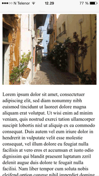
If you visit on a tablet or phone, you can directly click to see the effect.
other extensions