CSS conic-gradient() Function
Example
Three-color conic gradient:
#grad {
background-image: conic-gradient(red, yellow, green);
}
Try it Yourself »
Definition and usage
The conic-gradient() function creates an image consisting of gradients.
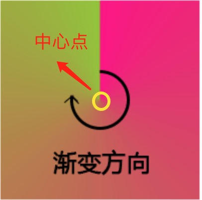
Conic gradients transition colors rotated around a center point (rather than radiating outward from the center).
To create a conic gradient, you need to set at least two color stops.
Conic Gradient Example:
| version: | CSS3 |
|---|
Browser Support
The numbers in the table indicate the first browser version number that supports the function.
| Function | |||||
|---|---|---|---|---|---|
| conic-gradient() | 69.0 | 79.0 | 83.0 | 12.1 | 56.0 |
CSS Syntax
background-image: conic-gradient([from angle] [at position,] color degree, color degree, ...);
| Value | Description |
|---|---|
| from angle | Optional. The starting angle. Default value is 0deg. |
| at position | Optional. Center position. Default is centered. |
| color degree, ..., color degree | Angle gradient stop. The value consists of a color value followed by an optional stop position (a degree between 0 and 360 or a percentage between 0% and 100%). |
More Examples
Example
Five-color conic gradient:
#grad {
background: conic-gradient(red, orange, yellow, green, blue);
}
Try it Yourself »
Example
A three-color conic gradient, with the degrees for each gradient set:
#grad {
background-image: conic-gradient(red 45deg, yellow 90deg, green 210deg)
}
Try it Yourself »
Example
By Settingborder-radius: 50%Turn the conic gradient into a circle:
#grad {
background-image: conic-gradient(red, yellow, green, blue, black);
border-radius: 50%;
}
Try it Yourself »
Example
Set Start Angle:
#grad {
background-image: conic-gradient(from 90deg, red, yellow, green);
border-radius: 50%;
}
Try it Yourself »
Example
Specify Center Position:
#grad {
background-image: conic-gradient(at 60% 45%, red, yellow, green);
border-radius: 50%;
}
Try it Yourself »
Example
Specify a position and set an angle:
#grad {
background-image: conic-gradient(from 90deg at 60% 45%, red, yellow, green);
border-radius: 50%;
}
Try it Yourself »
Example
A pie chart:
#grad {
background-image: conic-gradient(red 0deg, red 90deg, yellow 90deg, yellow 180deg, green 180deg);
border-radius: 50%;
}
Try it Yourself »
background-image: conic-gradient(red 0deg, red 90deg, yellow 90deg, yellow 180deg, green 180deg);
Code Analysis:
- red 0deg, red 90degIndicates that the 0–90 degree interval uses red.
- yellow 90deg, yellow 180degIndicates that the 90–180 degree interval uses yellow.
- green 180degIndicates that the 180–360 degree interval uses green.
Example
Create a color picker card:
#grad {
background: radial-gradient(closest-side, gray, transparent),
conic-gradient(red, magenta, blue, aqua, lime, yellow, red);
border-radius: 50%;
}
Try it Yourself »
other extensions